Driving traffic to your website is crucial in building authority in the online space. However, your efforts should continue from there. For you to increase your followers and customers, you must be able to convert them to leads.
Driving traffic to your website is crucial in building authority in the online space. However, your efforts should continue from there. For you to increase your followers and customers, you must be able to convert them to leads.
And how can you do that? By creating effective lead capture forms.
In this article, we�ll guide you through the best form design practices, show you some of the best examples, and give you an idea of what are the best lead capture tools in the market.
Are you ready?
What is a lead capture form?
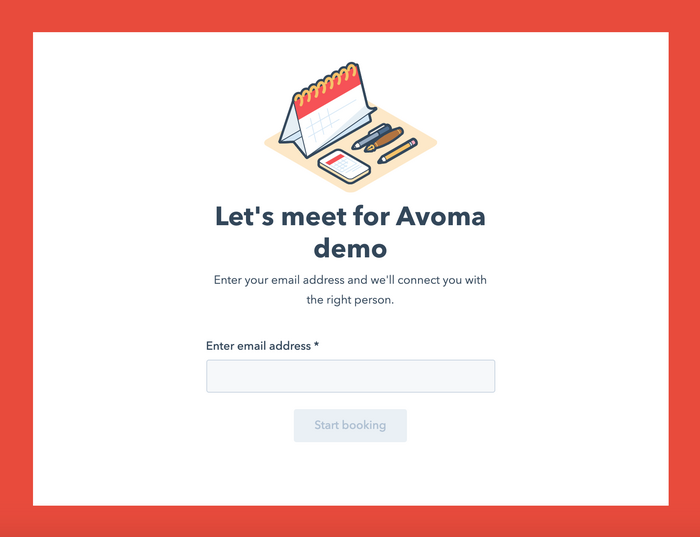
Online lead capture forms are used to obtain your prospects� contact information, such as the mobile number and email address.
Since lead forms allow various businesses to attract customers and build relationships, you�ll surely need to create one at some point.
And although capturing leads doesn�t equate to driving sales, it helps to push potential customers into the sales funnel and affect purchase decisions. Ultimately, the lead-to-customer conversion rate will still depend on whether you manage to drive the right leads with your campaigns. Your lead capture forms play a key role in this process.
On-Demand Video Course On Native Advertising
Boost your ROAS with native ads. Enroll now with our limited 30% discount.

This brings us to the next section. What are the types of lead generation forms?
Actually, there are quite a few of them. Depending on your business goals, you can choose among the following:
1. Contact forms
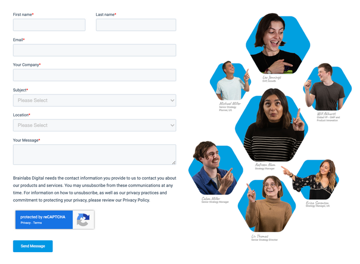
Contact forms are the most popular type of lead capture forms. You can spot them on most company websites, either as standalone pages or embedded somewhere on the home page.
2. Quote forms
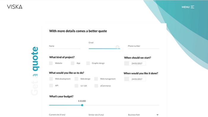
These forms exist to provide your prospects with the estimated price of your product or service. You can give a brief breakdown of costs and discounts, then ask your leads for detailed information, and send them a custom-tailored quote later.
3. Gated content forms
Content upgrade forms allow you to offer bonuses or materials to your leads, (like ebooks, mini-courses, or promo codes) in exchange for leaving their email address.

4. Registration forms
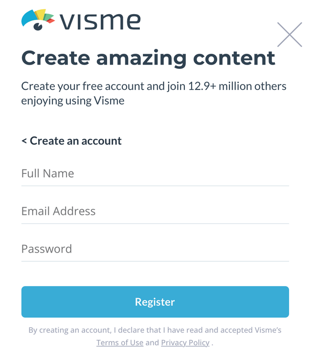
These forms allow your visitors to sign up for your software, product, webinar, or other services. Together with newsletter signup forms, this is one of the most common types of forms out there.
5. Newsletter subscription forms
Newsletter subscription forms can also be considered lead capture forms since you can later convert your subscribers into customers. You may use email newsletters to announce upcoming events and new products of your company, so they can be visible to your leads.

Best Practices To Design Lead Capture Forms
Creating and designing a lead capture form needs to be a thoughtful process. Follow the tips below to increase your chances of getting more conversions.
Structure your forms well
Form structure affects the overall experience of your respondents and can therefore increase or decrease your response rate. Highly organized and responsive forms tend to be more appealing to people and induce them to continue and follow through with the submission. On the other hand, poorly structured forms are often abandoned.
On-Demand Video Course On Native Advertising
Boost your ROAS with native ads. Enroll now with our limited 30% discount.

When organizing your forms, keep your audience in mind. Make it as easy as possible for them to answer the questions.
To create a better form structure, you may:
Group your content. Creating sections based on the theme of your questions can help with the cognitive load of your respondents. The brain can�t function well with clutter, so you can�t expect your prospects to finish a poorly organized form. Make sure to categorize your fields and questions well.
Choose the correct input fields. Although this might seem like a minor thing, it can significantly affect the quality and accuracy of the data you collect. If you want to collect email addresses of your respondents, use the email form field. So once they input the wrong info, i.e., mobile number, it will be rejected. As much as possible, use the designated field instead of the default �text field.�
Use the right questions and the right words. Think about your target customers when creating your form and address them directly. Only add fields that are relevant to them and can add value to your business. For example, if you�re providing digital services, asking for a home address might be unnecessary. Instead, ask them to specify their email address, company niche, the size of their team.
Provide clear instructions. Make sure that the requirements are understandable and straightforward, so they can answer right away, without the need for interpretation.
Carefully select between single-page or multi-page forms. Although short single-page forms are great, oftentimes you�ll need to create longer ones. In this case, consider whether it will fit a single page or creating a multi-page form would be better. However, be careful and avoid splitting your forms into too many pages unnecessarily. According to a study by Paperform, adding extra pages can decrease the completion rate.
The appearance of your forms
Your form�s visual elements also play a massive part in the completion rate. The statistics have shown that 75% of buyers judge the credibility of a business based on how their website looks.
What do we mean by a �well-designed� form? Aside from the clear structure, you should also use the right colors and fonts.
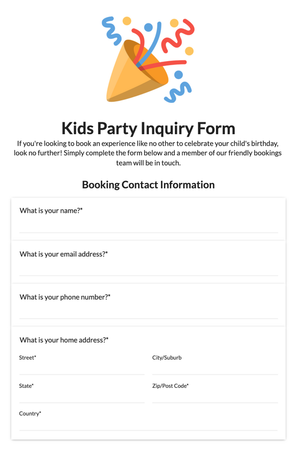
Make sure that your text is readable and communicates a clear message. In addition, theming your lead forms based on your company colors can also add brand recognition and make them look more trustworthy.
The psychological aspects of your forms
Creating forms is quicker nowadays as there are templates and intuitive form builders available. However, to build an effective lead capture page that encourages responses from your audience, you also need to understand human psychology.
One main factor is the attention span. Now that people can only concentrate for 8 seconds, you need to make sure your form�s design is captivating enough to draw people�s attention.
The next thing to consider is trust. For people to invest time in answering your questions, you need to win their trust first. Once they are comfortable with your brand and know enough about you, it will be easier to ask them to fill out your form and start a commercial relationship.
How to A/B test lead capture forms
A/B testing your lead capture forms is vital as different audience segments are likely to behave differently. What works for older audiences might fail to work for Gen Z.
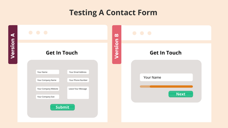
Below are some things you need to keep in mind when A/B Testing:
Test one variable at a time. A/B testing requires you to be patient. Changing more than one variable can result in confusion as you won�t be able to identify which variable is driving the improvement. You can start by decreasing or increasing the number of fields, creating a personalized CTA button, or changing the color scheme of your form.
Leverage user tracking software. Use professional user-tracking software to understand the behavior of your visitors and identify at which point they bounce. Some options are Smartlook, Hotjar, or multiple other alternatives.
Analyze your results. Before deciding what to do next, make sure that you understand and track your results well. Although the data is essential, there are other factors that you need to consider. For example, adding two extra form fields might result in a decrease in the number of generated leads, but an increase in their quality. In this case, you might get more customers through a longer form, even if there are fewer respondents.
Best lead capture form examples
Now that you already have an idea of the best practices, it�s time to see some lead capture form examples to get you inspired.
On-Demand Video Course On Native Advertising
Boost your ROAS with native ads. Enroll now with our limited 30% discount.

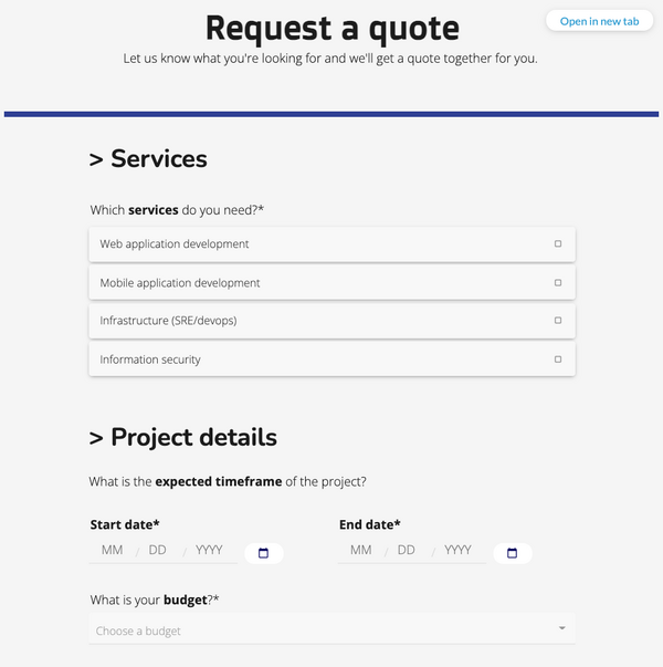
Lead capture form template by Paperform
This quote request form by Paperform is very sleek and responsive. The fonts are readable, and the CTA button is visible and in the right place. This is an excellent example of a longer form that doesn�t feel overwhelming because it has enough white space.
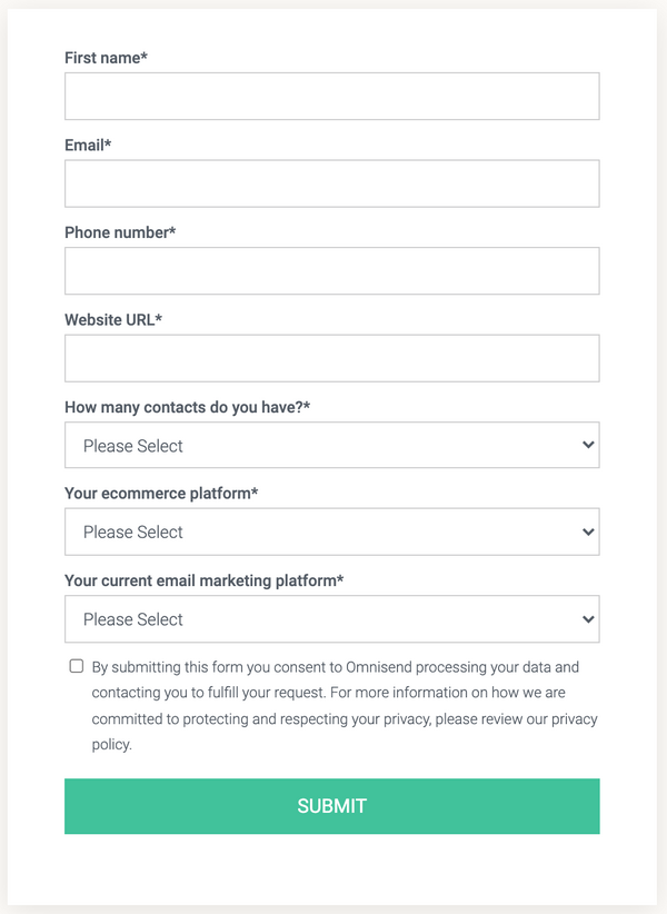
Lead capture form by Omnisend
This form by Omnisend is an excellent example of a demo request form. It�s got a simple yet elegant design, with a semi-transparent image on the background. There are seven fields in total, all of which are aimed at collecting vital information from the leads and helping them get started with the product.
Lead capture form by Joinative
Another example by yours truly � Joinative. It is aesthetic, unique, and stylish. Although it consists of multiple steps, it is enjoyable to fill out because the questions are very intuitive.

Best lead capture software tools
If you�re excited to create your first lead capture form but don�t know where to start, check out these top form builders.
Paperform
Paperform is a pro-level form builder software. Its modern and intuitive interface resembles Google Docs, allowing you to create lead capture forms and landing pages quickly and easily. Paperform supports 3000+ integrations, turning it into a powerful workflow automation platform.
Contact Form 7
Contact Form 7 is one of the oldest yet most popular form plugins for WordPress. If you�re looking for something simple and don�t care that much about customization, this software is a great option. It provides security features like supporting reCAPTCHA to protect your visitor�s information and Akismet to save you from spammers.
HubSpot
Hubspot offers a freemium online form builder that is connected with their CRM software. You can start with a free account to access over 1,000 form fields and quickly build your form with a drag-and-drop interface. Moreover, data collected with Hubspot forms will automatically be reflected in your contacts database.
Now, are you ready to design your lead capture form?


