In a perfect world, your prospects would be converting right after clicking on your ad. In the real world, it takes over 20 online touchpoints before a consumer makes a purchase decision.
In a perfect world, your prospects would be converting right after clicking on your ad. In the real world, it takes over 20 online touchpoints before a consumer makes a purchase decision.
According to the statistics, your conversion rates should be extremely low if you�re targeting new audiences with paid ads.
The good news is that you can reduce the length of your buyer�s journey by simply adding a presell landing page to your campaigns.
What�s a presell page?
A presell page is a page users land on before they�re displayed an actual offer. This page warms up your audience before you pitch a product or service to them.
Ever encountered a fancy quiz that�s helped you identify your favorite wine style, a story of a couple who met at language learning lessons, or an article on how to choose a perfect skincare routine? Then you have an idea of how a presell landing page looks.
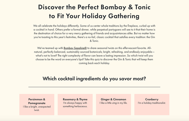
A quiz created by Bon Appetit in collaboration with Bombay Sapphire.
Presell pages enable you to catch the attention of audiences at the very top of the funnel and drive them all the way through it in one interaction.
Who needs a presell page?
Literally everyone can benefit from the concept. It�s effective for:
Affiliate marketing campaigns; Paid social advertising campaigns; Google Ads; Native advertising campaigns; Content marketing campaigns.Whenever you�re planning to drive cold traffic, a presell page is a perfect way to make the most out of it.
Presell pages in advertising
Often, this extra page is used within native advertising campaigns. There are two primary reasons behind this trend.
On-Demand Video Course On Native Advertising
Boost your ROAS with native ads. Enroll now with our limited 30% discount.

First, as native advertising experts need their ads to fit in the editorial environment seamlessly � by doing so, they expect to avoid banner blindness and win more clicks � they usually build their promotions around topics that pique readers� interest. These topics are typically presented with the help of interviews, customer stories, video tutorials, quizzes, and other content formats � we also know them as presell pages.
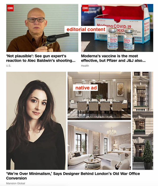
Most importantly, native advertising platforms show the best performance when ads are displayed to broad audiences. It means that advertisers deal with new, cold audiences that haven�t been actively looking for what they�re offering. Their campaigns should attract these audiences, make them enter the sales funnel, and drive them all the way to the bottom of the funnel. And a presell landing page is the best way to make these people fall in love with the product or service in only a few minutes.
Undeniable benefits of presell pages
A presell page is a powerful tool for boosting your campaign�s conversion rates. Here�s why:
It allows you to create campaigns that appeal to audiences at the top of the funnel. It generates demand. It�s perfect for lead generation Embed a lead capture form into your presell page, and you won�t lose visitors that aren�t ready to make purchase decisions yet. It warms up cold audiences and builds trust before you move them further down the funnel. It eliminates the need for extra touchpoints and speeds up the sales cycle.The impact of a presell page is easily traced when you look at the typical buyer�s journey.
Presell landing pages & Buyer�s journey
When deciding to buy something, customers go through several stages. The whole path is called a buyer�s journey. During this journey, prospects� awareness level will be changing the following way:
Unaware Problem aware Solution aware Product aware Fully aware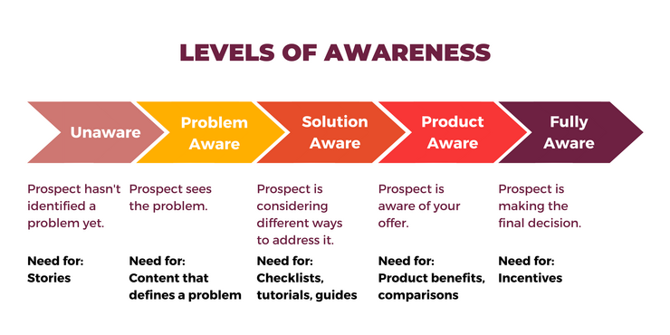
At each level, a customer needs specific content to journey further into the next stage.
As typical landing pages are designed for customers that are already problem- or solution-aware, they are missing the very first (and probably most important) steps of identifying and defining the problem. In other words, they don�t generate demand.
Presell pages cope with this issue by connecting with customers while they�re completely unaware of the pain point. This way, a single campaign accompanies a prospect all the way through the customer journey, supporting them with all the necessary content.
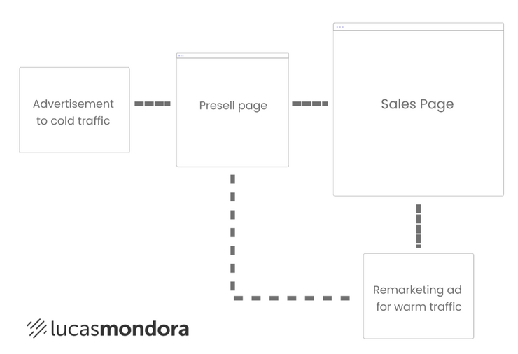
Idea: Even if a visitor leaves your presell page after reading through it, they aren�t lost. When setting up your page, set up a trigger in Google Tag Manager that will be recording all the visitors who have made it to a certain point on the page (this way, you�ll filter out irrelevant people) and set up a new audience list in your ad platform where these users are added every time a trigger fires. Create a remarketing campaign targeting people on the list to get one more chance to convert warm traffic.
Presell page examples
Before we show you how to build high-converting presell pages, let�s look at some of our favorites.
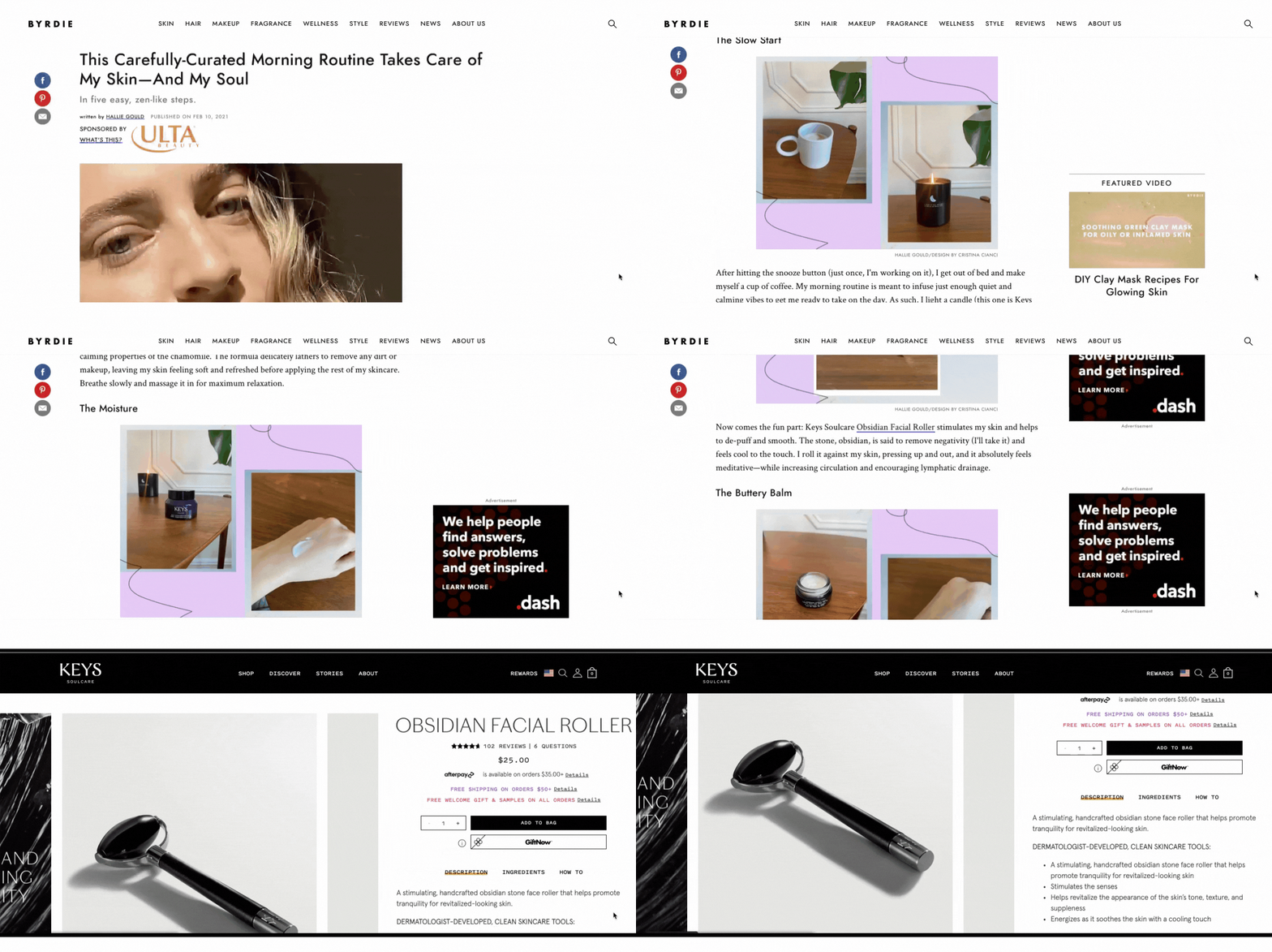
Ulta Beauty
The advertiser has included user-generated content in their promotional campaign.
The native ad says: �This morning routine takes care of my skin � and my soul.� It�s clear from the title that the piece is written by a consumer, and it makes the ad more relatable to users.
It�s quite typical for advertisers to use appealing headlines and drive users to traditional product landing pages. However, this approach only boosts click-through rates and hurts conversion rates.
Luckily, Ulta Beauty hasn�t gone for this deceptive practice. The advertisers have included a presell page that meets expectations set with the ad headline and introduces promoted products by making them fit in a sweet and short guide.
Only after a reader discovers the editor�s recommendations on creating a zen-like morning routine and feels the urge to follow them, they�re offered to visit product landing pages.
Naked Wines
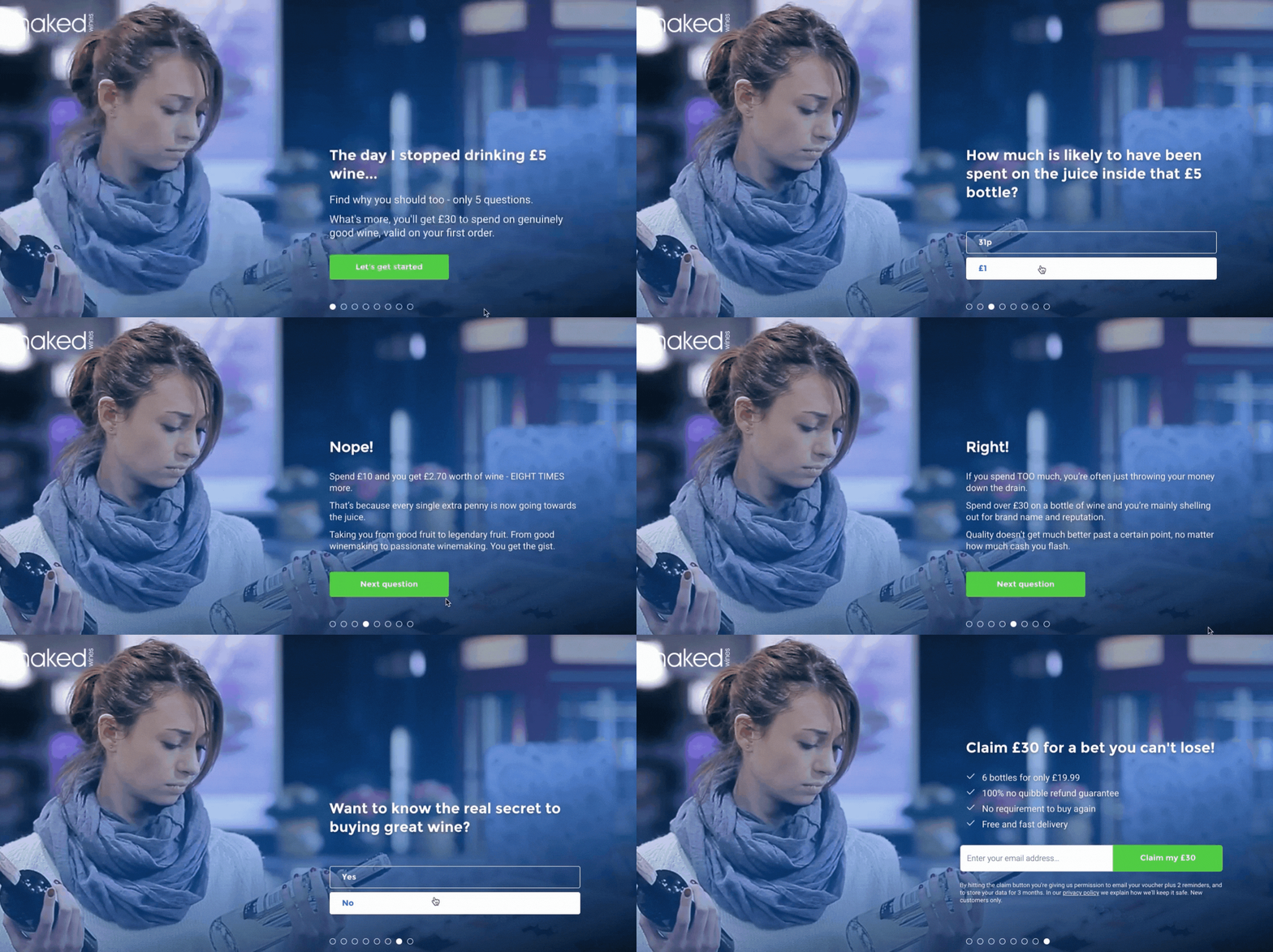
The Naked Wines team uses various kinds of presell landing pages in their native advertising campaigns, from how-to articles to interactive quizzes.
Naked Wines is a club selling wine subscriptions. Their service isn�t something people search for too often. Therefore, the company�s marketing strategy is based on demand generation � they use engaging topics that appeal to wide audiences and create awareness for their services.
The example below is a knowledge quiz that appeals to everyone who buys wine. Visitors get into the pipeline when they leave their email address to claim a �30 voucher for their future purchases.
What makes a perfect presell page
So, you just pick a catchy topic, create content, and then lead visitors to your product page, right? Not at all.
To create an effective presell page, you need to align top-funnel content that appeals to broad but relevant audiences with the further steps into the pipeline, where the product is introduced. The transition from the first step into the buyer�s journey to the last step should be as smooth as possible. And we know how to achieve that.
Why we use Unbounce to build presell pages
The process of creating a landing page isn�t limited to picking an engaging idea for your content. It starts with a tool that allows you to implement this idea.
Our team chooses Unbounce to build presell pages for clients.
It�s easy to use. We build and launch pages ridiculously fast. With advanced features, like dynamic text replacement and mobile optimization, we don�t need to understand the coding basics to create relevant, responsive pages. It supports custom HTML. We can anything on our landing pages. It allows us to build custom templates that we can reuse for future campaigns or even sell to our consulting clients. The opportunity to add popups and sticky bars to our presell pages allows us to easily drive visitors to the actual offer.What�s most important, our readers can get any Unbounce plan 20% off.
Apart from the right tool, you need four more components to build a perfect presell page. Below we�ve explained each of them.
1. A clear understanding of customer interests
First, you need to identify the topics that are of interest to your audience.
Note: You shouldn�t expect to pick the most converting idea right away. It�s most likely to take several tests before the right flow is identified. Therefore, we recommend that you make a list of 3-5 ideas you�ll be verifying with new tests.
Of course, it�ll help if you already have a blog or a social media account where you can monitor the best- and worst-performing topics.
Mind that the amount of traffic certain post generates isn�t an indicator of the right content. Quite simply, you might be driving tons of irrelevant visitors with your top-performing content. Instead, measure the number of clicks on CTAs or relevant banners from your blog content and then divide it by page traffic. The resulting number is your page�s conversion rate � use it to compare effectiveness of your top-performing pages.
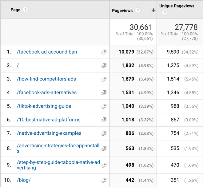
For instance, if we looked only at our most popular blog posts, we�d need to single out articles on banned Facebook Ad accounts, competitor ad analysis, Facebook Ad alternatives, and TikTok advertising.
But when we check the data on pages that drive the most clicks on conversion elements, we form a completely different opinion on our best-performing content.
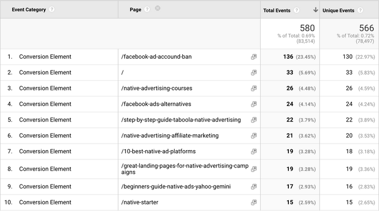
While there�s the same post taking #1 position across both dashboards, its CVR is only 1.4% � the lowest number on the list.
We�ll skip topics that drive a lot of conversions but haven�t reached top-10 in terms of traffic as they appeal to very narrow audiences and don�t work for demand generation.
That�s why the next promising topics are #4 with CVR of 1.8% and #5 with CVR of 4.4%. Although the difference is huge, we�ll pick both of them since topic #4 is less specific and will do a better job of attracting new audiences.
2. Engaging concept
When you know what kind of content appeals to your target audience the most, you need to think of how it can be translated into an engaging concept for your promotion campaign.
On-Demand Video Course On Native Advertising
Boost your ROAS with native ads. Enroll now with our limited 30% discount.

Can you use it as a ground for a quiz or a customer story? Do it.
Say, if we decided to use an idea behind the article on Facebook Ad alternatives, we�d interview a company that has shifted from Facebook to native advertising and seen exceptional results.
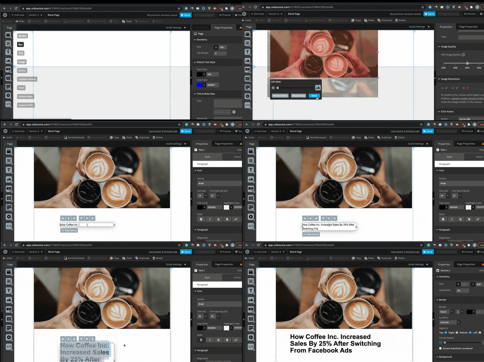
Here are some ideas for your first presell pages:
A story of a founder of your brand; A customer story; A quiz that helps to identify the right solution; A video tutorial; A list of practical tips, etc.3. Alignment between expectations and page content
Next, make sure your presell page content does meet expectations set with its title.
It often happens that marketers use clickbait headlines to increase traction. Avoid this approach unless your page content delivers on the promise made in a title.
Moreover, people are less likely to leave your page when its title is identical to the one of an ad headline. And since you�ll be using 3-6 headlines per one campaign (we strongly you to do so), matching your page title to each of them wouldn�t be possible without dynamic text replacement. You can access this feature if you build your pages with Unbounce. The process is very simple:
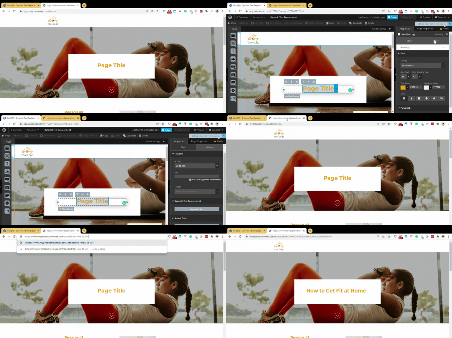
You can access Unbounce 20% off with our exclusive link.
Alternatively, you can build a custom script that will be replacing title text depending on your ad headline.
4. The next steps into the funnel
Do you remember that the purpose of your presell page is to drive warm audiences to your offer? Never forget about it.
When designing your presell page, make sure it helps to move visitors further down the funnel. After telling your story, include CTAs that connect the presell page to your campaign goal.
It can be a clickable product card, a question (e.g. �Do you qualify for�?�), a product bundle, a coupon code for the next purchase, or anything else that moves your prospects forward.
How to build a presell page with Unbounce
Now, let�s guide you through the process step-by step.
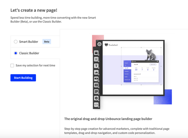
When you log into your account, click Create New at the upper right corner and choose to work with Classic Builder.
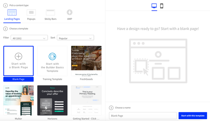
In the next tab, select a content type (we�ll work with a landing page) and choose a template (we�ll work with a blank page).
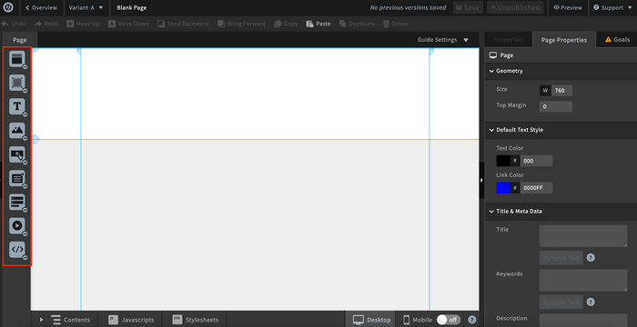
In your new project, you can drag and drop any element you want to see in your page from the sidebar on the left.
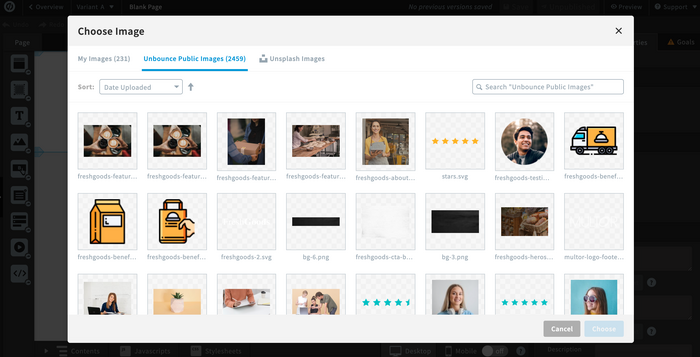
We�ll start with an image. Unbounce allows you to upload your own image or pick from Unbounce Public Images or Unsplash Images.
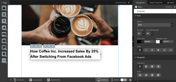
After adding the image, we�ll place text either on top of it or right below it.
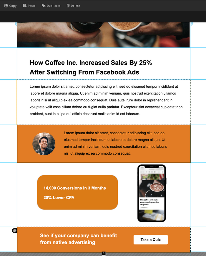
Next comes the success story. We�re adding texts, examples, social proof, and a CTA in the body of the page.
It�s time to make this page responsive on mobile devices. Switch the toggle at the bottom to ON, save your project, and switch to the Mobile tab.
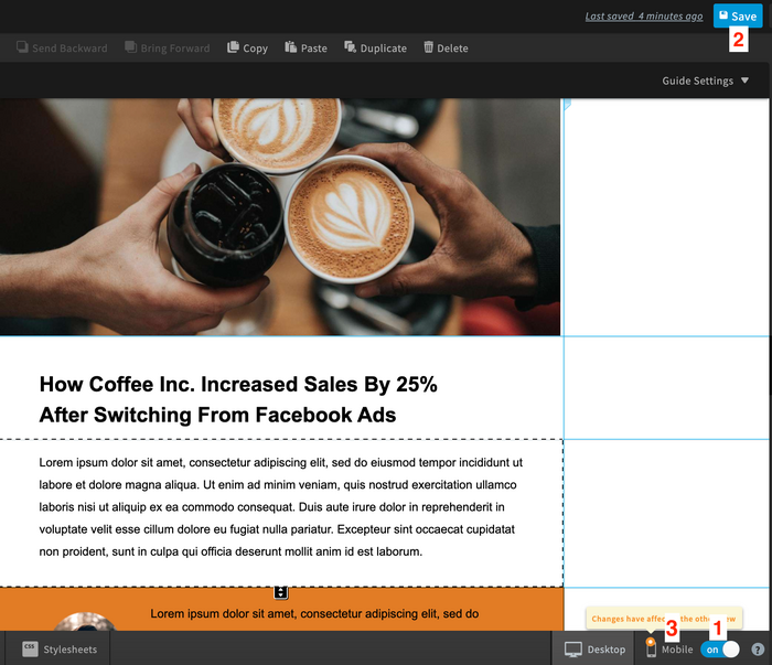
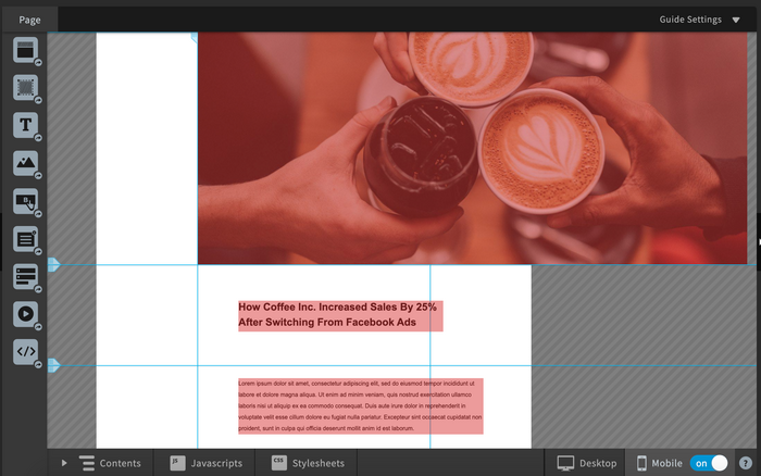
Start adjusting page content until it fits the layout of mobile devices. Avoid changing the order of sections as well as the size of texts � it might affect the way your desktop version looks.
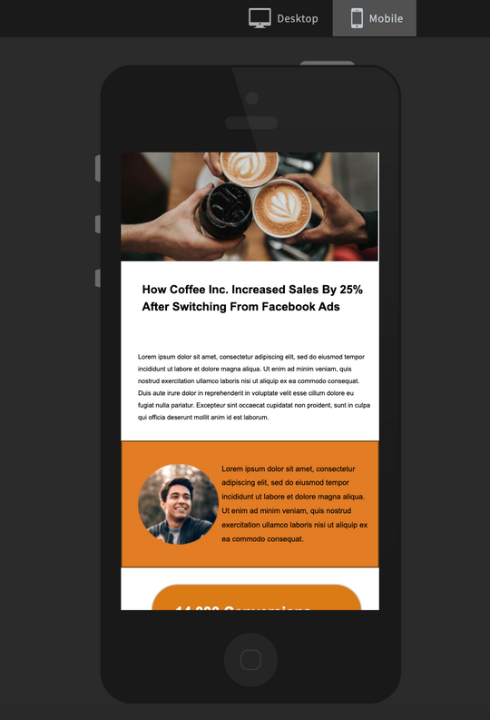
When you�re ready, save your project, move to Preview, make sure your page looks good on both device types, and go to Overview.
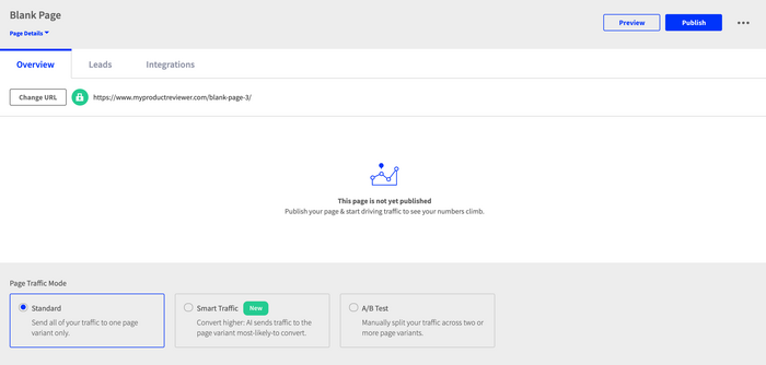
In the Overview tab, you can customize the URL and publish your page.
Tip: Don�t forget to activate your 20% discount by following the link.
Your next steps
You�ve built your first presell page. What�s next? If you haven�t decided on the promotion channel yet, go for native advertising. It�s good for attracting and converting cold traffic at scale.
Don�t know how to make native advertising work for you? Check out our Udemy course.
On-Demand Video Course On Native Advertising
Boost your ROAS with native ads. Enroll now with our limited 30% discount.
