There was a time when adding too many features, elements, and colors [�] The post How Minimalistic UI Can Help You Turn Around Your Business For The Better In 2023 appeared first on CMARIX Blog.
There was a time when adding too many features, elements, and colors to a mobile app was the industry norm and the mark for excellence. But, with the boom of the internet and the popularity of mobile applications, user behavior has significantly changed and more and more people are looking for convenience. So, businesses must focus on accessibility and adding features that are essential to both users and their growth. An easy way to add convenience and accessibility to your mobile application is by following a minimalistic UI design process.
But, what is minimalistic UI all about and what are its essential characteristics? To help you figure it out and implement a clean minimal UI app design, we have put together the detailed guide below. We will discuss the essential points needed to understand minimalistic UI and delve further into its benefits. You will also find actionable points to consider to help you better implement a minimal app UI design. Worried you won�t have enough inspiration to design your app and better cater to your user needs? We also discuss the popular industry apps that implement minimalistic UI design features in the following article.
So, what are you waiting for? Jump right into it and learn how minimalistic UI will help bring your business growth dreams into reality!
What Is A Minimalistic UI?
Before we discuss what minimalistic UI means, let us understand what the concept of minimalism is all about. As clear from the name, minimalism means �less is more� and is a prime focus of today�s designers across all industries. Whether we talk about interior design or app design, minimalism must be the point of focus and must be realized via relevant design processes. But, let us now refocus and consider minimalistic UI in app design.
Minimalism in UI is designed on the same principle and refers to a clean, simple app design. In minimalistic UI, apps only have essential functionalities to eliminate app complexities and add to user convenience. There are multiple design principles and processes that come under minimalistic UI and help better realize them.
Interested to know more about minimalistic UI and its benefits? Keep reading and get closer to implementing a minimal app design for your business.
What Does Minimalistic UI Design Look Like?
Minimalism in UI design means that the app design must be simple, clean, brief, and consistent across all screens and pages. This is the impact of minimalism on the front-end design, but what about back-end minimalism? Well, the communication between the different functionalities and segments of the app must be clean and simple. In the case of modularity, communication between them must be simple and easy to understand.
Ultimately, the implementation doesn�t matter at the user level but can make it easier for your development team. Whatever the implementation and the concept followed, it must be the one that best supports user convenience and adds to the accessibility. In simple terms, minimalistic UI means providing users with the most out of simple and legitimate methods.
Want to know more about the principles of minimalistic UI, its elements, and top benefits for businesses? We recommend checking out the relevant sections that better break down these principles and help you implement them.

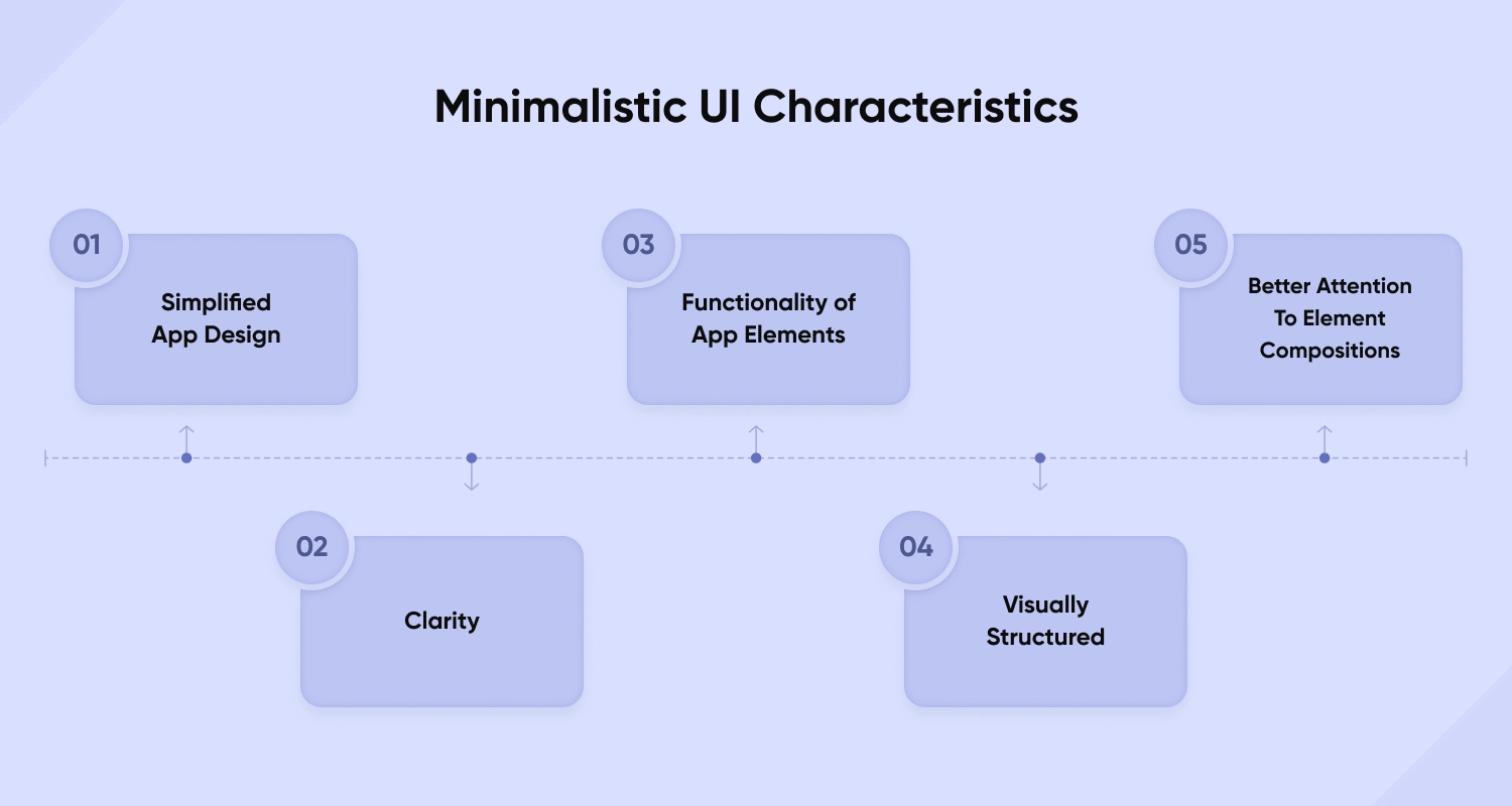
Minimalistic UI Characteristics

Before we get right into discussing the elements you must add to implement a minimalistic UI design, let us look at its characteristics.
1. Simplified App Design
A minimalist design app includes elements and features that are not complicated and offer a simple and clean app design.
2. Clarity
Other than including simple and easy-to-understand elements, the functionalities and focus of the app must be clear. The main purpose of the app must not be lost in trying to implement clever design, animations, and transitions.
3. Functionality Of App Elements
A core concept of minimalistic UI is that every element must be functional and key to the overall working of the app. Your mobile app or web application must not contain features or elements that only add to the design and attractiveness. Instead, all elements and included functionalities must be working and add to the core purpose of the application.
4. Visually Structured
Since the main principle of minimalistic UI is a simple and clean design, it must implement a design that flows easily. You must not introduce elements that complicate the app design and make it difficult for users. Ensure that the app has a clear visual structure and implements a hierarchy for easy app design flow.
5. Better Attention To Element Compositions
An important concept of minimalistic UI is the golden ratio which dates back to ancient times and has historical significance. The concept focuses on ensuring app proportions and structures are more appealing to the eye. We recommend getting in touch with a development company offering access to professional UI/UX design services to ensure they better implement the concept of the golden ratio.
Elements To Add For A Minimalistic UI
Interested in knowing more about minimalism UI concepts and how you can better design and implement a minimal app? Check out these top elements that you must add to your app design and get ahead in designing and implementing minimalistic UI concepts:
White Space
One of the crucial concepts of implementing minimalistic UI is focusing on the white space and properly utilizing it. Also known as negative space, white space refers to the app space that is devoid of colors and text. Although it might seem insignificant from the point of view of an app�s design and functionality, it is quite essential for a designer and can make all the difference in user experience.
White space helps add a clutterless and simple impression to the app design and interface. Moreover, it is important to add contrast and implement a better structure in the overall app design. Designers must focus on the white space of the app to implement a minimalistic UI design that helps grab the attention of users and focus their concentration on important elements.
The different types of white space that designers must consider to better implement a minimalistic UI design are:
Layout Whitespace � The spacings implemented via paddings and margins Content Whitespace � The area that is essential to separate the textual content and columns Text Whitespace � The gap between the letters and lines of the application�s text content Visual Whitespace � The spacing that separates the graphics, icons, images, and other visual contentThe benefits of implementing and better utilizing the whitespace of an app include:
Adds to the content readability and app usability Ensures better visual elegance and attractiveness Helps draw focus to specific app elements and visual design Better divides app content for an efficient structureColor Schemes
Another essential element to implementing a minimalistic UI and app design is the color scheme of the application. Although the functionality of the app does matter, visual elements can help make or break a user�s impression. It is important to consider the colors you pick, their type, and the visual effect that they provide on the emotional forefront.
To boost user retention, UI/UX designers must not include too many colors to ensure the app is feature-rich and does not draw away user retention. When you restrict the number of colors added to your app design, it ensures a better style and keeps the users� focus on important elements and functionalities. We recommend choosing one out of these two commonly used color schemes and principles:-
Monochrome Schemes
In simple terms, designers following monochromatic color schemes choose a single color and adjust its properties to create variants. Some common properties manipulated include the color�s brightness, saturation, temperature, and contrast. These help create different varieties of the same color to create a scheme that is easy on the user�s eyes.
Analogous Schemes
Analogous color schemes are created with the help of colors that are next to each other on the color wheel. These are used to create different application features that tune well and create a calm and composed aesthetic.
Typography
Typography refers to the different aspects of textual concepts and is also known as typefaces. The term refers to the technique of written words implemented in realizing the app design and can help capture user attention. We recommend choosing a single typeface to ensure the app is not cluttered and implements minimalistic UI design aspects. You must also consider the emotions expressed via each font to ensure better user focus.
When the font type and size are selected wisely, they can help avoid offering a disorganized feel and ensure the app doesn�t look messy. Moreover, selecting an appropriate typography can help you achieve the best results and add a touch of class and sophistication to your app. We recommend checking out the effects of different fonts, length, style, spacing, size, and weight to ensure a minimalistic UI design.
Icons And Visual Effects
An important concept designers must consider for better implementation of minimalistic UI designs is iconography. It refers to the conveyed visual language that helps ease the app�s complexity and allows users to better comprehend the app content. We recommend carefully building your app icons and other visual components to ensure an effective yet minimalistic UI design.
Benefits Of A Minimalistic UI To Your Business
Other than implementing a minimalistic UI via UI design principles and concepts, you must consider the industry�s current UI/UX design trends. After all, user behavior changes with time and as a business, you must adapt to these changes to ensure a better app design. But, why should you be concerned about implementing a minimalistic UI and designing a minimalist illustration app? Well, a minimalistic UI design can bring several benefits to businesses and help you boost your growth in no time.
Some benefits that a minimalist web app design can bring to your business or start-up are:
Better Focus On The Solution And Functionality
The main concept and focus of a minimalistic UI design is to ensure the functionality of the app is clear to users. This ensures that first-time users and visitors do not struggle to find out the main focus of your app. So, you can better communicate the USP of your app and bring in more users. It also helps ensure that users know what the app interface is all about and why they must use your application.
Apps with a minimalistic UI design also help users better leverage app features and functionalities. It also allows users to unambiguously understand the industry concerns addressed by the app and convey the solution in a simple way.
Better Design Consistency
Apps with minimalistic UI designs help designers maintain better consistency even when future updates are pushed to the code. It might be difficult for the design team to follow the same theme and the elements throughout the business lifecycle. For example, the business might reevaluate its business situation and revamp the strategies implemented. In that case, the themes and other design elements also need to be replaced.
When applications have complicated themes and design schemes, it can be challenging to consider all important points and maintain consistency. However, in the case of minimalistic UI apps, teams need to consider a few design points and elements and can change them for a better user experience.
Highlight App Functionalities
Sometimes, design teams lose focus when trying to implement clever designs and animations. Whether your team wants to create a visually attractive interface or a simplistic one, the focus must be to cater to user needs. Minimalistic UI design concepts better draw user attention and highlight essential components. This means that there is no clutter to draw away user focus and can help bring better business success.
Clear CTAs
The main purpose of designing an application is to bring in more customers and boost business. This is why call-to-actions (CTAs) are a must and must be implemented after thoughtful planning. You must include CTAs that offer a clear understanding of the services offered and the benefits you can offer users. The focus is to trigger action as soon as possible which is why they must be as clear as possible. Ensure that the CTAs are not hidden amidst other features and content and are catchy.
Better Navigation
A minimalistic design takes the user across different features that answer user concerns and can solve their needs. Overloading your application with unnecessary functionalities can complicate the app design and defeat the purpose of a minimalistic UI. Apps designed with minimal concepts in mind help ensure a seamless and intuitive design that addresses user pain points and better communicates the needs of the app to the user.
You may like this: Best Practises for Chatbot UX Design
Popular Apps Using Minimalistic UI Design Elements

Now that we have discussed the important principles and elements of a minimalistic UI design, let us look at some popular apps that utilize the concept. This will provide you with inspiration to help you better design a functional and useful app.
Google Calendar
Utilizes one of the most important concepts of minimalistic UI � grid layout. Google Calendar is one of the finest planning apps available that allows users to schedule events and organize their routines without complicating the features. The beauty of the app is its inclusion of only essential features and an analogous color scheme that is synonymous with the company�s logo.
No app in today�s industry can better showcase the importance of whitespace other than Instagram. With simple icons and an added focus on whitespace, Instagram is quite effective in offering a pleasant look and feel.
Airbnb
Airbnb is highly popular among travelers and utilizes a single typography that keeps users focused on the actual content. Moreover, their utilization of the whitespace is also on point and helps the app look clutter-less.
You may like this: Build an App Like Airbnb
Final Thoughts
Minimalistic UI design has been a popular concept in the past few years and is expected to stay on the list of the top UI/UX trends. Moreover, a minimalistic design eliminates the need for non-essential functionalities, which helps reduce the cost of designing an app. We advise you to focus on keeping your UI simple and clean without burdening users with information.
Interested in revamping your existing application or building an app following minimalistic UI principles? Get in touch with the top development company offering professional mobile app design services and get ready to take your business to the next level!
Frequently Asked Questions
User interface refers to the visuals and functionalities of the app that is visible to the user which is why it is quite important. Your app must include an interface design that makes the user experience more seamless and clean. To learn more about the importance of a minimal UI design, read the above article.
To ensure that your app UI caters to user needs and ensures better customer satisfaction, you must test your app UI on potential users. This will help you collect feedback and develop an actionable plan to design a better app UI.
Typography refers to the properties of the app�s textual content and designers must focus on them to ensure better readability and maintain simplicity. Think about the emotions and the visual look offered by every font and choose the most relevant one. Check out the section revolving around typography in the above article to know more about how you can approach it in the best way possible.
There are a lot of key factors that one must consider to ensure a minimalist UI design. To learn more about these in detail, check out the relevant sections in the above article.
The prime focus of a minimal UI is to offer a clean and simplified look to the app for better user experience. To know how a minimal UI design can benefit your business, check out the above article.
The post How Minimalistic UI Can Help You Turn Around Your Business For The Better In 2023 appeared first on CMARIX Blog.


