Spider-Man: Across The Spider-Verse is a certified blockbuster that has audiences clinging to the edge of their seats. This stylish sequel to Spider-Man: Into the Spider-Verse features Miles Morales, Gwen Stacy, and a whole host of Spider-Verse heroes known...
Spider-Man: Across The Spider-Verse is a certified blockbuster that has audiences clinging to the edge of their seats. This stylish sequel to Spider-Man: Into the Spider-Verse features Miles Morales, Gwen Stacy, and a whole host of Spider-Verse heroes known as the The Spider Society, from a mysterious new villain with ties to Miles� past.
To showcase the spectacular abilities of the denizens of the Spider-Verse, Sony Pictures Animation called on an amazing team of effects animators from Sony Pictures Imageworks. As we all know, with great power comes great responsibility. Part of that responsibility falls to Pav Grochola (Look of Picture and FX Supervisor) and Nikolaos Finizio (2D FX animator). Tasked with giving the multiverse and its characters their magic with truly striking visual effects, they are key members of a team which redefined animated cinema with Spider-Man: Across The Spider-Verse�s unique and ambitious style.
We were lucky enough to interview Nikolaos and Pav about their work on the feature film. They inform us of the web of roles they played throughout the movie�s animation pipeline, giving us an insight into the scale of such a major animated project, and the team effort that goes into pulling it off. From designing bespoke tools to enable the team to achieve consistent line work, to the graphic techniques employed to deliver the perfect balance between Spider-Man�s classic comic book style and a modern animated marvel, the two effects artists share their giant-sized stories from the production.�
Read our full interview below to discover how 2D and 3D FX come together to create the striking, superhero style of Spider-Man: Across The Spider-Verse.
Official trailer for Spider-Man: Across The Spider-Verse, directed by Joaquim Dos Santos, Kemp Powers and Justin K. Thompson.Please introduce yourselves and your roles on the project�
Nikolaos: Hey! My name is Nikolaos Finizio and over the past 2 years I�ve been the main 2D FX animator on Spider-Man: Across the Spider-Verse.
Pav: My name is Pav Grochola, I was the Look of Picture/FX supervisor. I had two roles on the [production]. Firstly, I helped develop many of the tools related to linework on the film. These tools were used by the inkline dept, which was a team of about 30 artists. I also supervised the effects department of around 40 artists, which includes working closely with the 2D artists.
How does it feel to work on iconic I.P. like the Spider-Man universe?
Nikolaos: I joined the production after the incredible success of Spider-Man: Into the Spider-Verse, so there was definitely a feeling of responsibility to live up to the first film. But, mainly, I was just excited to contribute to a franchise that had set such a high new standard for stylistic experimentation and artistic expressionism in animated movies.
It did also help that this movie featured childhood-favorite characters of mine like Spider-Man 2099 and the Scarlet Spider.
Pav: Spider-Man was my favorite superhero as a kid, so he holds a special place in my heart. The first Spider-Verse film received so much love � I feel incredibly lucky to have worked on both films.�
It�s worth noting that while watching the film is magical, the reality of working on movies is less glamorous. The day-to-day involves a lot of hard work and problem solving, which is actually the part I enjoy the most. Coming up with creative solutions to difficult challenges.
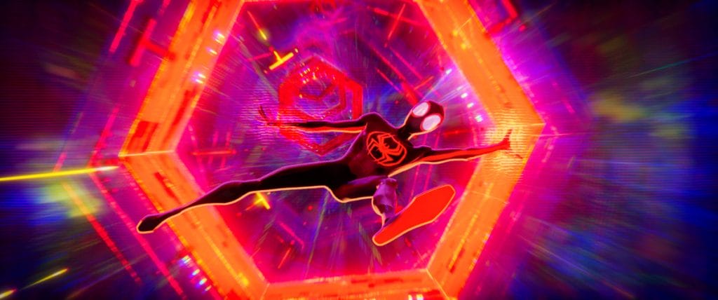 Production still from Columbia Pictures and Sony Pictures Animation�s Spider-Man: Across the Spider-Verse, featuring Miles Morales (voiced by Shameik Moore).
How have you developed upon the style of Spider-Man: Into the Spider-Verse?
Pav: The success of the first film encouraged us to raise the stakes and take bigger risks. In this film we visit multiple worlds; each with their own unique style, not to mention all the characters that had their own look. At times it felt like we were making 5 movies at once, there were so many challenges.�
Spider-Man�s a famous comic book hero. How did you channel this graphic format in a faithful way?
Nikolaos: Personally I think one of the things that made Spider-Man: Into the Spider-Verse so successful is precisely that it managed to capture that comic book energy; taking advantage of the full range of stylizations and procedural, graphic, hand-drawn or painted techniques that are available to animation film-makers. In turn giving that sense of surprise and wonder to mainstream audiences who might have been exposed mainly to styles that fall in the range of stylized photorealism.
This time around we had the opportunity to double down on stylistic experimentations and hybrid techniques (2D and 3D).
Pav: The beautiful reference from Sony Pictures Animation�s art department guided us. We were also constantly referring to the art from the comic books. The art department helped us achieve the correct visual style by guiding our work. We spent a lot of time developing tools that break the conventional �CG look.��
We made dedicated tools for linework, brushing and watercolor just to mention a few. It required striking a balance between staying true to the comic book look, while also making modifications needed to bring it to life through animation.
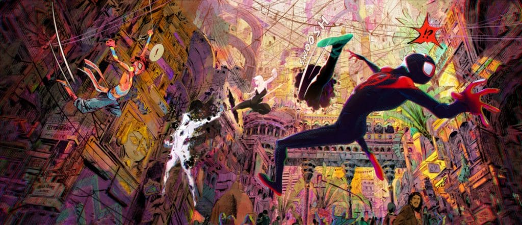 A visual development image featuring Pavitr Prabhakar (aka Spider-Man India), Gwen Stacy and Miles Morales fighting The Spot in�the city of Mumbattan on Earth-50101 � a kaleidoscopic hybrid of Mumbai and Manhattan.
How did 2D FX help achieve this style, compared to the previous movie?
Nikolaos: 2D played a bigger role in this movie. Pav brought me in relatively early on in FX production to help with the FX concept development, provide timing and design ideas as well as mockup visuals that would be otherwise time consuming with standard 3D techniques. When we moved from FX research to actual shot work, the main difference was that this time we animated shot-per-shot.
On the first film 2D asset-libraries were created for the 3D FX artists to place and re-use. While we still relied on a library-approach for some elements (such as the water dripping from the windows in rainy shots, background fires/smoke), for the most part we created shot-specific animations as you would on a 2D production.
This allowed for a bigger interplay between departments: sometimes the FX pass on a shot would start with 2D, get handed over to the 3D department for further passes, then back to 2D for final touches or extra layering. Sometimes we�d be asked to only add some details on top of an already nearly finished shot. Some other times we�d be asked to create bold graphic 2D animated elements that would constitute the whole FX pass.
Effects could be entirely 3D, 2D or anything in-between: We could try every approach depending on the desired look and that opened up a lot of possibilities! By the end of the project we had expanded the 2D FX department to 6 animators; me, Slava Spiriannin, Quentin Cordonnier, Brice Maleo, Alex Alvarado Chavez and Brandon Louie!
Pav: Comics are drawn by hand, so it makes sense to add as much hand drawn artwork to the frame as possible. In the previous film, we created numerous elements using 2D effects which were placed on cards and positions in 3D space, timed with the animation. This approach was fast and efficient due to element re-use. However, the drawback is that it doesn�t produce the same level of quality as custom drawings for each shot. On this film we relied more heavily on 2D effects artists to make specific drawings for each shot.�
My contribution on Spider Verse: Across the Spider -Verse.
Thanks to the whole FX crew, and especially to @NikolaosFinizi, for giving me the opportunity to work on this banger that is Spider Verse. Thanks man  #2DFX #vfx #spiderverse pic.twitter.com/5sYs9vUYdP
Were you conscious about moving CGI animation from photorealism to more stylistic animation on this project?
Nikolaos: Absolutely, that was a frequent topic of conversation between us. CGI has in recent years reached photo-realism. Somewhat like artists and illustrators after the invention of photography, we can now move past it and embrace new possibilities. I know Pav also wrote a very interesting paper about his considerations on this topic. Hopefully he�d like to share some of his insights here as well!
Pav: Yes, absolutely! The default tools that currently exist for computer graphics are all geared towards photorealism. That is great for live action films and for more traditional CG animated styles. But unfortunately it is not super useful for matching a comic book style. As someone that�s worked in the field for over 20 years, doing something different is super exciting. I�m especially interested in matching styles that are based in drawing because I have a fine arts background.�
With the Spider-Verse containing a multitude of different universes with different appearances, what unique challenges did this present?
Nikolaos: We often joked about how the visual development and research needed for this movie must have been four or five times what would normally be required by one movie! Every effect needed to feel coherent with the stylistic rules of its universe. We often had to re-think the same effect multiple times. The explosions in Gwen�s world don�t look the same as the explosions in Spider-man 2099�s world for example. We go from sketchy linework and graphic highlights that complement billowing 3D FX simulations to full-on anime-inspired 2D smoke.
Pav: Adapting a static 2D image into an animated film introduces technical hurdles and requires careful compromises. This process becomes even more complex and time-consuming when dealing with multiple styles. To handle each style efficiently, we had to develop very versatile tools.
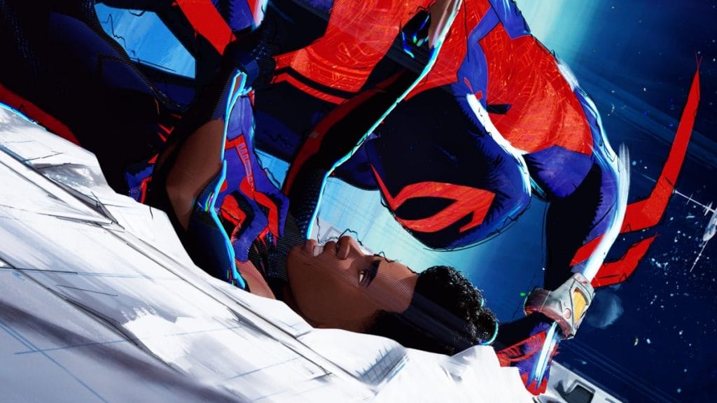 Production still from Columbia Pictures and Sony Pictures Animation�s Spider-Man: Across the Spider-Verse, featuring Miguel O�Hara (Oscar Isaac) and Miles Morales.
Were there any notable inspirations behind each individual universe? Can you give examples?
Nikolaos: There were always solid general references and starting points. For example, when working on Mumbattan�s world we were given the classic �Indrajal Comics� series as the inspiration behind the visuals. It was our job to then understand what that would mean in terms of FX. What does fire look like in this world? What about dust or explosions?
For me personally that was one of the best parts of the gig. It meant I�d be asked by Pav to come up with some cool design, find a shape language that would work, provide timing examples and ideas or draw over 3D FX passes to try and get the right look. He always encouraged us to push the stylization of the FX as much as we could. As a matter of fact, some of the craziest ideas we had were met with the best reactions from the directors!
Pav:�Gwen�s World (Earth-64) was inspired by Jason La Tour.� Miles� World (Earth-42) was inspired by Sean Gordon Murphy. Mumbattan (Earth 50101) was inspired by Indian Spider-Man comic books from the 1960s and 70s. Nueva York (Earth 928) was inspired by Syd Mead.
How did you achieve the halftone comic effect of Miles Morales�s Home Dimension?
Pav: That was an effect that�s applied in comp. It involved heavy offsetting across different color channels, inspired by misprinting that can be seen in comic books.
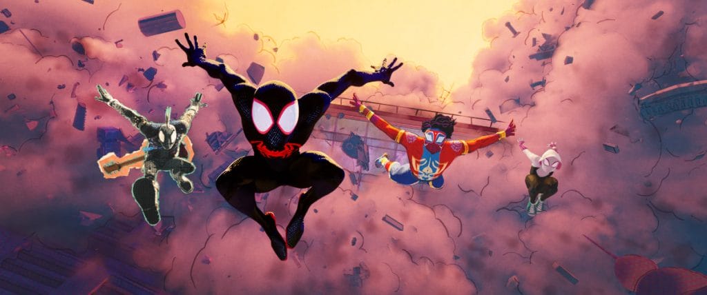 A visual development image featuring Hobie Brown (Spider-Punk), Miles Morales, Pavitr Prabhakar and Gwen Stacy
How was the character of The Spot created, and how did 2D FX come into play?
Nikolaos: Spot is a very interesting character FX-wise, especially in his final transformed look as we see him towards the end of the movie. By that point his whole body looks like a splash of chaotic mixed-media energy. Even before involving 2D in the process, lead 3D FX artist Filippo Maccari had built a tool that allowed them to translate the character�s movement into dazzling watercolour or paint simulations. Pav then assigned me the task to experiment on it. This led us to 2D animated abstract shapes and Sergio Toppi-inspired linework. We landed on the final look where Filippo�s paint simulation tool was able to pick up information from both the character and 2D FX animation. The result combined the 2D hand-designed shapes and timing with the complexity and texture of the 3D sim.
Pav: The 2D effects on Spot were mainly applied to the moment where he was starting to show his powers and would emit tendrils of ink. The 2D artist draws the tendrils as different types of layers. One of these layers allowed us to import them into a paint simulation software called Rebelle. The software would then run a watercolour sim that is paired with the drawing.
Did your approach to 2D and 3D FX differ throughout the various spider characters in the Spider-Verse?
Pav: We generally used a combination of 3D and 2D effects for all the characters in the film. For Spot we used more watercolor simulations that were driven by 2D effects and 3D procedural lines. For Vulture we used a combination of 2D hand drawn lines and procedurally generated lines.
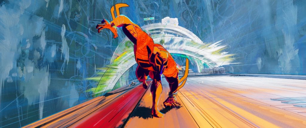 Production still from Columbia Pictures and Sony Pictures Animation�s Spider-Man: Across the Spider-Verse, featuring Miguel O�Hara.
What tools, techniques or workflows helped 2D FX departments and 3D FX departments collaborate more effectively?
Nikolaos: In terms of tools, I�d say the ability to easily switch between bitmap and vectorial 2D animation workflows has been crucial in allowing us the freedom to adapt to all the different universes� styles. We could always go more painterly/expressive or provide clean vector geometry when needed for 3D passes.
Pav: In certain cases, it was important for the 2D animation to lead the effect, with the 3D work adding enhancements on top of it. For other effects, the process was reversed, where the 3D played a primary role and the 2D complemented it. In the case of 2D driving the effect we exported often exported the drawings as curves that would drive a secondary effect from Houdini (our effects software).� Another interesting technique we developed was a method of interpolating 2D drawing in Houdini. This allowed the 2D artists to draw only the keyframes, which saved us a lot of time.
What tools in Toon Boom Harmony did you find useful on this project?
Nikolaos: The ability to easily switch between bitmap and vector 2D animation workflows in Harmony really helped us adapt to all the different universes� styles. We could always go more painterly/expressive with bitmap brushes and textured vectors while also being able to provide clean vector geometry and linework when needed. In general, it helped us work with a completely traditional 2D animation workflow but enhanced with digital tools that helped us achieve peculiar looks or gave us time-saving shortcuts.
While most of the 2D FX work in the movie is traditionally hand-drawn and animated frame by frame (often straight-ahead), in some instances we had to come up with something different. Miles� nervous system while he�s charging his electrical powers is an example of that, in those scenes we created a hand-drawn design on a keyframe that we would then rig and deform to match the character�s animation, this would give us the right placement of all the nerves and details for every frame so that we could then animate more 2D layers on top and only have to worry about design and timing!
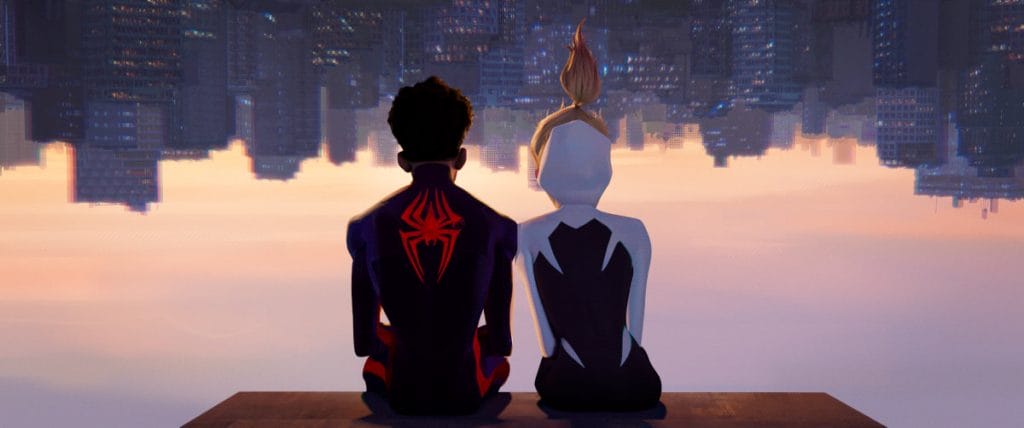 Production still from Columbia Pictures and Sony Pictures Animation�s Spider-Man: Across the Spider-Verse, featuring Miles Morales and Gwen Stacy.
Do they have advice for FX artists who want to work on a production like Spider-Man: Spider-Verse?
Pav: When crewing FX artists for any show, it�s really important to have a well balanced team. Within FX there is a subset of skills such as pipeline, technical simulation, and creative FX, in which artists may have varying levels of proficiency.
Having said that, productions like Spider-Man: Across the Spider-Verse are definitely skewed towards having more creative artists. It�s more important that artists enjoy creative problem solving, than technical problem solving. There are no �right� answers a lot of the time, it�s whatever looks cool. That can be either frustrating or exciting based on your perspective. I would recommend creating a reel that showcases, stylized, creative effects. If you can convincingly translate a 2D effect to a procedural 3D effect-� that�s especially interesting for us to see.
Nikolaos: I would just add that from a 2D FX perspective it�s important to be able to work in a range of styles. Being familiar with different tools and techniques and being able to draw inspiration from disparate sources is always a plus when you get assigned one of those creative-problem solving tasks!
Want to see more of Spider-Man: Across the Spider-Verse, true believers? Be sure to visit the production�s official website. Interested in working on cutting edge animated films like Spider-Verse? Apply to join the friendly neighbourhood team at Sony Pictures Imageworks. Ready to jump into 2D FX animation? Artists can download a 21-day trial for Harmony Advanced.
The post Behind the amazing 2DFX in Spider-Man: Across The Spider-Verse appeared first on Toon Boom Animation.


