� Coming back to my old work and upgrading it has so far been an enjoyable exercise in design techniques. Transforms, textures, warpings and UVs, all sorts of tricks have been used to give a serious touch-up on what...
� Coming back to my old work and upgrading it has so far been an enjoyable exercise in design techniques. Transforms, textures, warpings and UVs, all sorts of tricks have been used to give a serious touch-up on what I have previously built.
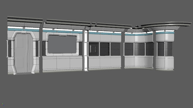
� The most engaging stage so far has been trying to keep the look authentic while also making a distinct style. The laboratory run by Smithston-Wessex, the megacorp funding an expedition to a far-off planet, is clean, slick, but this hides the more insidious nature of their work. While it might be a little safe to design a sterile look for one of my major forays into environment modelling, the uncomplicated nature allows me to focus on clean design. Which, with that mastered, can be a springboard for more daring aesthetics.
� I have brought the environment forward in time a little. Looking back on my references, I was always inspired by the styles of the late 1960s and mid 1970s. Too contemporary for the original Star Trek, a lot more in line with Space 1999 and 2001: A Space Odyssey.�
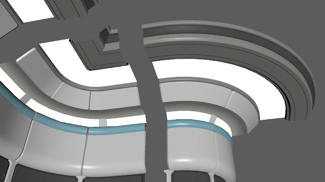
� The new design however might have creeping elements of Star Trek: The Next Generation, which developed its style in part from the visual re-imagining given to the original Star Trek series for its films. What I mainly took from this series was maybe the cleaner, rounded styles (which was popular in the Sixties) but definitely the large bands of fluorescent lighting. Along the ceiling and stretching from bottom to top, this design choice is really good for giving an illuminated feel to a room. A little impractical if you're actually within the room as it basically has you staring into a fluorescent light wherever you look, but definitely a feature emblematic of the era's science fiction film and television.
� I did not want to go overboard with the creep towards the 80s. Although it is going to be interesting to combine this with the Ridley Scott-esque corridors of the base since I made a few subtle changes to the shape of the doorways and window openings. Not that I'm too worried, I considered redesigning the doors anyway.
� True to form, I'm not done yet with this style - apart from the obvious bits like the need for a ceiling and a floor, I want to remake the doors to the isolation chambers (as well as the isolation chambers themselves) in that tapered peak threshold but in a way that is far more in line with the aesthetic I am going for. What I have in mind is to adapt the panelling already used for the door and window to fit the door to the isolation unit, which might need more bulk as it is supposed to be more heavy-duty than your typical base door.
� Could be adapting what I have, could be I design new geometry for it. But it will be enjoyable.
� For now I have decided to focus on the biolab itself. In a sense, it is my "hero" environment, where most of the project takes place. The corridor, which in previous efforts was designed as if it were a focus, will come later as it can be attached to the windows looking out into the rest of the base.
Mock environments, locked doors and reflected, polarised or shuttered windows could be used to make the base appear much larger than it really is.
� And just as a demonstration of the difference, here is the biolab design in the first attempt, with a few props, a door and a window to give an idea just how much of an overhaul this has been. To say it has been significant however I believe is an enormous understatement.
Personally I can hardly tell these are intended to be for the same room.


