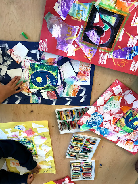
Many start of year lessons have an �about me� theme.� This one is a little bit of a different twist on that as the theme is abstracted. Kindergarten students worked on these great mixed media number artworks in art...
Many start of year lessons have an �about me� theme.� This one is a little bit of a different twist on that as the theme is abstracted. Kindergarten students worked on these great mixed media number artworks in art class this first quarter.� Students engaged in four different processes that reinforce a lot of academic work from their classrooms!These artworks address color, number and letter recognition as well as learning to identify facts about themselves, like name and age.� Talk about cross curricular! With many English language learners, 'beginning at the beginning' was necessary and made for great results with these Jasper Johns inspired number prints.
In our first class, we talked about color (these were the first lessons of the year).��
Rainbow order was a big focus. I use a song to teach rainbow order (sung to the tune of hot cross buns).� I cannot take credit for the song, I definitely picked it up from a preschool resource long ago. Singing is such a great way to learn!��
Red, Orange, Yellow. Green in the middle. Blue then purple. (or you can violet).
Students created some fabulous rainbow order foil prints in this class.� We did one to keep in class and one to take home. I just loved the oohs and ahhs from pulling these simple prints.
In the next class, students tore up their rainbow paper into 10 or so chunks.� Using a glue sponge, these pieces were applied to a primary colored construction paper for a background.
The next element was letter stamping. While Kinders were waiting, they worked on a small paper to accompany their artwork stating their name, their first letter and their age.�
Back at my printing station, I took about four students at a time and did not hand them the correct stamp but instead asked, "what is the first letter of your name?"� (I still kept my class lists handy just in case someone was unsure!)
� � � � ��
Students used simple foam letter stamps to stamp their first letter all over their paper.�
My original plan was to print first and last initial, but students didn�t know it, so I scrapped that plan.
In our next class, students worked on line artworks, at their tables while I pulled small groups to do gelli prints on their artworks.�
I chose gelli prints because it was pretty similar to a collograph in that we just had to mask the area of the number. So I could pull a two color print with just one print.� We rolled the base color on, then put a cardboard number on top and rolled ink over the number, which being higher than the gelli plate, took most of the ink. I experimented in different classes with different color combos and in some, just a one color print.�
I inserted some art criticism into the lesson for the last bit. We'd previously looked at Jasper Johns artworks featuring numbers and letters. Our discussion then was mostly on color observations and brushstrokes.� Students were able to see the connections in color, shape and theme between their artworks and this master artist. During my last session on this artwork, I used a a VTS resource recently adopted by my district, called, Discussions for Learning from Davis.� There was a guided discussion provided on a number print of John�s from this resource, which includes a lot of vocabulary building.��
Our finishing touch was adding line to the prints to draw focus to the number in the artwork.�
For many students this was also an introduction to oil pastels. I love how the pastels draw so smoothly and brightly, even over the torn paper.� Students chose their colors and outlined their number box. Pastels were also used to add small matching numerals around the page. I really enjoy how the contrast between the neatness and uniformity of the print with the student handwriting!�
Looking for more art lesson ideas?
Check out this other use of torn paper for beautiful artworks for students of all ages:
Tear it Up! Spring Collaborative Collage Using Painted Paper Scraps
or this simple Kindergarten lesson on shape:�Kindergarten Cities
Reflection
In future years I think I will put a different spin on this. � I have two ideas. One is to keep the torn paper background and do a collagraph plate print on top.� This would mean taking one class in between to build the plate. I would like the students to have more ownership over the print.� If I did this, I would eliminate the letter stamps, but maybe incorporate the name in a different way.� Maybe a hand drawn border?�
My second idea is to do the gelli prints the usual way, use three colors or so and just make the print the artwork, keeping the number theme.� Honestly, you could do the same with a collagraph print as well.�
I think as a lesson meant to address color, connect with academic goals and create original pieces with an art historical connection, it�s done pretty well.� I do always like to reflect though to see how I could meet the same goals with fewer steps, be clearer in my instruction or make room for more divergence!�
I hope you enjoyed this lesson share!� Thank you for reading. If you have a moment, I love to read your comments.��


