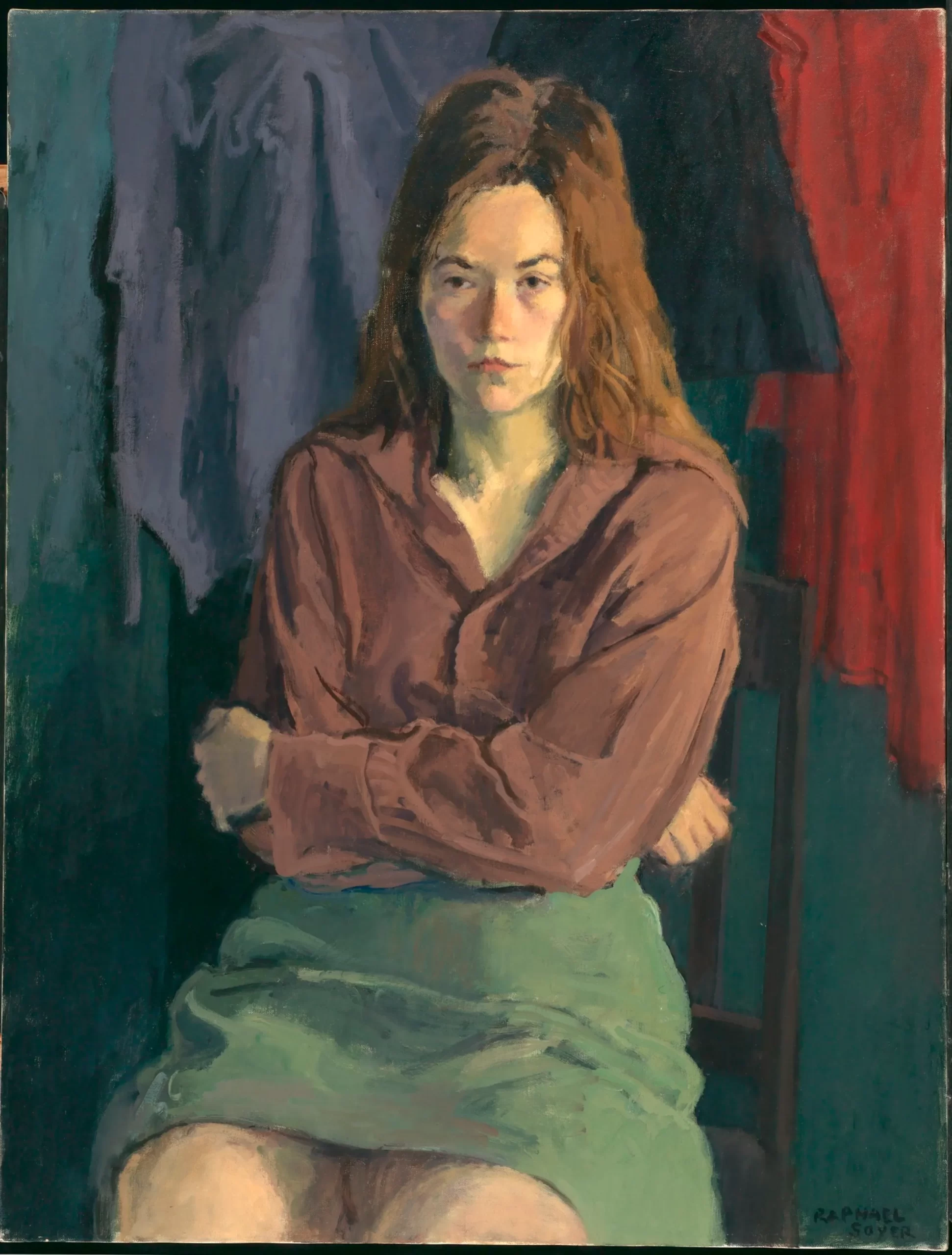
As any retailer will tell you, presentation is everything. Painters, as retailers hoping to sell objects they make, have to consider how those objects are best presented. If a painting is to be framed, what kind of frame will...
As any retailer will tell you, presentation is everything. Painters, as retailers hoping to sell objects they make, have to consider how those objects are best presented. If a painting is to be framed, what kind of frame will present it to best advantage? Not framing a painting is also an aesthetic choice. I�ve written before about the role frames play in our perception of a painting (see previous blog here). The issue came up for me again this week when Roberta and I visited the Art Institute of Chicago to see the exhibition Van Gogh and the Avant-Garde: The Modern Landscape. The show follows five artists � Vincent Van Gogh, Georges Seurat, Paul Signac, Emile Bernard, and Charles Angrand � as they painted the evolving suburbs west of Paris during the 1880�s. It�s worth a look, both for the paintings themselves and as an example of the ways that such paintings have been framed.
�When I was a grad student at the University of Chicago, I sneered at Impressionist and Neo-Impressionist paintings bearing Louis-style gold frames. I had read Felix Feneon, a critic who was close friends with several of the Neo-Impressionists, and I knew from his writing that the only proper frame for such works was a simple white frame, with just enough vermillion and chrome yellow added to the mixture to keep the white paint from being too cold. But a trip to the Art Institute revealed Impressionist paintings in Louis-style frames to beat the band, and even Seurat�s A Sunday Afternoon on the Island of La Grande Jatte bore such a frame. What was wrong with those curators? Were they simply following the taste of vulgar arrivistes for whom any expensive painting must bear a gaudy gold frame?
�Now, over the vantage of many years, I regard Louis-style frames on Impressionist works with much more equanimity. In fact, I have come to feel it�s a natural process. Just as old tree stumps in the forest inevitably sprout mushrooms, all valuable paintings will eventually grow Louis-style frames. Many of the works in the Art Institute�s current exhibition attest to this seemingly inevitable fate.
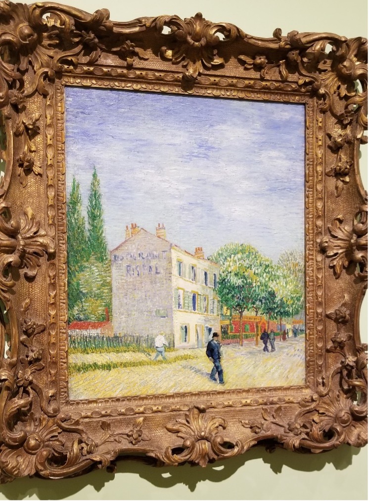
Vincent Van Gogh. The Restaurant Rispal at Asnieres, 1887.
Collection The Nelson-Atkins Museum of Art, Kansas City, MO.
There were, however, many works which were framed in simple, modest white frames, a method of which Feneon would approve. There were frames, on the other hand, that seemed to me to go a bit bonkers in the direction of modernity.
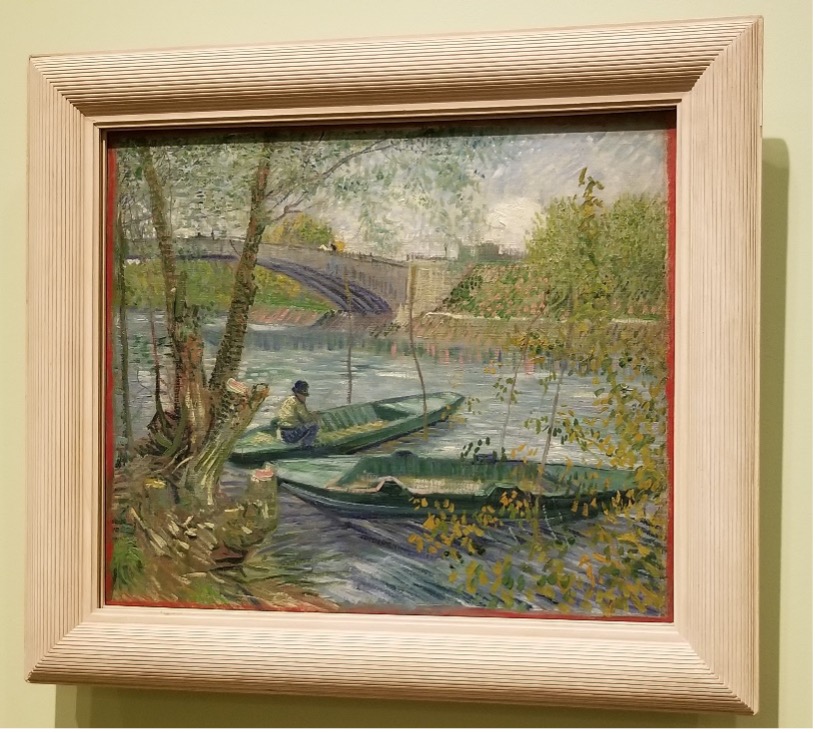
Vincent Van Gogh. Fishing in Spring, the Pont de Clichy (Asnieres),
1887 Collection The Art Institute of Chicago, Chicago, IL
It may be hard to see from the photo, but the frame on Van Gogh�s Fishing in Spring is indubitably pink, with a red liner. What�s with those choices? Was the framer trying to match some tone in the painting? I can�t believe that Theo Van Gogh, his brother�s dealer, would have framed it like this. At any rate, I think the pink calls attention to itself in a way that doesn�t serve the painting.
This was not the only case.� The work below has a large rabbet, painted pink.� Its width makes it resemble a mat, causing the frame look like one for a print or other work on paper, not an oil painting.� Again, I don�t think it serves the painting well.
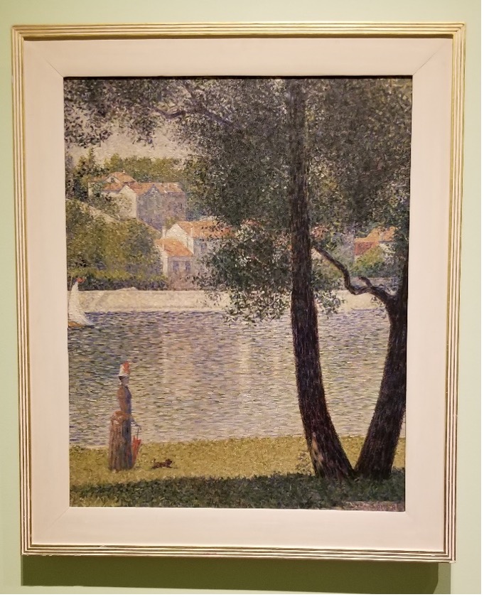
Georges Seurat. The Seine at Courbevoie, 1885.
Private Collection
After viewing the special exhibition, we walked over to the permanent collection gallery where Seurat�s masterpiece hangs. The gold Louis-style frame I saw during my grad student days has been gone for several years.
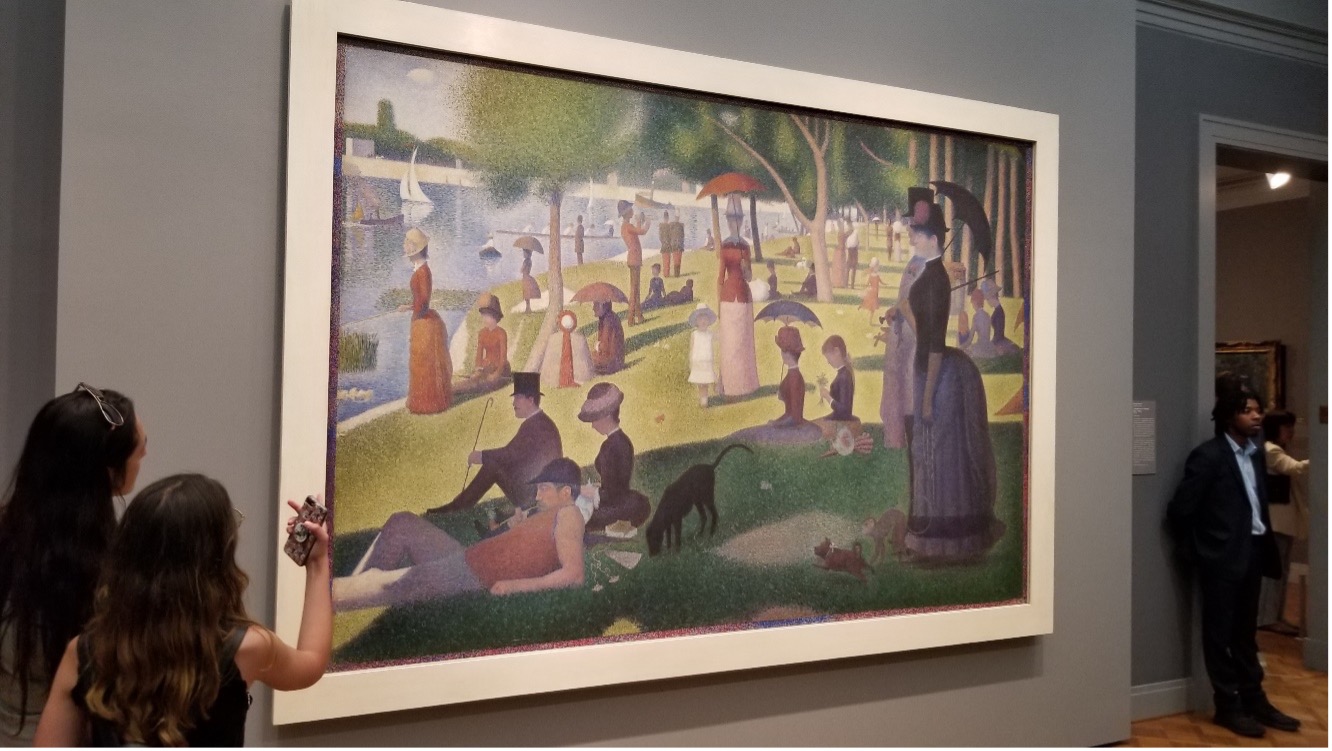
Georges Seurat. A Sunday Afternoon on the Island of La Grande Jatte, 1884.
Collection The Art Institute of Chicago, Chicago, IL
There�s a very informative article on the Art Institute�s website about the manners in which Seurat�s painting has been framed since its creation. Current scholarship suggests that the frame the painting now bears is what the artist would have wanted. Is that the final word? Frames, more so than paintings, are subject to the whims of fashion. A frame should complement, not compete with its painting. When in doubt, remember some article of clothing you wore years ago that makes you shudder today. Then frame your works in simple, modest fashion.


