Make beautiful multi-scale plots with matplotlib in 3 easy�steps.Large-magnitude outliers, tiny features, and sharp spikes are common frustrations to data visualization. All three can make visual details illegible by scrunching plot components into too small an�area.Sometimes a fix can...
Make beautiful multi-scale plots with matplotlib in 3 easy�steps.
Large-magnitude outliers, tiny features, and sharp spikes are common frustrations to data visualization. All three can make visual details illegible by scrunching plot components into too small an�area.
Sometimes a fix can be had by simply excluding unruly data. When including such data is chief to a question at hand, applying a log scale to axes can realign spacing for better separation among lower magnitude data. This approach can only go so far,�however.
In this article, we�ll take a look at another option: zoom plots, which augment a visualization with panels providing magnified views of areas of interest.
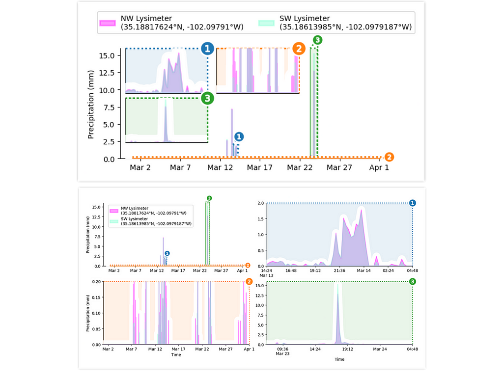 The visualizations we�ll be building in this tutorial.
Zoom plots are commonly arranged as inserts into the main plot, but can also be combined as a lattice with the original plot. We�ll delve into�both.
This article provides a code-oriented tutorial on how to use matplotlib with specialized tools from the outset library to construct zoom plots. We�ll build a visualization of rainfall data from Texas made available by Evett et al. via the USDA. This data set comprises a full year of rain gauge readings from two nearby sites, taken at 15 minute intervals.
The short duration of rain events and extreme intensity of the heaviest rainfall complicates matters. Throwing a month�s worth of Evett et al.�s rainfall data into a simple line plot of reveals the visualization problem we�re up�against.
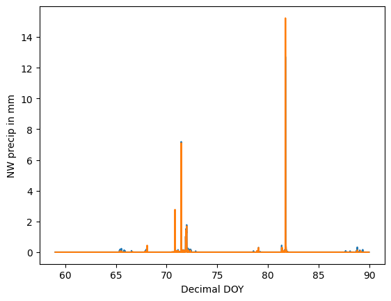
We�ve certainly got some work to do to nice this up! In our visualization, we�ll focus on recovering three particular components of the�data.
the little shower around day�72,the big rainstorm around day 82,�andlight precipitation events over the course of the entire�month.To better show these details, we�ll create a zoom panel for�each.
Our plan is laid out, so let�s get into the code�?
Step 0: Get�Data
Fetch the rain gauge records via the Open Science Framework.
# ----- see appendix for package importsdf = pd.read_csv("https://osf.io/6mx3e/download") # download data
Here�s a peek at the�data.
+------+-------------+--------------+--------------+------------+-----------+| Year | Decimal DOY | NW dew/frost | SW dew/frost | NW precip | SW precip |
+------+-------------+--------------+--------------+------------+-----------+
| 2019 | 59.73958 | 0 | 0 | 0 | 0 |
| 2019 | 59.74999 | 0 | 0 | 0.06159032 | 0 |
| 2019 | 59.76041 | 0 | 0 | 0 | 0 |
| 2019 | 59.77083 | 0 | 0 | 0.05895544 | 0.0813772 |
| 2019 | 59.78124 | 0 | 0 | 0.05236824 | 0.0757349 |
+ ... + ... + ... + ... + ... + ... +
Before moving on, some minor preparatory chores.
nwls = "NW Lysimeter\n(35.18817624�N, -102.09791�W)"swls = "SW Lysimeter\n(35.18613985�N, -102.0979187�W)"
df[nwls], df[swls] = df["NW precip in mm"], df["SW precip in mm"]
# filter down to just data from March 2019
march_df = df[np.clip(df["Decimal DOY"], 59, 90) == df["Decimal DOY"]]
In the code above, we�ve created more detailed column names and subset the data down to a single�month
Step 1: Axes�Grid
Our first plotting step is to initialize an outset.OutsetGrid instance to manage our latice of magnification plots. This class operates analogously to seaborn�s FacetGrid, which facilitates construction of standard lattice plots by breaking data across axes based on a categorical variable.
OutsetGrid differs from FacetGrid, though, in that in addition to axes with faceted data it prepares an initial �source� axes containing all data together. Further, OutsetGrid includes tools to automatically generate �marquee� annotations that show how magnifications correspond to the original plot. The schematic below overviews OutsetGrid�s plotting�model.

Getting back to our example, we�ll construct an OutsetGrid by providing a list of the main plot regions we want to magnify through the datakwarg. Subsequent kwargs provide styling and layout information.
grid = otst.OutsetGrid( # initialize axes grid managerdata=[
# (x0, y0, x1, y1) regions to outset
(71.6, 0, 72.2, 2), # little shower around day 72
(59, 0, 90, 0.2), # all light precipitation events
(81.3, 0, 82.2, 16), # big rainstorm around day 82
],
x="Time", # axes label
y="Precipitation (mm)", # axes label
aspect=2, # make subplots wide
col_wrap=2, # wrap subplots into a 2x2 grid
# styling for zoom indicator annotations, discussed later
marqueeplot_kws={"frame_outer_pad": 0, "mark_glyph_kws": {"zorder": 11}},
marqueeplot_source_kws={"zorder": 10, "frame_face_kws": {"zorder": 10}},
)
Here we�ve specified a wider-than-tall aspect ratio for subplots and how many columns we want to�have.
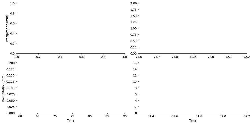
Our axes grid is set up, we�re ready for the next�step.
Step 2: Plot�Content
It�s time to put some content on our�axes.
We can use area plots to co-visualize our rain gauges� readings. (For those unfamiliar, area plots are just line plots with a fill down to the x axis.) Applying a transparency effect will elegantly show where the gauges agree?�?and where they�don�t.
We can harness matplotlib�s stackplotto draw our overlapped area plots. Although designed to create plots with areas �stacked� on top of each other, we can get overlapped areas by splitting out two calls to the plotter� one for each�gauge.
To draw this same content across all four axes of the grid, we will use OutsetGrid�s broadcast method. This method takes a plotter function as its first argument then calls it on each axis using any subsequent arguments.
# draw semi-transparent filled lineplot on all axes for each lysimeterfor y, color in zip([nwls, swls], ["fuchsia", "aquamarine"]):
grid.broadcast(
plt.stackplot, # plotter
march_df["Decimal DOY"], # all kwargs below forwarded to plotter...
march_df[y],
colors=[color],
labels=[y],
lw=2,
edgecolor=color,
alpha=0.4, # set to 60% transparent (alpha 1.0 is non-transparent)
zorder=10,
)
For better contrast against background fills, we�ll also use broadcast to add white underlay around the stackplots.
grid.broadcast(plt.stackplot, # plotter
march_df["Decimal DOY"], # all kwargs below forwarded to plotter...
np.maximum(march_df["SW precip in mm"], march_df["NW precip in mm"]),
colors=["white"],
lw=20, # thick line width causes protrusion of white border
edgecolor="white",
zorder=9, # note lower zorder positions underlay below stackplots
)
Here�s how our plot looks before we move on to the next�stage.
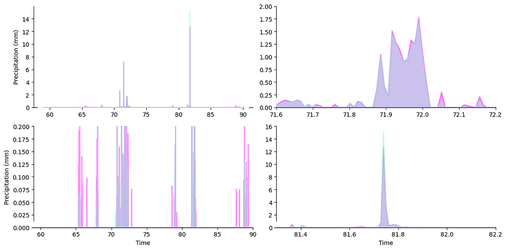
Looking good already?�?we can already see magnifications showing up on their proper axes at this�stage.
Step 3: Zoom Indicators
Now it�s time to add zoom indicator boxes, a.k.a. outset �marquees,� to show how the scales of our auxiliary plots relate to the scale of the main�plot.
# draw "marquee' zoom indicators showing correspondences between main plot# and outset plots
grid.marqueeplot(equalize_aspect=False) # allow axes aspect ratios to vary
Note the kwarg passed to allow outset plots to take on different aspect ratios from the main plot. This way, outset data can fully expanded to take advantage of all available axes�space.
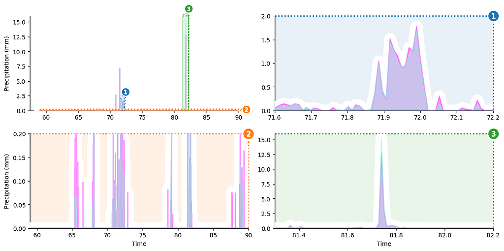
We�re most of the way there?�?just a few finishing touches left at this�point.
Et Voil�!
Our last business is to add a legend and switch out numeric x ticks for proper timestamps.
grid.source_axes.legend( # add legend to primary axesloc="upper left",
bbox_to_anchor=(0.02, 1.0), # legend positioning
frameon=True, # styling: turn on legend frame
)
# ----- see appendix for code to relabel axes ticks with timestamps
With that, the plot is complete.
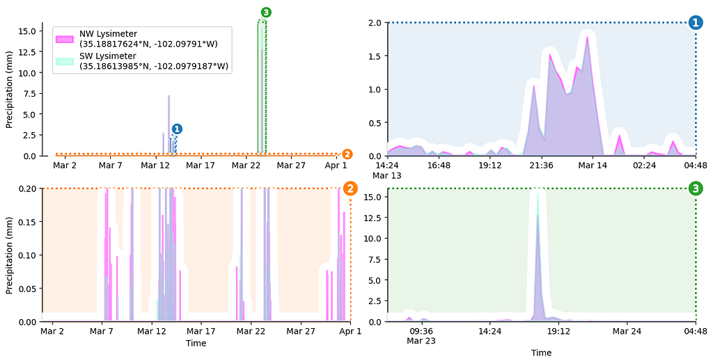
That�s all there is to it, a zoom plot in 3 easy�steps.
Bonus: Want Insets�Instead?
We can create insets by rearranging the magnification lattice axes into position over the main axes. Here�s how, using the outset library�s inset_outsets tool.
otst.inset_outsets(grid,
insets=otst_util.layout_corner_insets(
3, # three insets
"NW", # arrange in upper-left corner
inset_margin_size=(0.02, 0), # allow closer to main axes bounds
inset_grid_size=(0.67, 0.9), # grow to take up available space
),
equalize_aspect=False,
)
sns.move_legend( # move legend centered above figure
grid.source_axes, "lower center", bbox_to_anchor=(0.5, 1.1), ncol=2
)
In this case, we�ve also used outset.util.layout_inset_axes for fine tuned control over inset sizing and positioning.
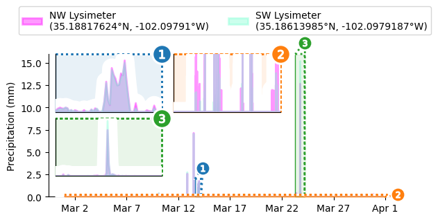
And just like that, we�ve got three zoom inserts arranged in the upper left hand�corner.
Further Information
There�s a lot more you can do with�outset.

In addition to explicit zoom area specification, the outset library also provides a seaborn-like data-oriented API to infer zoom inserts containing categorical subsets of a dataframe. Extensive styling and layout customization options are also available.
Here�s a peek at some highlights from the library�s gallery�
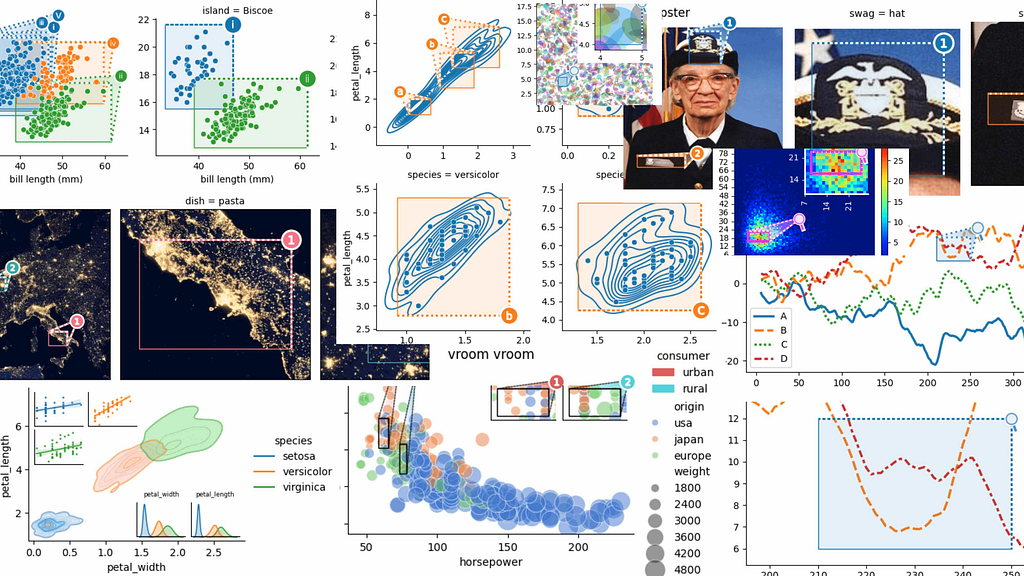
You can learn more about using outset in the library�s documentation at https://mmore500.com/outset. In particular, be sure to check out the quickstart guide.
Outset can be installed via pip as python3 -m pip install�outset.
Authorship
This tutorial is contributed by me, Matthew Andres�Moreno.

I currently serve as a postdoctoral scholar at the University of Michigan, where my work is supported by the Eric and Wendy Schmidt AI in Science Postdoctoral Fellowship, a Schmidt Futures�program.
My appointment is split between the university�s Ecology and Evolutionary Biology Department, the Center for the Study of Complexity, and the Michigan Institute for Data�Science.
Find me on Twitter as @MorenoMatthewA and on GitHub as @mmore500.
disclosure: I am the author of the outset�library.
Citations
Evett, Steven R.; Marek, Gary W.; Copeland, Karen S.; Howell, Terry A. Sr.; Colaizzi, Paul D.; Brauer, David K.; Ruthardt, Brice B. (2023). Evapotranspiration, Irrigation, Dew/frost?�?Water Balance Data for The Bushland, Texas Soybean Datasets. Ag Data Commons. https://doi.org/10.15482/USDA.ADC/1528713. Accessed 2023�12�26.
J. D. Hunter, �Matplotlib: A 2D Graphics Environment�, Computing in Science & Engineering, vol. 9, no. 3, pp. 90�95, 2007. https://doi.org/10.1109/MCSE.2007.55
Marek, G. W., Evett, S. R., Colaizzi, P. D., & Brauer, D. K. (2021). Preliminary crop coefficients for late planted short-season soybean: Texas High Plains. Agrosystems, Geosciences & Environment, 4(2). https://doi.org/10.1002/agg2.20177
Data structures for statistical computing in python, McKinney, Proceedings of the 9th Python in Science Conference, Volume 445, 2010. https://doi.org/ 10.25080/Majora-92bf1922�00a
Waskom, M. L., (2021). seaborn: statistical data visualization. Journal of Open Source Software, 6(60), 3021, https://doi.org/10.21105/joss.03021.
Appendix
You can find the entire code as a gist here and as a notebook�here.
To install dependencies for this exercise,
python3 -m pip install \matplotlib `# ==3.8.2`\
numpy `# ==1.26.2` \
outset `# ==0.1.6` \
opytional `# ==0.1.0` \
pandas `# ==2.1.3` \
seaborn `# ==0.13.0`
All images are works of the�author.
A Killer Fix for Scrunched Axes, Step-by-step was originally published in Towards Data Science on Medium, where people are continuing the conversation by highlighting and responding to this story.


