Photo by Mathew Schwartz on�UnsplashIntroductionIn the previous article, we discussed the surprising behavior of data in higher dimensions. We found that volume tends to accumulate in the corners of spaces in a strange way, and we simulated a hypersphere...
 Photo by Mathew Schwartz on�Unsplash
Introduction
In the previous article, we discussed the surprising behavior of data in higher dimensions. We found that volume tends to accumulate in the corners of spaces in a strange way, and we simulated a hypersphere inscribed inside a hypercube to investigate this, observing an interesting decrease in their volume ratio as the dimensions grew. Examples that demonstrated the advantages of multi-dimensional thinking were the DVD-paper experiment and the kernel trick in support vector machines(SVMs).
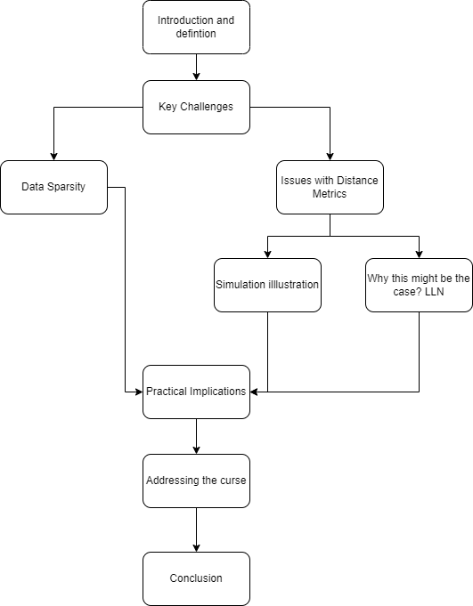
Today, we will be looking at some of the difficult aspects of high-dimensional data which is referred to as curse of dimensionality. Our goal is to have an intuitive understanding of this concept and its practical implications. The diagram below outlines how our article is structured.
 Image by�Author
Understanding the Curse of Dimensionality
�Curse of dimensionality� is a term that was first used by Richard E. Bellman back in the 1960s. It began as Bellman�s idea from dynamic optimization and it turned out to be a fundamental concept for understanding complexity in high-dimensional spaces.
Good, but what is �curse of dimensionality�?
It is at its core the difficulties and unique characteristics one faces when working with data in high-dimensional spaces( in our case this refers to having many features, columns or attributes in datasets). These spaces go far beyond our experience of everyday life in three-dimensional space.When we increase the number of dimensions on a dataset, the volume it occupies expands exponentially. This might appear initially as an advantage?�?more space could mean more data and probably more insights? However, that is not the case because having many dimensions comes with a number of challenges which change how we need to deal with and understand these high-dimensional data.
Key Challenges
The shift from low-dimensional to high-dimensional data faces several harsh challenges. There are two, which stand out because they have the most significant effects: 1) sparsity of data; 2) the issue with distance metric. Each of them makes analysis in higher dimensions even more�complex.
Data Sparsity: Islands in an Ocean of Emptiness
Data sparsity in highly dimensional spaces is like few small islands lost within a vast ocean. When dimensionality increases, data points that were close together in lower dimensions become increasingly separated. This is due to the fact that the amount of space expands exponentially with each new addition of another dimension. Just imagine a cube becoming a hypercube; its corners move further away from its center and make it more empty inside. This growing emptiness is what we refer to as data sparsity.
Many data analysis techniques struggle with sparsity. For example, many clustering algorithms depend on closely situated data points to form meaningful clusters. However, when data points become too dispersed, these algorithms face difficulties.
Distance Metric Problems: When Proximity Loses�Meaning
In high-dimensional spaces, distance metrics encounter significant challenges. Metrics like Euclidean or Manhattan distances, which are useful for measuring proximity between data points in lower dimensions, lose their effectiveness. In these expanded spaces, distances start to converge. This means that most pairs of points become nearly equidistant from each other and from a reference point. This convergence makes it harder to distinguish between close neighbors and distant�ones.
In tasks like classification, where distance measurements are crucial for categorizing new data points, these metrics become less effective. As a result, algorithm performance drops, leading to less accurate predictions and analyses.
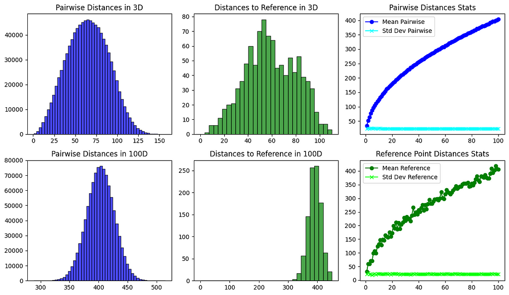
To better understand how distance behavior changes in higher dimensions, let�s perform a simple simulation. We will generate random points in both low and high-dimensional spaces. This will allow us to observe and compare the distribution of distances, showing us how these distances evolve as we move to higher dimensions.
import numpy as npimport matplotlib.pyplot as plt
from scipy.spatial.distance import pdist
def generate_points(dimensions, num_points, range_min, range_max):
return np.random.uniform(range_min, range_max, (num_points, dimensions))
def calculate_pairwise_distances(points):
distances = np.sqrt(((points[:, np.newaxis, :] - points[np.newaxis, :, :]) ** 2).sum(axis=-1))
np.fill_diagonal(distances, np.nan) # Ignore self-distances by setting them to NaN
return distances
def calculate_distances_from_reference(points, reference_point):
distances = np.sqrt(((points - reference_point) ** 2).sum(axis=1))
return distances
def calculate_stats_for_dimensions(num_points, dimensions_range, range_min, range_max):
means_pairwise = []
stds_pairwise = []
means_ref = []
stds_ref = []
for dim in dimensions_range:
points = generate_points(dim, num_points, range_min, range_max)
pairwise_distances = calculate_pairwise_distances(points)
reference_point = generate_points(dim, 1, range_min, range_max)
distances_from_ref = calculate_distances_from_reference(points, reference_point)
means_pairwise.append(np.nanmean(pairwise_distances))
stds_pairwise.append(np.nanstd(pairwise_distances))
means_ref.append(np.mean(distances_from_ref))
stds_ref.append(np.std(distances_from_ref))
return means_pairwise, stds_pairwise, means_ref, stds_ref
def plot_histograms_and_stats(num_points, dimensions_range, range_min, range_max):
fig, axs = plt.subplots(2, 3, figsize=(12, 7), tight_layout=True)
# Plotting histograms for 3D and 100D
for i, dim in enumerate([3, 100]):
points = generate_points(dim, num_points, range_min, range_max)
pairwise_distances = calculate_pairwise_distances(points)
reference_point = generate_points(dim, 1, range_min, range_max)
distances_from_ref = calculate_distances_from_reference(points, reference_point)
axs[i, 0].hist(pairwise_distances[~np.isnan(pairwise_distances)], bins=50, alpha=0.7, color='blue', edgecolor='black')
axs[i, 0].set_title(f'Pairwise Distances in {dim}D')
axs[i, 1].hist(distances_from_ref, bins=30, alpha=0.7, color='green', edgecolor='black', range=(0, max(distances_from_ref)))
axs[i, 1].set_title(f'Distances to Reference in {dim}D')
# Calculating and plotting mean and std deviation trends across dimensions
means_pairwise, stds_pairwise, means_ref, stds_ref = calculate_stats_for_dimensions(num_points, dimensions_range, range_min, range_max)
# Plotting mean and std deviation graphs for pairwise distances
axs[0, 2].plot(dimensions_range, means_pairwise, label='Mean Pairwise', marker='o', color='blue')
axs[0, 2].plot(dimensions_range, stds_pairwise, label='Std Dev Pairwise', marker='x', color='cyan')
axs[0, 2].set_title('Pairwise Distances Stats')
# Plotting mean and std deviation graphs for distances to reference point
axs[1, 2].plot(dimensions_range, means_ref, label='Mean Reference', marker='o', color='green')
axs[1, 2].plot(dimensions_range, stds_ref, label='Std Dev Reference', marker='x', color='lime')
axs[1, 2].set_title('Reference Point Distances Stats')
axs[0, 2].legend()
axs[1, 2].legend()
plt.show()
plot_histograms_and_stats(1000, range(1, 101), 1, 100)
 Image by�Author
The code output shows how distances change across dimensions. In 3D, there are different distances between points. In 100D, distances between points tend to be similar. Graphs to the right also show that as dimensions increase, the mean distance between points gets bigger, but the standard deviation stays roughly the same as it was on 2D or 3D�space.
Another note here is that as dimensions increase, the mean distance between points gets bigger and approaches the maximum distance. This happens because most of the space is concentrated in the�corners.
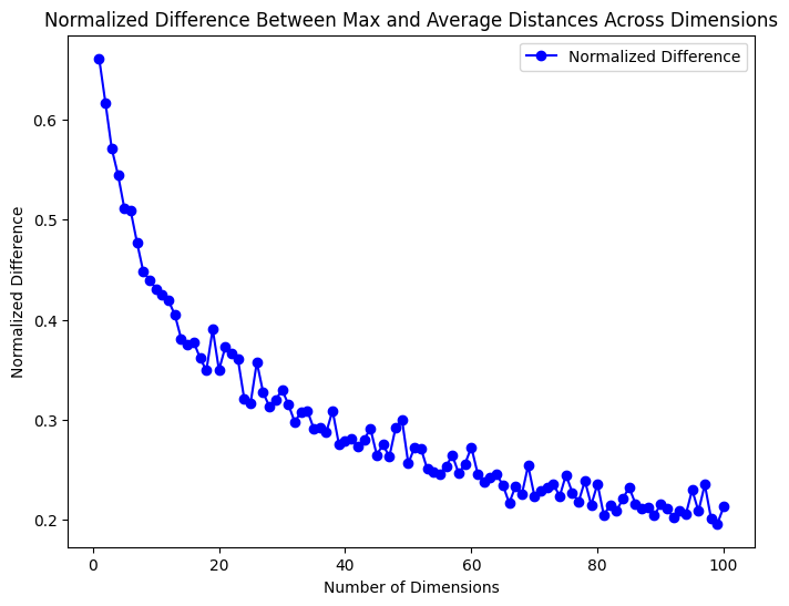
To better understand this, we can simulate random points in dimensions up to 100D. This will let us compare the average distance to the maximum distance.
import numpy as npimport matplotlib.pyplot as plt
from scipy.spatial.distance import pdist
def generate_points(dimensions, num_points, range_min, range_max):
return np.random.uniform(range_min, range_max, (num_points, dimensions))
def calculate_distances_stats(points):
# Compute pairwise distances
distances = pdist(points)
# Calculate average and maximum distance
average_distance = np.mean(distances)
max_distance = np.max(distances)
return average_distance, max_distance
def plot_normalized_difference(num_points, dimensions_range, range_min, range_max):
normalized_differences = []
for dim in dimensions_range:
points = generate_points(dim, num_points, range_min, range_max)
average_distance, max_distance = calculate_distances_stats(points)
normalized_difference = (max_distance - average_distance) / max_distance
normalized_differences.append(normalized_difference)
plt.figure(figsize=(8, 6))
plt.plot(dimensions_range, normalized_differences, label='Normalized Difference', marker='o', color='blue')
plt.xlabel('Number of Dimensions')
plt.ylabel('Normalized Difference')
plt.title('Normalized Difference Between Max and Average Distances Across Dimensions')
plt.legend()
plt.show()
plot_normalized_difference(500, range(1, 101), 0, 1)
 Image by�Author
The graph shows that as we go into higher dimensions, the average distance gets closer to the maximum distance. We used normalization in here to make sure the scales were accurate.
It�s important to understand the difference between absolute and relative distances. While absolute distances generally increase with more dimensions, it�s the relative differences that matter more. Clustering algorithms like K-means or DBSCAN work by looking at how points are positioned compared to each other, not their exact distances. This lets us find patterns and relationships that we might miss if we only looked at the distances.But this leads to an interesting question: why do pairs of points in high-dimensional spaces tend to be roughly the same distance apart as we add more dimensions? What causes this to�happen?
 Photo by Aakash Dhage on�Unsplash
To understand why pairs of points in high-dimensional spaces become equidistant, we can look at the Law of Large Numbers (LLN). This statistical principle suggests that as we increase our sample size or the number of dimensions, the average of our observations gets closer to the expected�value.
Let�s consider the example of rolling a fair six-sided dice. The expected mean of a roll is 3.5, which is the average of all possible outcomes. Initially, with just a few rolls, like 5 or 10, the average might be significantly different from 3.5 due to randomness. But as we increase the number of rolls to hundreds or thousands, the average roll value gets closer to 3.5. This phenomenon, where the average of many trials aligns with the expected value, shows the essence of the LLN. It demonstrates that while individual outcomes are unpredictable, the average becomes highly predictable over many�trials.
Now, how does this relate to distances in high-dimensional spaces?
The Euclidean distance between two points in an n-dimensional space is calculated by summing the squared differences across each dimension. We can think of each squared difference as a random variable, similar to a roll of a dice. As the number of dimensions (or rolls) increases, the sum of these �rolls� gets closer to an expected�value.
A crucial requirement for the LLN is the independence of random variables. In high-dimensional vectors, this independence might be shown through an interesting geometric property: the vectors tend to be almost orthogonal to each�other.
import numpy as npdef test_orthogonality(dimensions, n_trials):
for i in range(n_trials):
# Generate two random vectors
v1 = np.random.randn(dimensions)
v2 = np.random.randn(dimensions)
# Calculate dot product
dot_product = np.dot(v1, v2)
# Calculate magnitudes
magnitude_v1 = np.linalg.norm(v1)
magnitude_v2 = np.linalg.norm(v2)
# Calculate the cosine of the angle
cos_theta = dot_product / (magnitude_v1 * magnitude_v2)
# Check if vectors are almost orthogonal
if np.abs(cos_theta) < 0.1: # Adjust this threshold as needed
orthogonality = "Almost Orthogonal"
else:
orthogonality = "Not Orthogonal"
# Calculate angle in degrees
theta = np.arccos(cos_theta) * (180 / np.pi) # Convert to degrees
print(f"Trial {i+1}:")
print(f" Dot Product: {dot_product}")
print(f" Cosine of Angle: {cos_theta}")
print(f" Angle: {theta} degrees")
print(f" Status: {orthogonality}")
print("--------------------------------")
# Try to edit this and notice the near-orthogonality of vectors in higher dimensions
dimensions = 100 # Number of dimensions
n_trials = 10 # Number of trials
test_orthogonality(dimensions, n_trials)
Try running the code above and editing the number of dimensions/ trials, and you can notice that vectors in higher dimensions are almost orthogonal.
The angle between two vectors, A and B, is determined by the cosine of the angle, which is derived from their dot product and magnitudes. The formula is expressed as:

Here, A?B represents the dot product of vectors A and B, and ?A? and ?B? are their respective magnitudes. For two vectors to be orthogonal, the angle between them must be 90 degrees, making cos(?) equal to zero. Typically, this is achieved when the dot product A?B is zero, a condition familiar in lower dimensions.
However, in high-dimensional spaces, another phenomenon emerges. The ratio of the dot product to the magnitude of the vectors becomes so small that we can consider the vectors to be �almost orthogonal.�
But what does it mean for two vectors to be �independent� in this�context?
Navigating a Grid City: An Analogy for Independence in High Dimensions
Imagine you are in a city laid out in a grid, like Manhattan�s streets. Picture yourself at an intersection, trying to reach another point in this city. In this analogy, each street represents a dimension in a high-dimensional space. Moving along a street is like changing the value in one dimension of a high-dimensional vector. Moving along one street doesn�t affect your position on another street, just like changing one dimension doesn�t affect the�others.
To reach a specific intersection, you make a series of independent decisions, like calculating distance in high-dimensional space. Each decision contributes independently but leads you to your destination.
This analogy also applies to the concept of orthogonality in high-dimensional vectors. When vectors are almost orthogonal, they follow their own paths without significantly influencing each other. This condition complements the need for statistical independence for the�LLN.
An important note: while this analogy of LLN offers a helpful perspective, it may not capture all the idea or causes behind this behavior. However, it serves as a useful proxy, providing an understanding of what the reason might be for pairs of point to be almost equidistant.
Practical Implications
One way the curse of dimensionality problems show up is overfitting. Overfitting happens when a complex model learns noise instead of the patterns in the data. This is especially true in high-dimensional spaces where there are many features. The model can make false connections or correlations and perform poorly when it sees new data(failing to generalize).
The curse also makes it hard to find patterns in big datasets. High-dimensional data is spread out and sparse, so it�s challenging for traditional analysis methods to find meaningful insights. Some changes or specialized methods are needed to navigate and understand this type of�data.
Another implication is that processing high-dimensional data takes a lot of computational power and memory. Algorithms that work well in lower dimensions become much more complex and resource-heavy as the number of dimensions increases. This means either having more powerful hardware or optimizing algorithms to handle the increased computational load efficiently.
How to address curse of dimensionality?
There are several strategies to deal with the curse of dimensionality. One way is to reduce the dimensionality while keeping the important information(ex. PCA algorithm). Another method is manifold learning(can be considered as a type of dimensionality reduction).which uncovers the structure within the high-dimensional data. The key idea behind manifold learning is that many high-dimensional datasets actually lie on a lower-dimensional manifold within the high-dimensional space(ex. Isomaps)
Note here that -generally speaking- traditional dimensionality reduction techniques like PCA (Principal Component Analysis) focus on preserving global data structure and variance in a linear fashion. In contrast, manifold learning techniques like Isomap(Isometric Mapping) emphasize uncovering the underlying non-linear structure(manifold) of data, aiming to preserve local relationships and geometrical features.Feature selection is also an option, where relevant features are chosen to improve model performance. Regularization techniques prevent overfitting by shrinking less important features. Increasing the sample size can also help, although it may not always be possible. These methods can help us analyze high-dimensional data more accurately and efficiently.
Conclusion
The curse of dimensionality is one of the most important problems in data science and machine learning. It happens when dealing with high-dimensional spaces. Two significant challenges that arise are data sparsity and issues with distance metrics. These challenges can cause overfitting in machine learning models and make computations more complex. To tackle these challenges, strategies like dimensionality reduction, feature selection, and regularization techniques can be�used.
If you have made it this far, I would like to thank you for spending time reading this! I hope you found the topic enjoyable and at least inspiring enough to delve deeper into the world of high-dimensional data. Please feel free to suggest any edits or point out any mistakes or inaccuracies.
Curse of Dimensionality: An Intuitive Exploration was originally published in Towards Data Science on Medium, where people are continuing the conversation by highlighting and responding to this story.


.jpg)


