Remember that expression that you have 5 seconds to make a good first impression?� After this you have reached the point of no return.� Well, this applies to the front of your house which is why street appeal is...
Remember that expression that you have 5 seconds to make a good first impression?� After this you have reached the point of no return.� Well, this applies to the front of your house which is why street appeal is so very important.� If you get this right, it sets you up well for everything else to follow.� Not all of the contestants achieved it this week.� Steph and Gian's house certainly ticked all of the boxes for street appeal and their house should have won.� The Block 2023 front facade reveal was certainly interesting with some major highs and lows.� This is the last week of the season and the houses will be going to auction this weekend and there is only one house that I would spend my money on.
As it is the final week of the reveals, the contestants were also busy finishing other areas in their homes and I have also included photos of the hallways here too.� I have all the images to show you, together with the judges' comments and my own.
The Block 2023 Front Facade reveal
First Place: Leah and Ash Score: 38 points
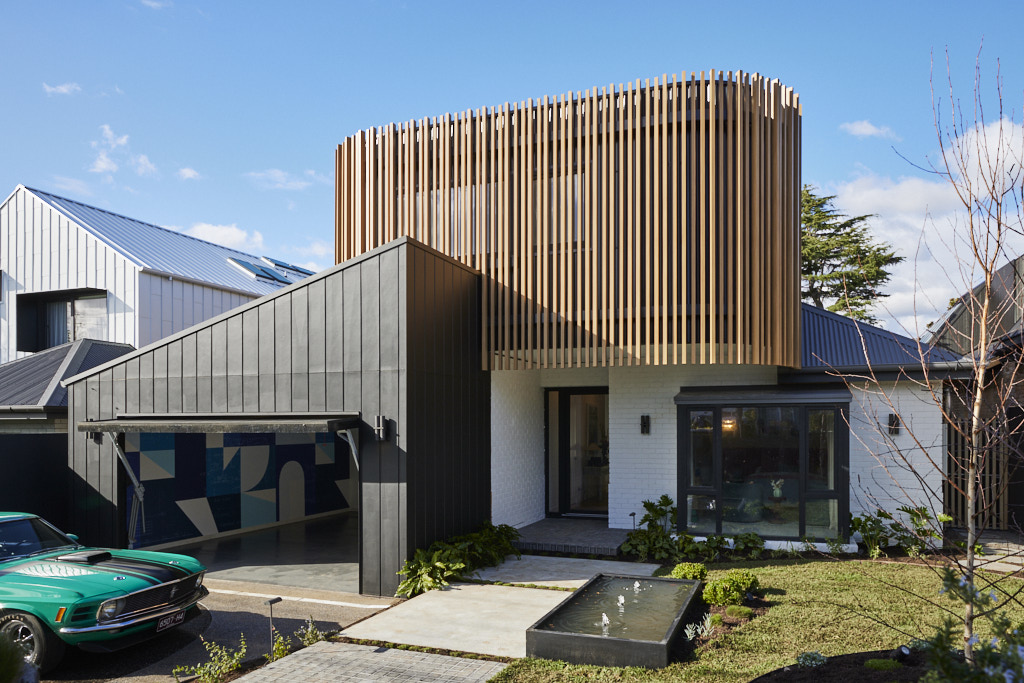
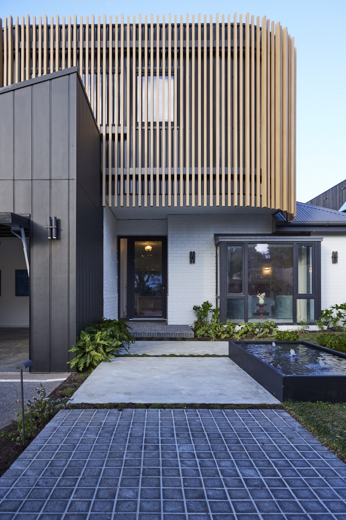
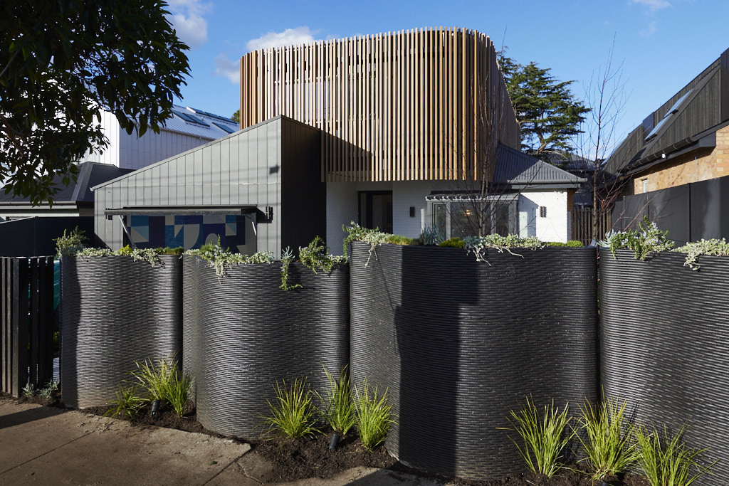
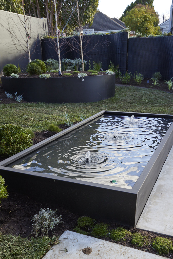
From the Contour 3D fence to the battens, pond and plants, Darren was impressed before he even walked into Leah and Ash�s front yard and once he made it through the gate, the praise kept coming. Contrasting yet complementing elements brought the old and new together, he said� and he liked what he saw. The mix of concrete and granite steppers, well-planned plant selection and undulating tiers, plus the old home�s plans turned into garage wallpaper were a beautiful touch, they agreed, topped off by a front garden bench Marty could already imagine prospective buyers using as they fell in love with the home. In all, he said, this was �turnkey and finished� and that�s what buyers want.
 Leah and Ash
 Leah and Ash
 Leah and Ash
 Leah and Ash
 Leah and Ash
 Leah and Ash
My thoughts on Leah and Ash's front facade and hallway
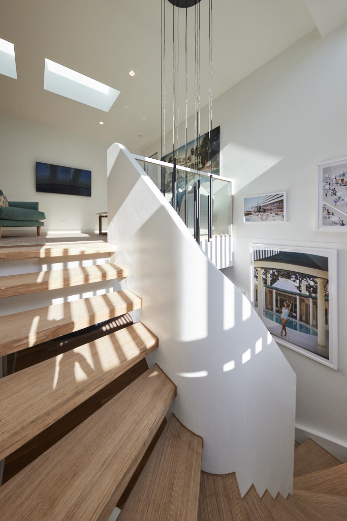
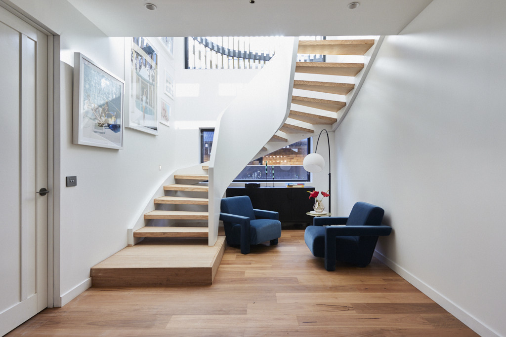
I have to say that I really don't like the contoured front fence.� It is simply too heavy and dark.� I know it will be softened with greenery, but I think it will be hard to keep clean and it just calls to mind a set of tyres. Once you get past this, the house has much more appeal.� I really like the curved timber battens which are a nice mid tone and balance the dark colours well. I like the white painted brick which adds texture to the house and I love the pathway with the inclusion of cobblestones.� The garden also has appeal from the front door with a lovely water feature and raised garden bed.� Overall, this is a very pleasing exterior, but not first place quality. Inside to the hallway, I love the generous proportions of the space and the curved staircase is beautiful.� The armchairs should go as they currently look like they have been left there awaiting collection.� They overwhelm the space and detract from the beautiful simplicity of the stairwell.Second Place: Steph and Gian Score: 37.5 points
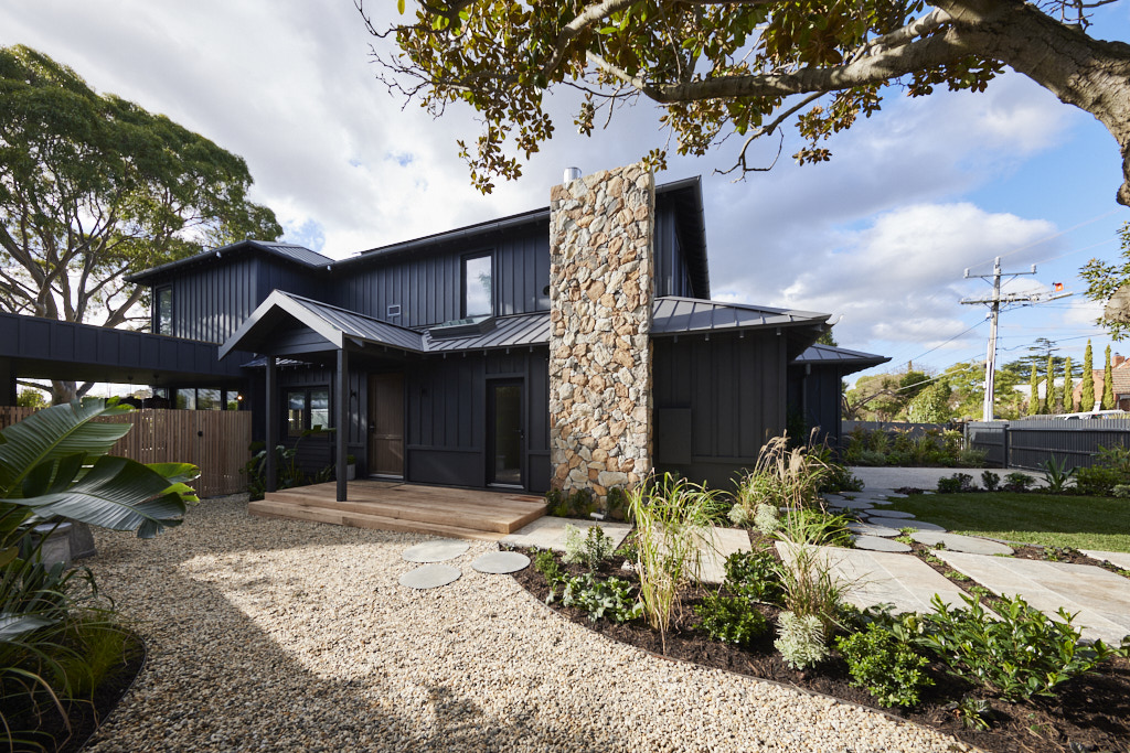
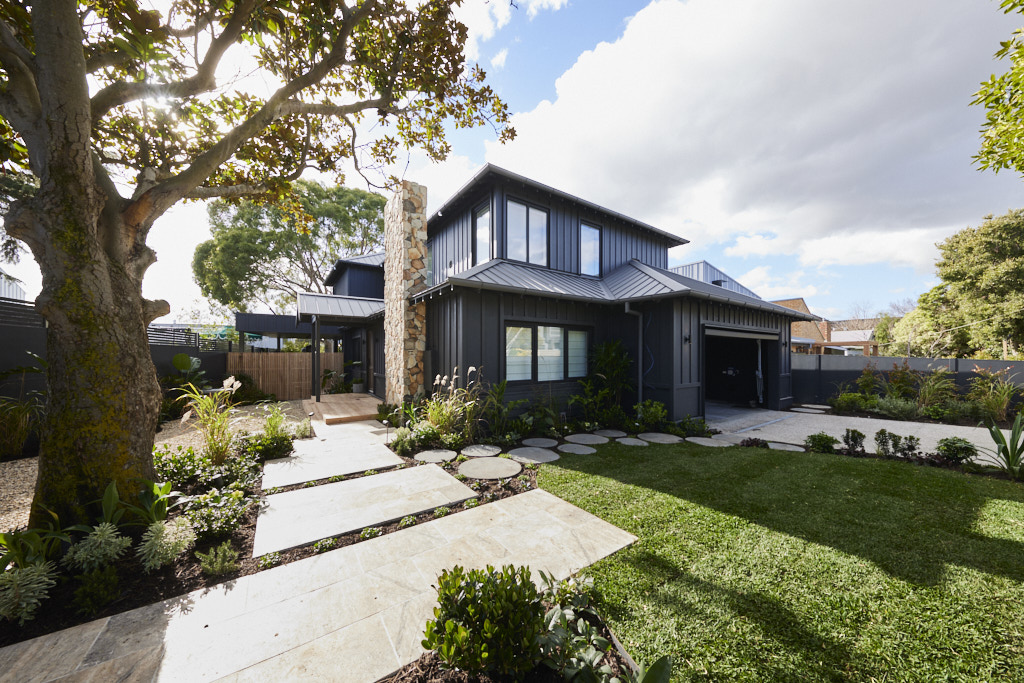
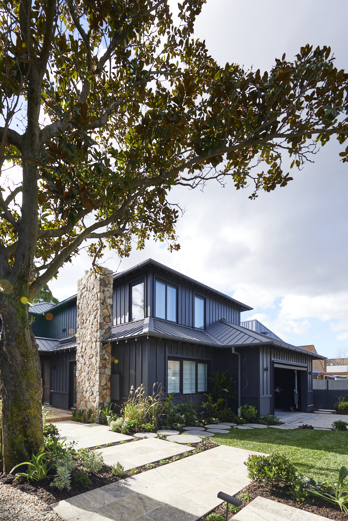
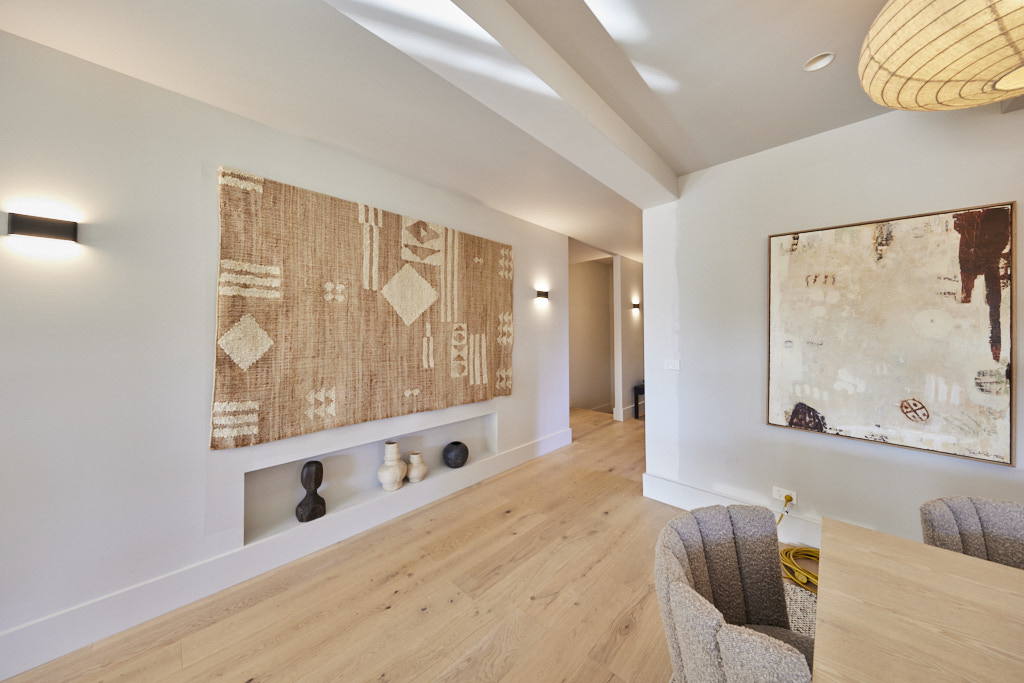
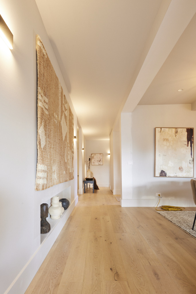
From the stacked stone fireplace, wide frontage, pebble and travertine path and a garden that looks well established, Gian and Steph�s front yard was, Shaynna said: �a show stopper!� And while she admired the magnolia tree, complete with a pair of nesting owls and Dave counted the different species used in the garden (at least 20, he said, and definitely something for every season), Marty looked at the practicality, noting this was the only Block house that could boast off-street parking for six cars. Inside, a lack of light in the foyer was a problem, Shaynna said, but for Darren the dark and moody exterior, a contrast to the minimalist inside, just won. It was a blend, he said, that: �really, really worked!�
 Steph and Gian
 Steph and Gian
 Steph and Gian
 Steph and Gian
 Steph and Gian
 Steph and Gian
My thoughts on Steph and Gian's front facade and hallway
I love this house.� The all black scheme is a very challenging one to get right and Steph and Gian succeeded.� This works because there is a mix of cladding; flat, vertical and horizontal.� There is lots of texture and change of direction, so the all black scheme does not overwhelm the look of the house.� It will of course be divisive, but I think they have achieved it well. There is no doubt that the look of the house would have failed though without the beautiful stone chimney.� This is non negotiable for a house of this size.� You can get away with a black painted cottage or smaller home without added embellishment, but one of this stature needed the warmth of the stone to pull it off. The use of natural timber for the decking, fencing and front door is perfect and again, a great foil for the heaviness of the colour. The hard landscaping in soft warm tones and a gorgeous mix of plantings means the garden is the perfect complement to the house. A great final week for Steph and Gian which should have seen them clear winners.Third Place: Kristy and Brett Score: 35 points
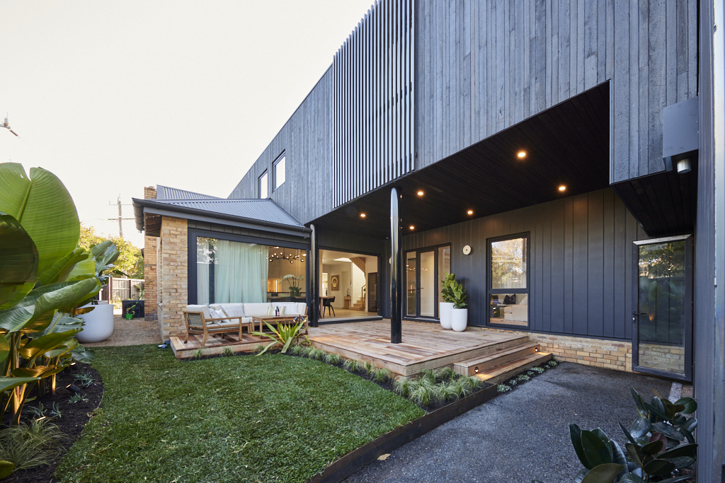
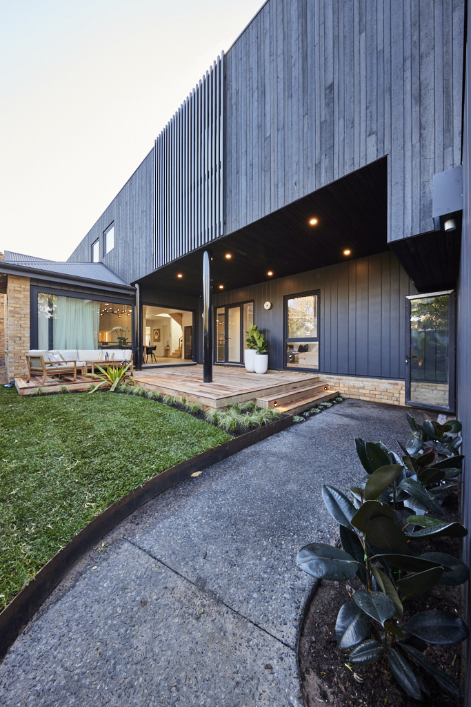
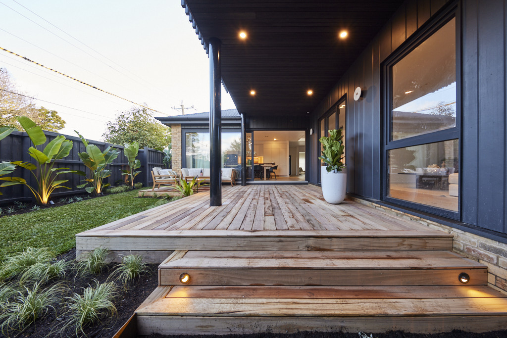
A unique and incredible entry, Shaynna said as the judges walked into Kristy and Brett�s front yard, with Darren noting the Design 10 charred black timber married with the colour palette chosen for the James Hardie cladding all played perfectly against the original bricks. A perfect blend of hard and soft, Dave said and a huge improvement over the backyard the couple had presented a week ago � he even defended the imperfect paint on the back of the gate by pointing out it had rained overnight. Into the garage the judges admired the choice of floor and the way it all flowed into the home � overall, Marty said, it was a space that will appeal to many and that is vital come auction day.
 Kristy and Brett
 Kristy and Brett
 Kristy and Brett
 Kristy and Brett
 Kristy and Brett
My thoughts on Kristy and Brett's front facade and hallway
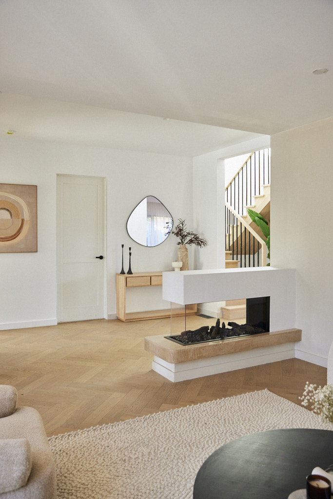
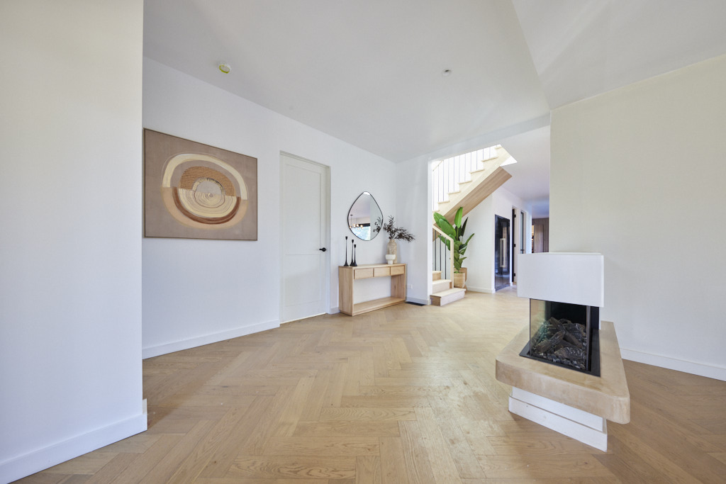
Another dark house, which looks good, but I don't think is as successful as Steph and Gian's.� I do like the mix of textures on the house and I love the dark colour with the natural brick. The eaves painted dark are very striking.� This is a great design tool for creating an intimate space.� White ceilings here would have looked out of place so this is a great use of colour and tone by Kristy and Brett. I love the generous size of the hallway.� The herringbone flooring that they used throughout the house is very striking here and there is a lovely open and airy feel to the interior.Fourth Place: Eliza and Liberty 34.5 points
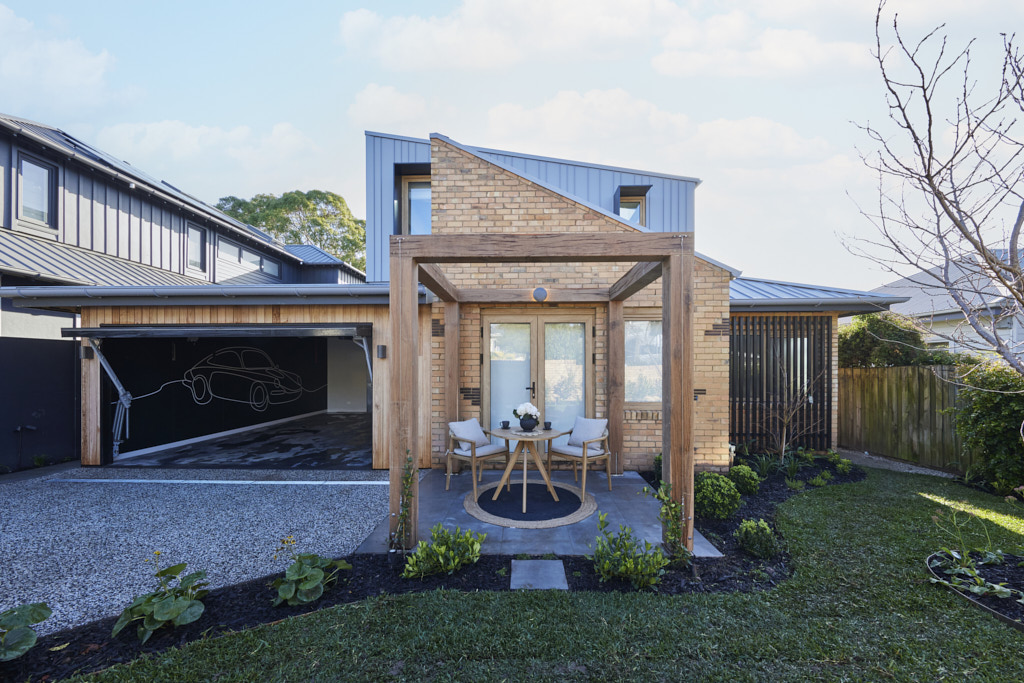
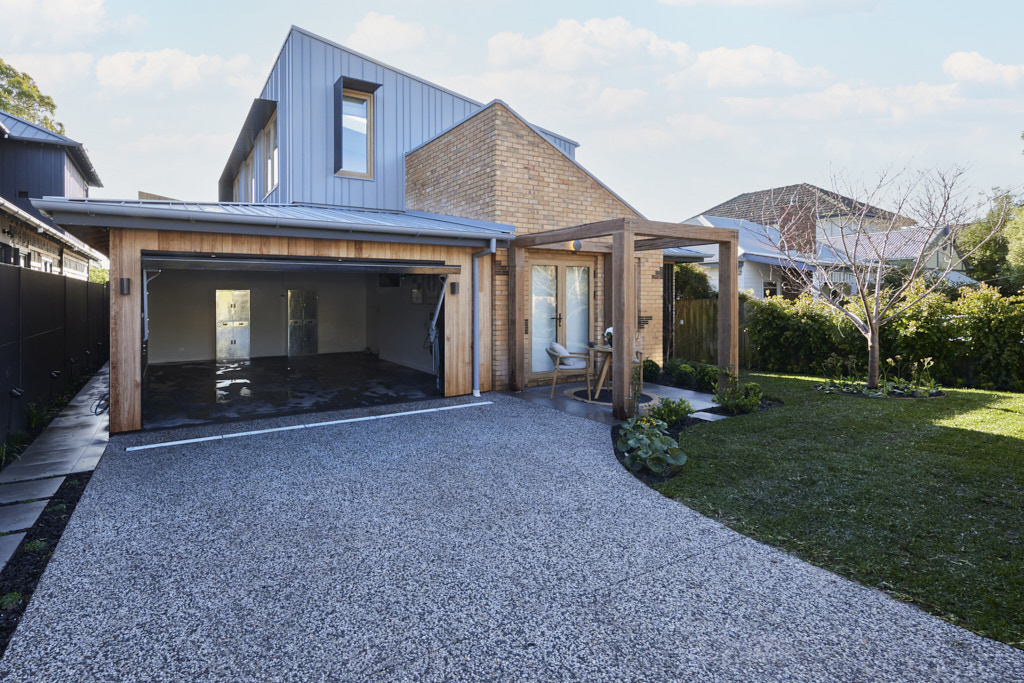
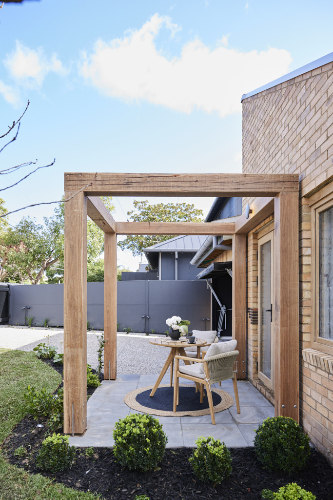
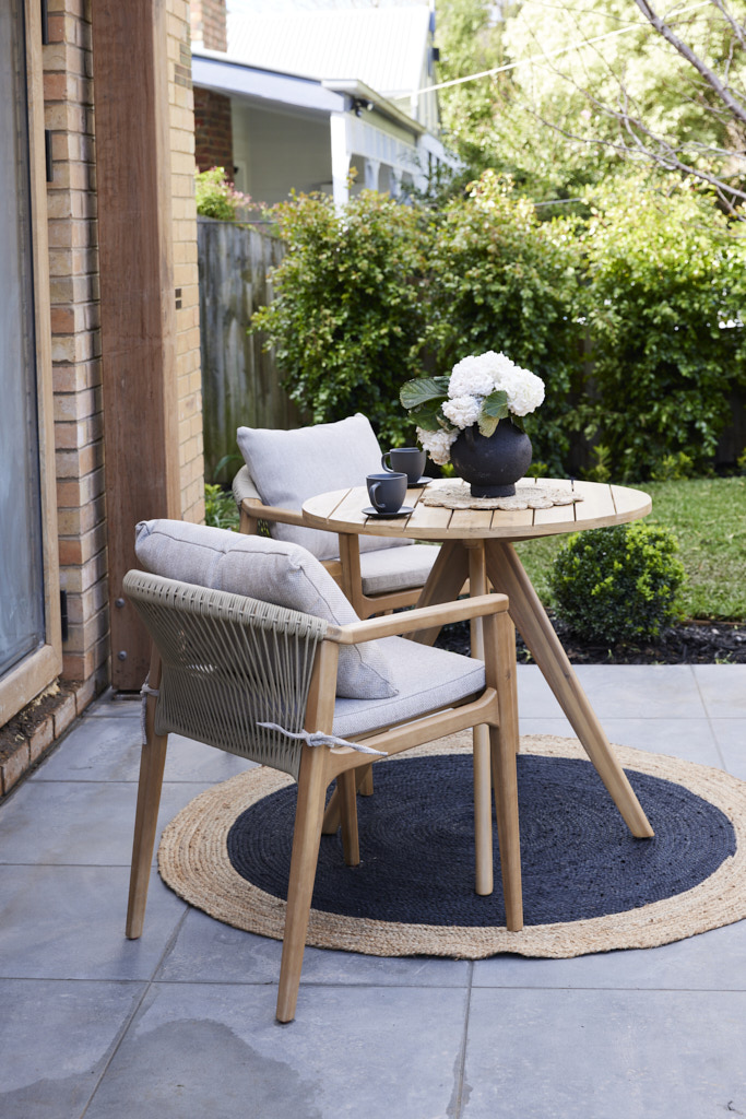
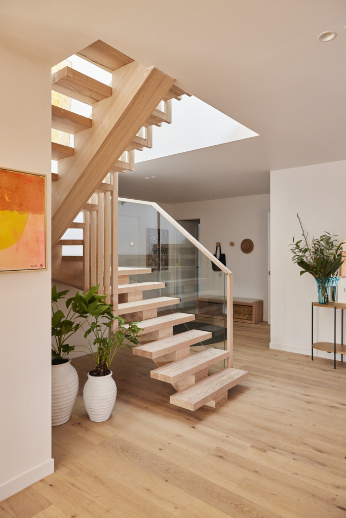
�Best on The Block!� the judges said of Eliza and Liberty�s timber clad garage door, the ideal accompaniment to a garden that incorporated hedging, lawn, seating area and an arbour set against Bluegum Colorbond and blond brick with timber look Aluplast windows and doors to come together harmoniously. �It really works,� they agreed. Marty�s only concern was how buyers will find the front door, tucked down the side as it is, but once there, the entry was grand and inviting. In the garage a Porsche theme Grafico mural brought smiles � especially from Marty, who said while house 5 might not have the most land, it ticks all the boxes buyers will be looking for.
 Eliza and Liberty
 Eliza and Liberty
 Eliza and Liberty
 Eliza and Liberty
 Eliza and Liberty
My thoughts on Eliza and Liberty's front facade and hallway
Small, but perfectly formed, sums up a very successful front facade for Eliza and Liberty. It's great to see Colorbond Bluegum, which is a relatively new colour in their range, for the cladding.� Its silvery blue tones work really well with the blond brick. I like the contrast of the dark screening by the front door too. The use of timber for the arbour works well and I really like the natural timber windows.� These have looked great from the interior of the property too.Fifth place: Kyle and Leslie Score: 32.5 points
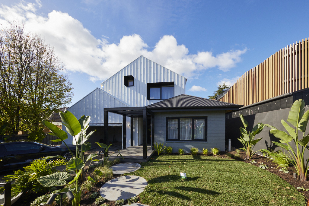
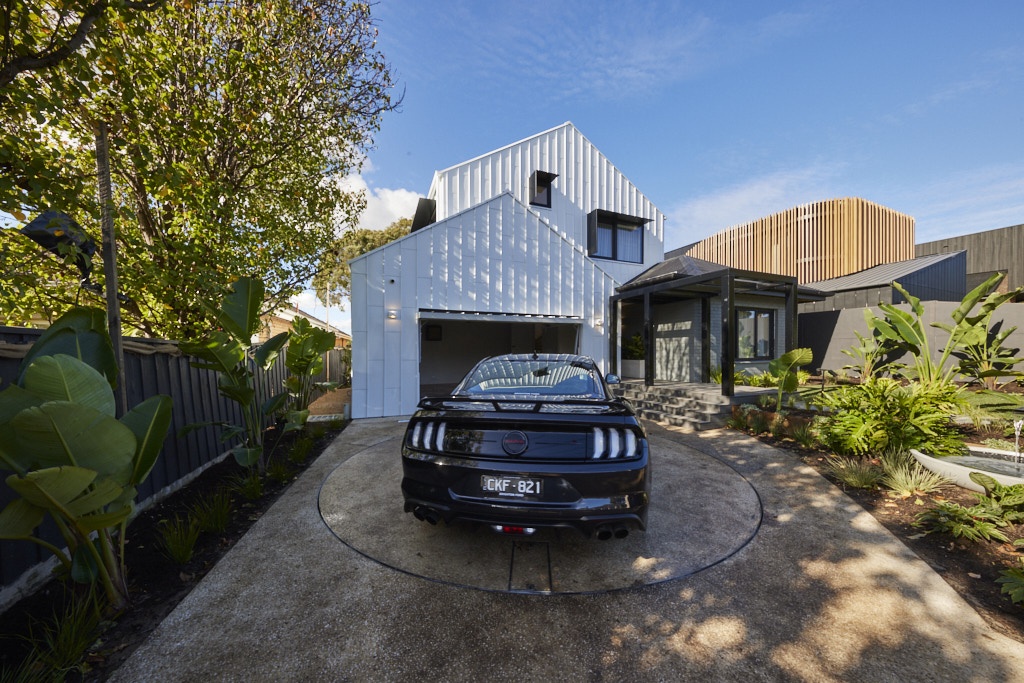
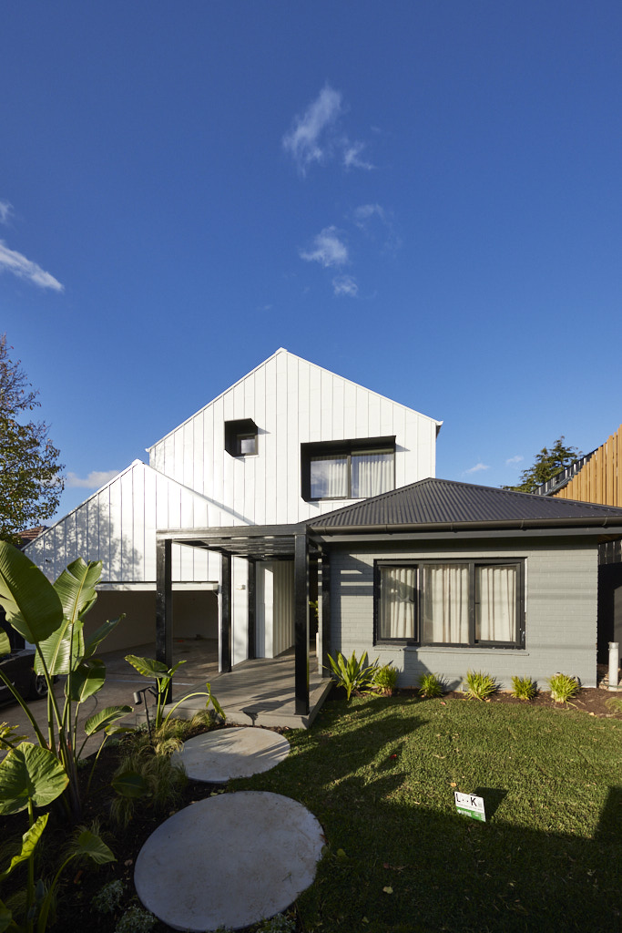
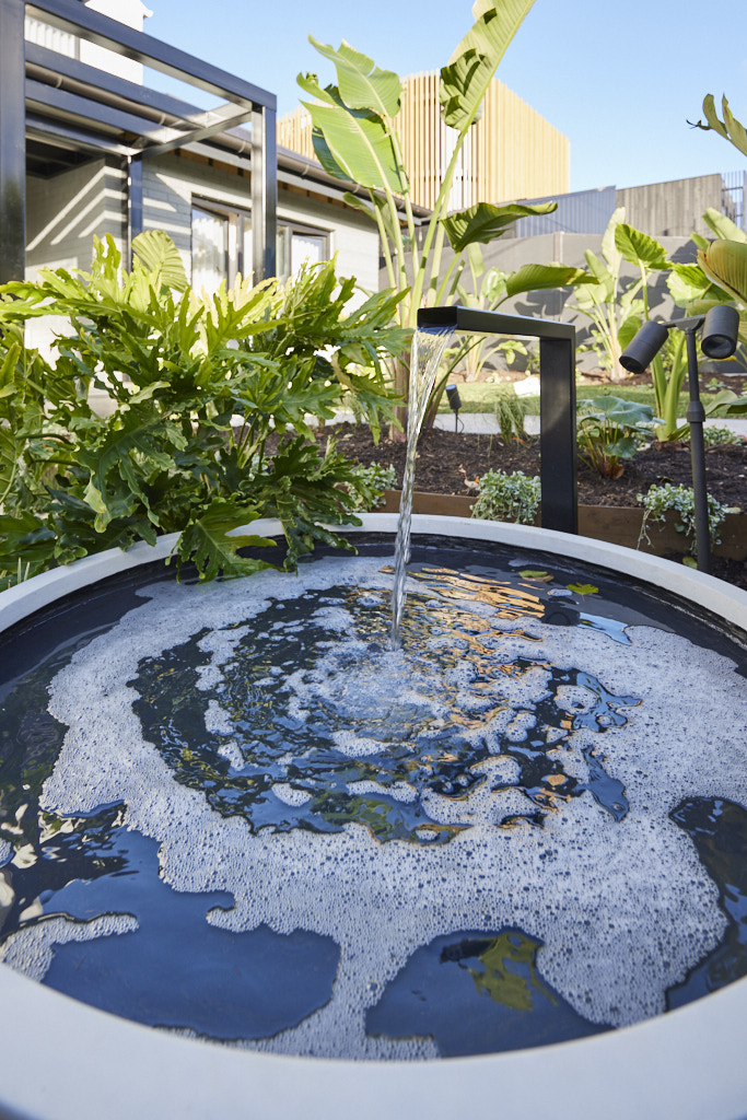
With a calming water feature and hi-tech Aussie Turntable driveway feature, this garden caught the judges with its perfect blend of old and new. A perfect match to the back yard, Dave pointed out, with Darren impressed by the diagonal lines and the detailing in the Dover White Colorbond cladding and how it contrasted in the design of the garden with the round steppers and the planting. Add in the Holcim Geostone driveway, Auto remote Access garage door and it all made, Marty summed up, for �a great first impression!� The grey paint choice for the fa�ade left them wondering however, but overall, they agreed it was the ideal face to a beautiful home.
 Kyle and Leslie
 Kyle and Leslie
 Kyle and Leslie
 Kyle and Leslie
 Kyle and Leslie
 Kyle and Leslie
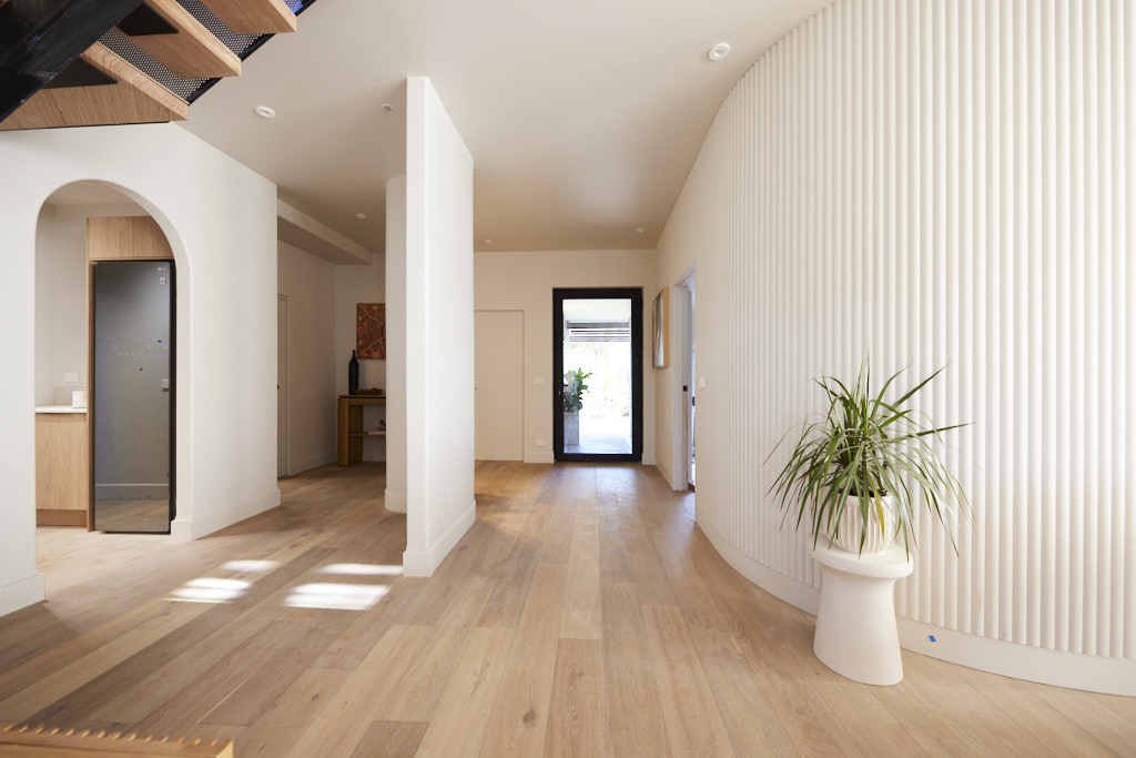
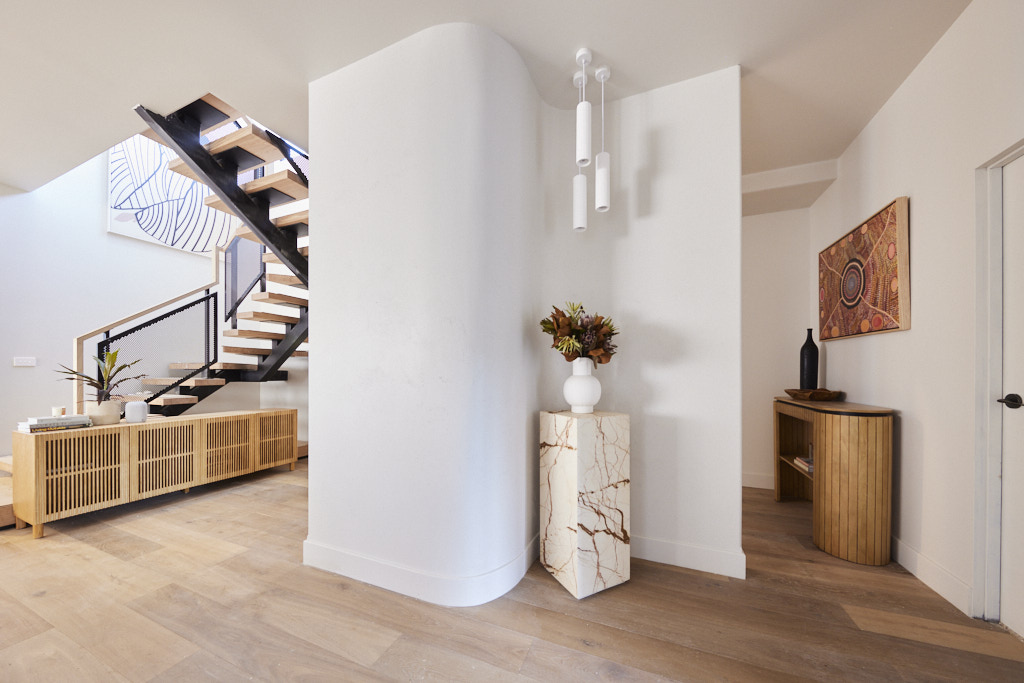
My thoughts on Kyle and Leslie's front facade and hallway
I would never recommend Colorbond Dover White for a broad expanse of exterior wall.� I love it for trims and garage doors, but find it too blindingly white for anything but an exterior feature.� The house still looks great, but I just think it should be knocked back a little. The front garden and water feature are attractive and I like the idea of the turning circle which would be a great idea for houses on busy roads. Their hallway is very successful.� It is nice and generous with a beautiful curved wall.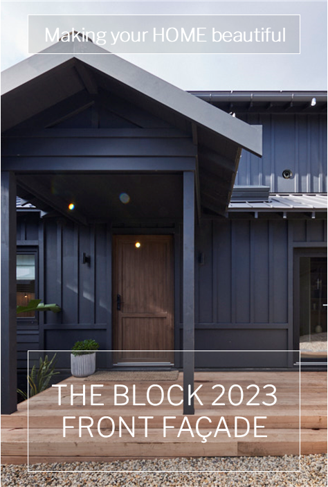
What did you think about the front facades?� I would love to hear what you think?
You can find out more about The Block and the contestants at�Channel 9.� Did you know that many of the beautiful items used on the show can be purchased through�The Block Shop?
All photography credits to David Cook Photography
You can see all the rooms and my thoughts on them from previous years of The Block�here.
If you are currently undertaking a renovation or building project or even just planning to re-paint your house then you should download my Free exterior and interior checklists.� These can be found in my Free Resource Library which has other e-books and checklists and is updated with new free invaluable resources regularly.��Join up for free here.
Follow me on Pinterest, Facebook or Instagram for more ideas and images.� If you are still stuck and need help with your project I offer an e-consultation service.� You can send me photos and/or plans with your questions and I will review and talk it all through with you.� I have packages from just one question through to a full colour scheme service ��click here for more details.
The post The Block 2023 Front Facade appeared first on Making your Home Beautiful.


