Last of the kids bedrooms, I’m not sure I’m finished this room, something doesn’t feel right, but it’s a work in progress. A few small updates have made a big difference and Lucy is happy. We didn’t really have...
Last of the kids bedrooms, I’m not sure I’m finished this room, something doesn’t feel right, but it’s a work in progress. A few small updates have made a big difference and Lucy is happy. We didn’t really have a plan for this space, we started by identifying the problems and finding solutions for them first.
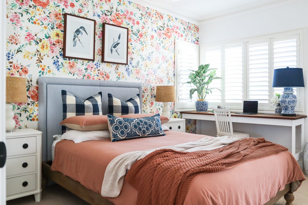
Lucy is 20 now and apparently her room made her feel like a little girl, she thought there was too much colour, too many patterns and too little mirrors … seriously! The issues we needed to address was her need for more desk space and the fact that one of her windows looks directly into the next door neighbours balcony, or more importantly that the next door neighbours look directly into Lucy’s room and they often make eye contact when she is sitting at her desk studying … awkward!
The first thing I did to create a new look in her bedroom was to remove all the things we no longer wanted or needed, then I gave everything a fresh coat of paint so we had a clean slate and could see what we were working with.
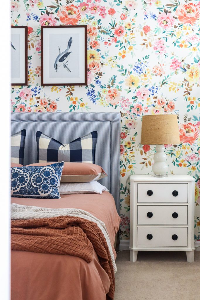
We decided to keep the bed, bedside tables and wallpaper, everything else was flexible.
Now to start addressing the functional problems of the room before we move on to the pretty things.
Firstly, desk space, I spent weeks looking for the perfect desk. I wanted it to run the entire length of the window, nearly 2 metres long, but only be as deep as a standard desk, about 60cm. I looked everywhere, I looked at desks, dining tables, console tables, 2 desks pushed together, nothing was quite right. So I found a picture of what I wanted and asked my husband if he would help me make it. It was very easy, cost under $200 and only took 1/2 a day. I painted the legs white and waxed the spotted gum top.
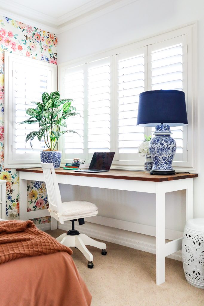
Problem 1 solved.
Next, the privacy issue. Obviously choosing the right type of window coverings was important in this room. We decided to go for plantation shutters from Tuiss Blinds Online for a few reasons. Firstly, they are contained within the window frame, with the desk sitting right under the window I didn’t want to use anything that might hang on the desk or get in the way. Next, the blades allow you to control who can see in and out while still allowing the daylight in. Lastly, they are nearly complete block out to keep the room dark for a 20 year old who parties all night and sleeps all day.
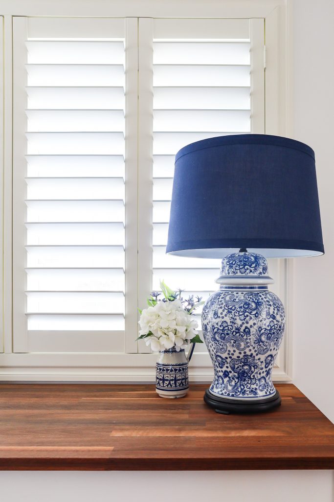
Problem 2 solved.
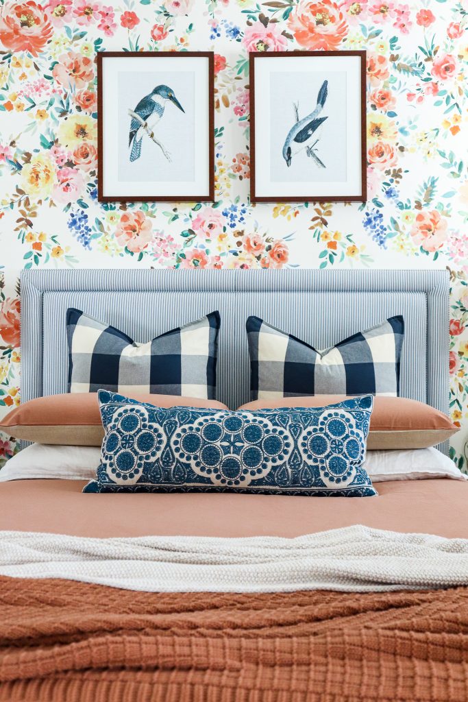
Now, the pretty things, Lucy wanted me to to remove some of the colour and pattern. We both agreed the wallpaper is staying because we still love it, so we stripped the bed back and only used very neutral linens to reduce the colour and pattern in the room. We chose a clay and natural linen quilt cover and cotton throw in the colour Woodrose to add some texture.
Lastly, the mirror. I let Lucy choose her own mirror and she found this glamorous gold one in a beautiful shape. We initially tried it above her bed but it was overpowering and too visually heavy, we moved it to the adjacent wall and it is the perfect finishing touch to her bedroom.
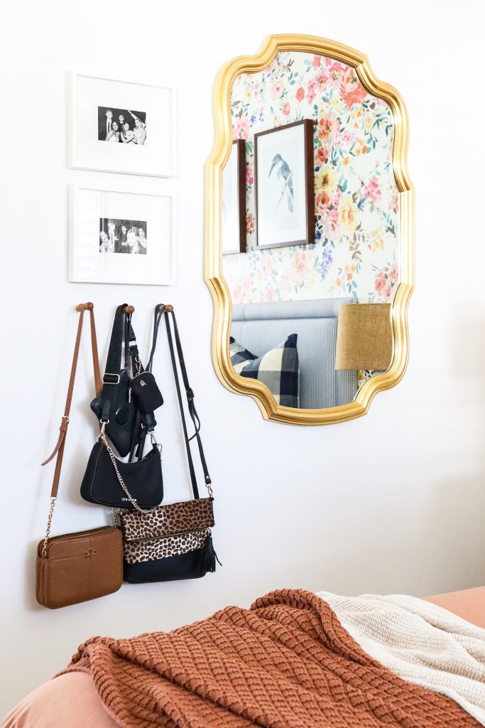
Problem 3 and 4 solved.
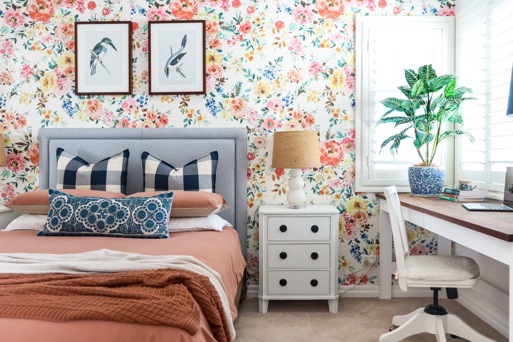
We didn’t make any major changes in this room, but it was just enough to give it a new look. I always say paint and window coverings make the biggest impact in a room and this room has proven that point again.
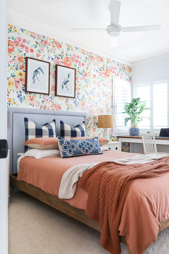
If you’re keen to update a room at your home, start by making a few small changes and see where it leads you.
Happy updating!
Hayley x


