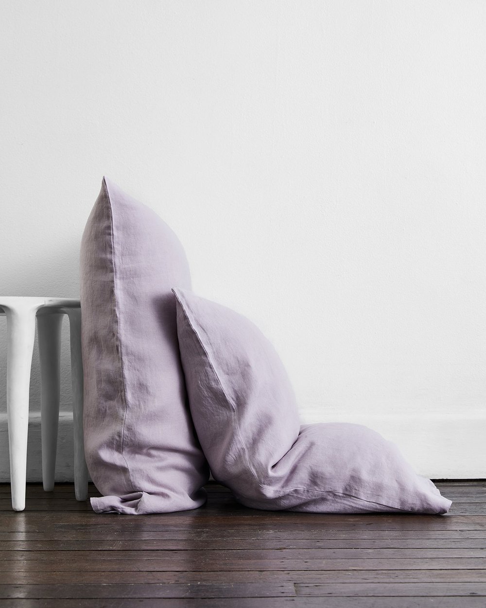
Displaying a carefree confidence and a daring curiosity that animates our creative spirit, Pantone�s colour of the year for 2022 is meant to help us embrace this altered landscape of possibilities.
Every year we look forward to this moment. The moment that Pantone announces their colour of the year.
In case you aren�t aware, Pantone is a pretty big name in the design space. From graphic design to fashion and interiors, Pantone�s colour matching systems are used in a multitude of industries worldwide.
Founder Lawrence Herbert actually created the first system for identifying, matching and communicating colours for consistency across the print and textile design industries back in 1963. His initial work led to the Pantone Matching System, a book that standardised colours across these fields � and continues to be an important tool to this day.
�
From here we get the Color Institute � the department within Pantone responsible for making the annual colour predictions since 2000.
The Color Institute studies how colour influences human thought processes, emotions and physical reactions. And with this it helps us professional garner a greater understanding of colour so that we can utilise it more effectively.
It makes sense, then, that oftentimes the chosen colour of the year is one that reflects the current environment and world events.
�
Enter Very Peri.
Displaying a carefree confidence and a daring curiosity that animates our creative spirit, Pantone�s colour of the year for 2022 is meant to help us embrace this altered landscape of possibilities.
�The Pantone Colour of the Year reflects what is taking place in our global culture, expressing what people are looking for that colour can hope to answer,� said Pressman, Vice President of the Pantone Color Institute.
�As we emerge from an intense period of isolation, our notions and standards are changing, and our physical and digital lives have merged in new ways.�
Last year, the brand broke with tradition and selected two tones as its colours of the year. Ultimate Gray, a simple grey colour, and Illuminating, a cheerful yellow, were its choices for 2021.
�
This time, Pantone did something different yet again and selected a shade that isn�t in its existing catalogue. Instead, they went for a new shade to represent the change happening around us.
Tinges of blue with a violet-red undertone, Very Peri displays a spritely, joyous attitude and dynamic presence that encourages courageous creativity and imaginative expression. The resulting Very Peri is similar to colours commonly found in nature, such as lavender flowers and birds with light purple plumage.
�Creating a new colour for the first time in the history of our Pantone Colour of the Year reflects the global innovation and transformation taking place. As society continues to recognise colour as a critical form of communication, and a way to express and affect ideas and emotions and engage and connect, the complexity of this new red violet infused blue hue highlights the expansive possibilities that lay before us.�


