Factory 42 takes the standard Euro worker-placement formula of 'get stuff, make different stuff, get points for the new stuff' and adds some pretty radical twists. The post Factory 42 Review appeared first on Punchboard.
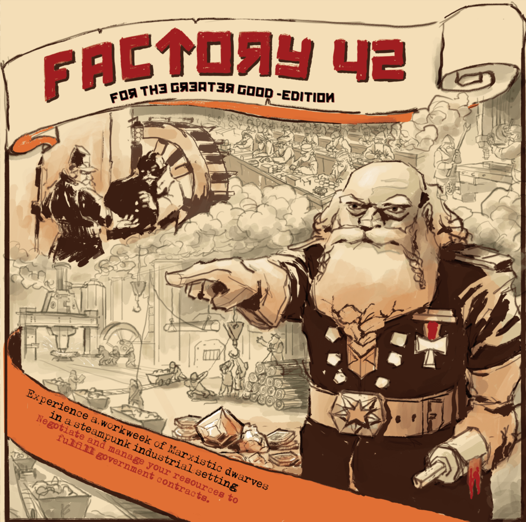
Factory 42 takes the standard Euro worker-placement formula of �get stuff, make different stuff, get points for the new stuff� and adds some pretty radical twists. Instead of the farmers or Renaissance traders you�re used to, you play the role of factory overseers. You place your dwarven workers in this quasi-Marxist world aiming to fulfil government orders �for the greater good�, but with plenty of opportunity to try to make things better for yourself by stepping on the heads of others. It does a really good job of working the theme into the game but with some fairly big issues along the way.
�Workers of the world unite��
The first thing I want to talk about is how well the theme is integrated into Factory 42. To set the scene: you and your dwarven workers are manufacturing goods in a government factory. Factory 42, no less. The main board has spaces for you to place your workers to try to fulfil government orders. Factories work on a production line basis and each worker space on the board is resolved in order, so by doing some careful planning, you can make sure the goods you need for manufacturing later in the round are requisitioned and delivered to your warehouses.
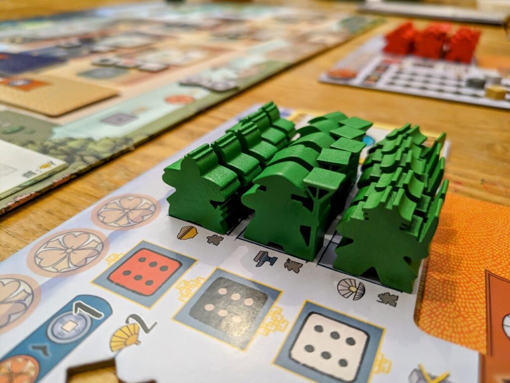
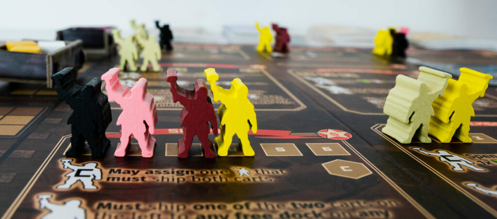 The worker meeples are really cute.
More accurately, you can try to make sure the goods are there.
Government being government, some of the things you want might get delayed by bureaucracy. This is represented by the imposing tower on the table. Inside the tower, there are cardboard layers with holes of different shapes and sizes. All of the available materials and goods for the round get dumped into The Tower of Bureaucracy, and as you�d expect, not all of it comes out. Some get tied up in red tape, some go out in the briefcases of management I expect. Whatever happens, it�s a decent analogy for the bureaucratic process. Players of the classic Wallenstein know what to expect.
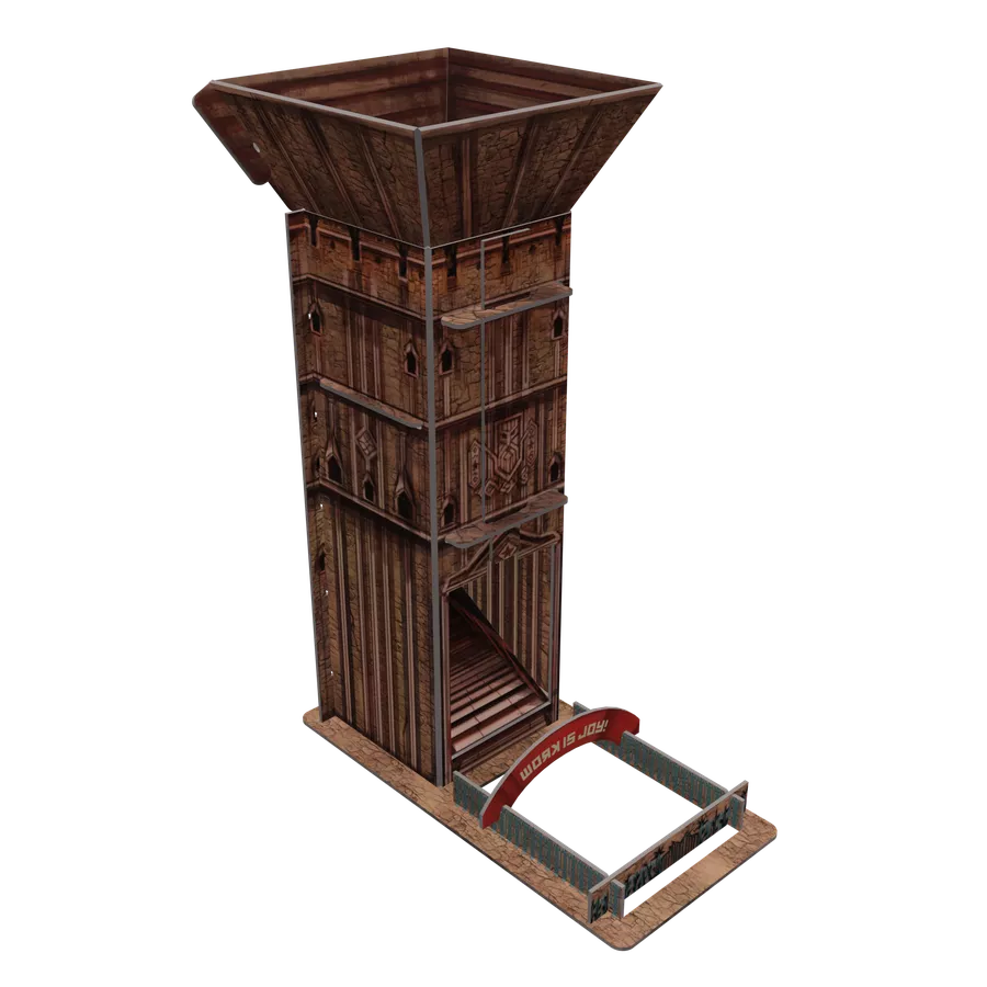 The bureaucracy cube tower plays an important role in the game.
Whatever the outcome, the goods you�re left with go into the common pool, which is shared by all players for the rest of the round. It�s a theme that�s carried throughout the game, this idea of a dwarven pseudo-communist society. Whatever�s available is available for all players equally. It just depends how quickly you get to the worker allocation space, and whether or not someone decides to take the optional Commissar spot, and that�s where shenanigans can really start to emerge.
�Landlords, like all other men, love to reap where they have never sowed�
The Commissar spot at each action space works to boost or alter each of those spaces, but it�s not mandatory to have a worker placed there. Some are nice, like the Loading space which lets you add extra cubes to the little railcars that carry goods to the players� boards. Some are less nice. The Trading spot, for instance, requires each player who wants to trade to pay a rosette token to the Commissar, if one is present. You need to pay somebody else just for the right to trade, and that Commissar might have been placed there after you chose to trade.
It�s not just the Commissar spots that can sway the game in this interactive way. Take the Shipping action as a perfect example. You can claim one of the first two railcars on the track which may or may not have lots of useful cubes on them, and then place them on a player board. Note that I said a player board, not necessarily your player board. If you want to scupper someone�s chances you can take that railcar with a paltry single lichen cube and clog up somebody else�s dock! When you take the Requisition action which lets you add cubes to the common pool you might already have stock of the items you need to fulfil this round�s government orders, so why not add a load of useless � but burnable � items to the pool which don�t help anyone else, but help you generate the steam necessary to make things.
The push and pull, and �Oooh you absolute git!� shouts from across the table are great, if interactivity in a euro is your thing, of course. It�s not for everyone, but for me it�s a good thing which takes me back to older, German-style Euros.
Unfortunately, being metaphorically kicked in the shins by the other players isn�t the only frustration you�re likely to face in the game.
�Nothing can have value without being an object of utility�
The quote above from Karl Marx hits particularly hard because of the lack of utility in a lot of different things in the game. There are a lot of examples where design decisions � or lack thereof � really hurt Factory 42. The first place it hit me was setting up for my first game. I was following the setup instructions in the rulebook thinking �I don�t really get some of this, I wish there was a setup picture�, only to find one on the following pages. It�s odd in the 2020s to not find an image on the same page as the instructions. I thought it was odd that there were no step numbers to reference on the setup picture, only to find that there are, they�re just almost invisible. See this image for an example of what I mean.
Update: After feeding this back to the publisher, a new version of the rulebook which makes this much clearer is already in the works and a PDF should soon be available on their website.
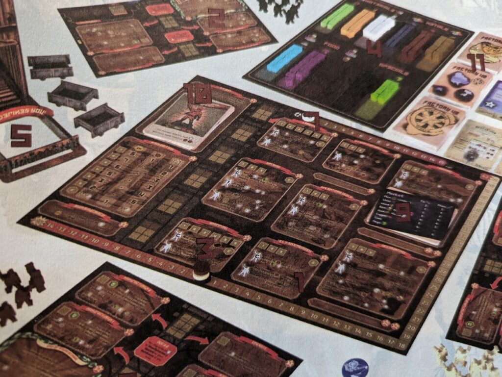 I took this photo of my rulebook, it hasn�t been edited. There are five numbers on that board in the middle � can you find them all?
I have no idea how this kind of design decision gets past an editor. I wondered if it was maybe just a one-off printing problem, so I headed to the publisher�s website only to find that it�s still the same now, even on version 1.35 of the rulebook. I carried on reading through the rules for each of the different action spaces and saw in the description for the first action � Requisition � where a sentence explaining costs reads: �The cost is also shown on the location�. Great, except that having scoured for the costs on the location and thinking I was just being a bit stupid, it�s just not there. I�m guessing whatever it refers to is now superseded by a reference card, but that�s all it is � a guess.
Update: The above paragraph is being addressed in a new rulebook revision too. I�ve kept my original text in the review, as this is what I was sent to review.
Each of the eleven different resources is a different colour and one of three different sizes. The choice of sizes is actually really clever. There�s a small Spiking bag included that gets loaded with cubes during one particular action, and players can draw cubes blindly from the bag to add to the pool. The bag is too small to get more than a couple of fingers in, but it�s probably enough to tell the difference between a big and a small cube. It�s not a lock-in, but you�ve got a rough idea of what you�re pulling out. It�s a really clever way to utilise the different sizes. The problem comes when looking at the pile of cubes in the common pool and trying to discern what�s there. I�m not colour-blind but even I have trouble telling what colour some of them are at a glance. The reliance on symbols that aren�t on the cubes, and the fact that the resource board (with the symbols) has backgrounds that are slightly different colours to the cubes might make it impossible for colour-blind people to play.
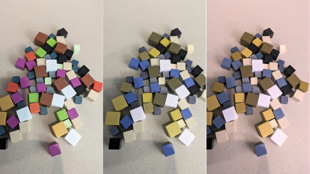 Eleven different colours. Left � original photo. Middle � red-blind protanopia. Right � green-blind deuteranopia.
It might sound like I�m nit-picking, but it�s important to understand that Factory 42 is a heavy game. Every little thing which makes an already complex game harder has its impact amplified by that weight. Just trying to work out whether you can do the things you want to if someone doesn�t sabotage you is tricky enough. Trying to make a mental note of how many of which cubes there are because you can�t tell what they are at a glance just makes things harder. Equally, each of the eleven different types has a symbol associated with it which might become intuitive later, but at first need constant reference to a reference card. Eleven is just too many things to have to pair a colour to a symbol, and a symbol to a part of a group of types.
Final thoughts
Factory 42 could be a good game. Maybe even a great game. But in the state it�s in now, there are just too many niggles for me to be able to say that outright. It�s like putting on a pair of walking boots to go for a difficult hike, only for someone to have thrown a handful of gravel into them before you even get going. The rulebook needs heavy editing to bring it up to standard, and there are so many little things you�ll find when you play which suggest it just needed more playtesting, or an experienced developer involved.
The Cyrillic-style backwards Rs, Es, and Ns in the headings in the rulebook. I get it. It looks very �Soviet�, but it doesn�t help. The typewriter-style smudged and incomplete typeface used on the tops of the cards is stylistic but difficult to read. When I go back and look at some of the things in the prototypes, like the bold colours of the cubes, it seems like some things have taken a step backwards in terms of function, in favour of form.
All of my grumbles are a real shame because I really enjoy playing the game. The semi-co-op, �greater good� feeling of creating a shared pool of things to fulfil the shared contracts is cool, especially with the way the knives come out when it comes to sharing things. The bureaucracy tower does its job really well, the spiking bag too. I love the way the market prices change every round. The optional modules for inventions and Elven contracts spice things up. The flow of the action resolution and the pain of choosing when to place a worker, and where � it�s all really good. It�s just let down by the barriers to entry.
I understand that there have been plenty of small revisions since the original crowdfunding campaign, but even with those I would still absolutely love to see a v2.0 of Factory 42 with some redevelopment. There�s a great game in here, complex and chewy with a ton of interaction, but it needs a concerted effort to work around the various issues to make it worth it.
Review copy kindly provided by Dragon Dawn Productions. Thoughts and opinions are my own.
If you enjoyed this review and would like to read more like this, consider supporting the site by joining my supporters� membership at either Patreon or Ko-fi. It starts from �1 per month, offers member benefits, and lets me know you�re enjoying what I�m doing.
Factory 42 (2021)
Design: Timo Multam�ki
Publisher: Dragon Dawn Productions
Art: Lars Munck
Players: 2-5
Playing time: 90-120 mins
The post Factory 42 Review appeared first on Punchboard.


