My thanks go to Net Galley and 8th Circle Press for the review copy. This book is for sale now. When I saw the cover of this children’s book, I thought it had strong possibilities. It’s original, and I...
My thanks go to Net Galley and 8th Circle Press for the review copy. This book is for sale now.
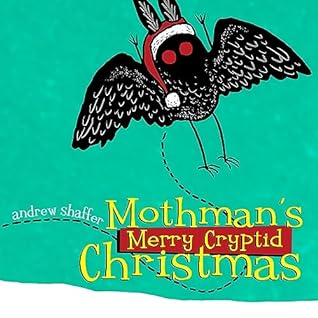
When I saw the cover of this children’s book, I thought it had strong possibilities. It’s original, and I thought it was conceptually strong, so I read it. Having done so, I have come away underwhelmed.
For a book like this, a takeoff on Rudolph the Red-Nosed Reindeer, two things are important. We need resonant, bold, eye-catching artwork to engage the little person that is reading it, or to whom it is being read, and we need a regular cadence. We’re supposed to be singing this book to the same tune as the song, and while the text certainly rhymes, it’s nowhere near in pocket. It’s awkward as hell, actually. Get out your metronome and try it, I dare you.
And as for the artwork, it can best be described as minimalist. When I saw Mothman on the cover, I was thrilled. Kids would love it, I thought. But that’s basically what’s on every single page. Mothman, plus a small amount of unengaging other stuff. There’s no bold artwork at all, and very little art of any kind. The illustration of our protagonist is the entire show, over and over.
I’ve since learned that this is a series. I haven’t seen any of the other books, but I’m going to guess they are more of the same. In fact, if I continue writing much longer, I will talk myself into dropping the rating to 2.5 stars instead of 3.
It feels lazy to me; it didn’t come close to meeting my expectations. When I took the galley, I thought that if this book was as good as I hoped it might be, I would purchase a copy of it for my grandsons. I’m not going to do that now, and if I won’t, I cannot recommend you buy it either.


