What we graphic designers have gained and lost in the digital era After 23 years, we�ve been remodelling the agency. Though our new space is smaller, it feels sharper. You wouldn�t believe the truckloads of stuff that went, much...
What we graphic designers have gained and lost in the digital era
After 23 years, we�ve been remodelling the agency. Though our new space is smaller, it feels sharper.
You wouldn�t believe the truckloads of stuff that went, much dating back to a primeval, pre-digital epoch. I wanted so badly to be unsentimental, brutal even. Strip the whole thing down to essentials and be re-born as a new, lean, future-ready BB&P.
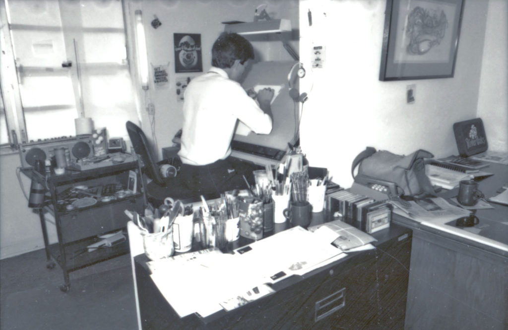
But as we emptied the agency attic, vestiges of the early BB&P kept being discovered. Turns out we still had virtually a full set of the tools that equipped a typical pre-Macintosh work station. I would hold an item up and ask the studio to guess its use. A weird, perforated plastic object with multiple scales of different calibrations. A magnifying glass that makes things smaller, not bigger. A pen shaped thing with a round metal ball where the nib should be. No one recognised the type linespacing scale, the reducing glass, the Letraset burnisher. All tools of a long, long bygone age.
I sometimes worry about what happens when the electromagnetic pulse of a thermonuclear exchange knocks out all the microcircuitry we depend on. Will anyone know how to cast type, mock up a layout, do paste-up? Then I console myself with the fact that after a thermonuclear exchange there probably won�t be a design industry.
Unearthing all the old relics made us think about how profoundly the Mac�s arrival disrupted our industry, the way we operated, what we earned.
Here�s how a small agency on a remote tropical island would get an ad ready for a colour magazine in pre-Mac times (let�s say 1985):
Concept � pretty much the only part of the overall process that hasn�t changed; pencil and paper still being critical tools Visual � think �Mad Men� here; lavish magic marker illustrations and hand-drawn typography on artboard overlayed with tracing paper Copywriting � way more copy in those days, for an era when people had the time and interest to read a witty ad Illustration � select and brief an artist, go through multiple iterations until it was just perfect, or: Photography � select and brief a photographer, process the film, review the contact sheets and order the prints (or select the right transparency) Typography � figure out how to make the copy fit into the allotted space, specify the font, its size and style. Fax this complex spec to a phototypesetter in Miami Typesetting � the raw typesetting would arrive via FedEx; a set of �type galleys� � duplicate copies on semi-gloss paper Artwork/mechanicals � laboriously cut and paste the galleys onto a mechanical board along with a photostat of any imagery to indicate position and size; FedEx everything back to Miami Prepress � The facility house in Miami would scan the boards along with the illustration or photography, then produce filmsetting, separations, colour progressives, proofs Approval/Corrections � Receive proofs via FedEx in the form of curious �Bluelines� which gave a vague, blue-tinted idea of how the layout would look. Approval by fax or more last minute changes Film Negatives � the facility house would produce the final set of printer negatives and FedEx them to us Submission to the magazineThe entire production process could never, never, take less than six weeks from the moment the client approved the initial concept. This meant that there were significant hiatuses built into every project and expectations accordingly matched this stately progress. Back then, graphic production was a tedious, complex and highly skilled business. Back then, you never had clients who dabbled in a bit of paste-up; there was a strict division of labour and you were properly paid for your expertise.
All of which meant that we pretty much billed the same on a monthly basis as we do today but produced a tenth of the volume of work. And looking at that old work now, what we see is so rudimentary compared with the complex concepts we can bring to life now. It was rough and inaccurate, too, compared to today�s digital perfection. But we�ve nevertheless lost some wonderful things, the most important being the rich profusion of illustration that existed then. Photography was expensive to create (no internet, no Shutterstock) and expensive to turn into print. Digital photography today is pretty much production ready.
Would I want to go back to 1982? Not a chance in hell. Never again do I want to breathe in SprayMount, slice through my finger with an X-Acto blade, or spend a night in a blacked-out PMT room. Frankly, I can�t remember the last time we produced an actual printed brochure for a client. But I miss the sensory joy of a beautifully printed and bound brochure, and the excitement of opening up the weekend edition of the local paper to see our stunning double-truck ad.
The post Looking Back in Amazement appeared first on BB&P Blog.


