There is such a thing as a bad call to action The goal of any page on a website, whether it's the...
Let’s Talk Web Navigation The Web Navigation Bar (aka, the nav & primary menu) The web navigation bar is a custom-built element on every webpage that contains links to other sections of the website. In most cases, the navigation...
Let’s Talk Web Navigation
The Web Navigation Bar (aka, the nav & primary menu)
The web navigation bar is a custom-built element on every webpage that contains links to other sections of the website. In most cases, the navigation bar is part of the main website template, which means it is displayed on most, if not all, pages within the website. This means that no matter what page you are viewing, you can see the multiple layers of content that are available to you.
The most common way navigation menus are displayed is usually in a horizontal list located at the very top of the page, containing the brand’s logo. When you visit most sites it is placed at the top of the page and is always placed before the main content, but sometimes placed down near the footer as well. In some cases, it may make sense to place the navigation bar vertically on either side. This type of navbar is called a sidebar and can work for your website depending on the styling and the type of content you have to share.
In more modern websites, some have both a horizontal navigation bar at the top and a vertical navigation bar on the left side. These links can either be exposed and immediately seen on the page or placed as a hamburger menu and shown when the user clicks and make all links visible. With many options to display navbar’s, you may be wondering which way is the best for your site. In this post, we will dive into 5 different ways web navigation is used and how companies are thinking outside the box and still remaining functional.
Standard Horizontal Menu
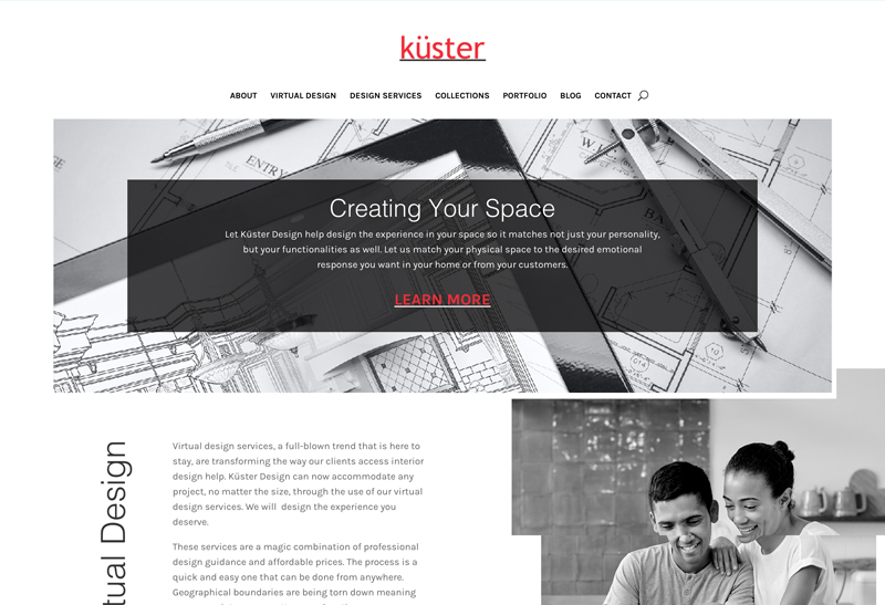
A number of factors influence the decision to choose horizontal navigation, including design, usability, type of content. Small websites often prefer horizontal type at the top of the site, while large corporate websites often use both horizontal and vertical types. This type of menu is the go-to at Roundpeg because it is simple and remains visible even during the scrolling of the page, which is called a sticky nav.
Using a menu at the top keeps all of the real estate on the page available for easy use so you can display content effectively without having to work around it. You can also add uniqueness to the main horizontal web navigation by adding hover effects and colors to guide the user.
Hamburger Menu
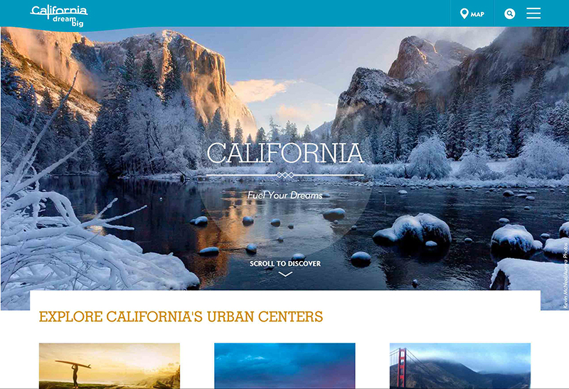
The hamburger icon was originally designed to simply indicate a list within any web page. This element is usually seen on the mobile display of a website, but now businesses are effectively using the icon as the main web navigation. The main pro of this design choice is that it keeps the menu simple and compact. By not showing all links on a webpage, the user is likely to scroll down your home and view content before seeing the other options.
Although the hamburger icon is becoming the more sleek and stylish choice, there are also cons to this display. One of the biggest gripes designers have with the hamburger menu is that it immediately makes whatever is in the menu less important and makes the user far less likely to go there. Another pain point is that hamburger menus have dramatically lowered click rates and engagement than other buttons and are increasingly ineffective.
Vertical Sidebar Menu
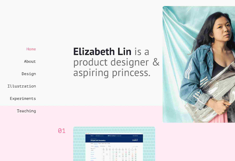
Vertical web navigation is primarily on the left sidebar that expands from a menu icon and is similar to what you see on mobile sites. This nav is easy to find in the upper left-hand corner of the main landing section. It is one of the less common ways designers display a menu.
Although it is a different experience and creates a level of uniqueness to a site, it can only be effective if a designer uses the webspace in a smart way since a vertical layout can take up the precious web real estate. This type of menu doesn’t have a logical hierarchical structure for the treatment of links so it is common for fashion, art sites, and online shops.
Sticky or Fixed Menu
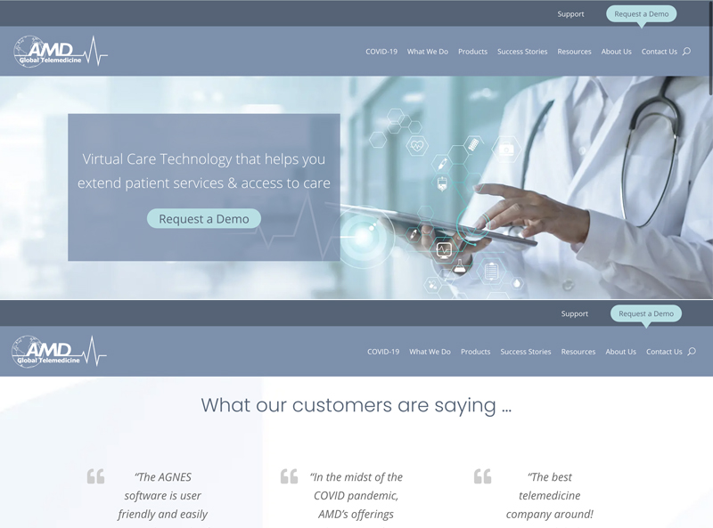
Gone are the days where a user can visit your site and need to scroll all the way back up in order to view all of the main menu items. A popular trend in UI navigation and one that we implement often, the sticky or fixed navigation menu does not disappear when the user scrolls down a web page. Sticky web navigation is typically used in websites where the main call to action elements are within the primary horizontal navigation bar. This, along with a clean horizontal menu, creates a nice sense of balance on longer web pages.
The Mega Menu
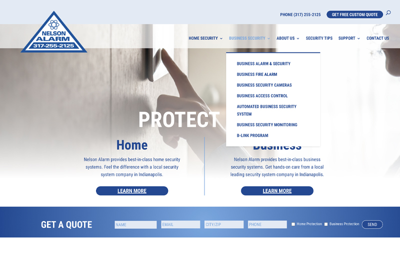
This type of menu is often seen in online retail websites and businesses offering lots of options in one menu, a mega menu is a drop-down interface triggered by the visitor hovering over a link. This dropdown usually shows all options in one main and can continue to expand depending on how many sub-page options the website has. The mega menu is not our go-to, but what we do instead is create a secondary nav on a page where there is a heavier amount of content to show and organize.
In Conclusion
The navigation bar is a uniquely important element of a website’s design since it allows users to quickly visit any section within the site. If you’ve ever visited a website without a navigation bar or a bar that is way too cluttered, you may have found it is difficult to locate the page you need. This also increases the chance that a user will need to click “back” multiple times in order to find the section they’ve already visited and can’t easily locate. Thankfully, web design has become more standardized in recent years and nearly every website now includes a well-designed navbar and more businesses are being creative and keeping the experience for all users fresh.
When thinking about what type of menu bar you want to use for your website, make sure the user experience is kept as the most important factor. Secondly, decide whether the style you choose aligns with the type of business you are running because at the end of the day it can make navigating around your site more painful and less effective to finding content.
got a project?
Whether you need a new website or some help with your social media we are ready to start the conversation.

Call to Action Do’s and Don’ts
Let’s Talk Web Navigation
The Web Navigation Bar (aka, the nav & primary menu) The web navigation bar is a custom-built...
Canning Cookies, Creating Cohorts: Google’s Advertising Shift, Explained
The devs over at Alphabet are not just trying to bolster their profit; they’re trying to make something that could be problematic better and more secure.
A Deep Dive into Web Scams
What exactly are web scams? Web scams are illegitimate internet websites used to deceive users...


